An Luc
Creative Director &
Designer
Selected work




⟵
(or press esc)
Not Even WhatsApp
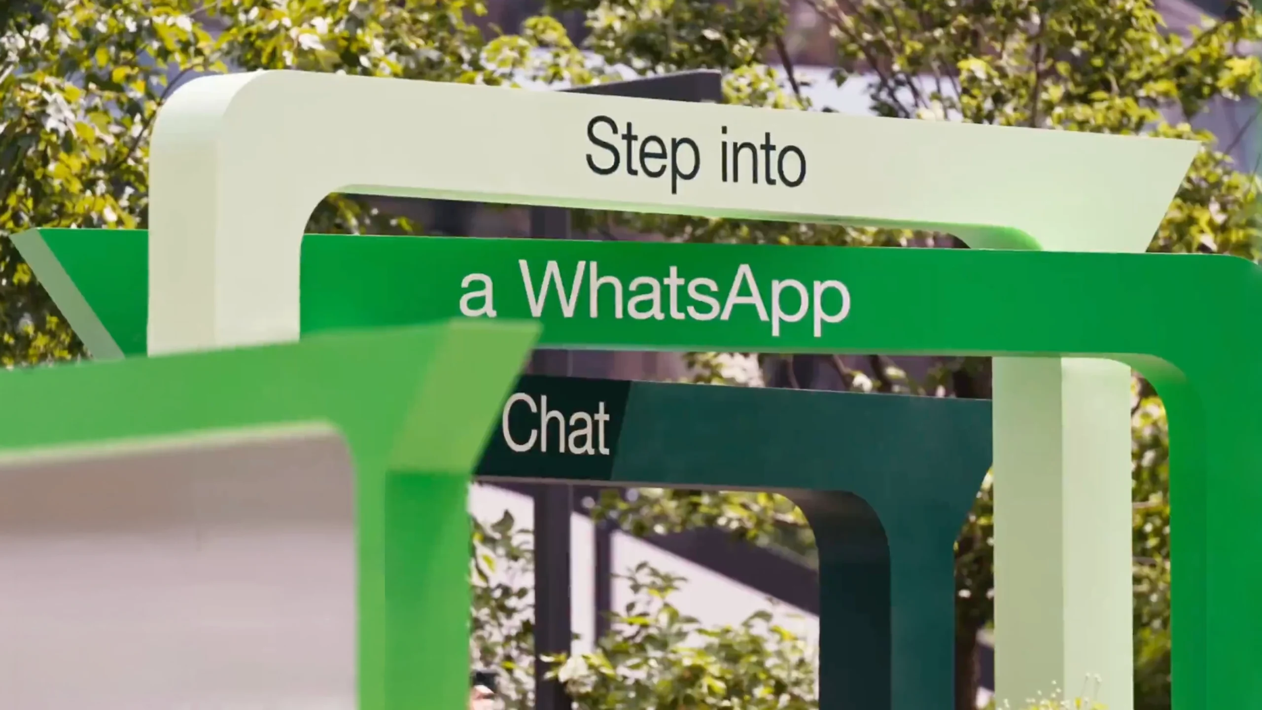
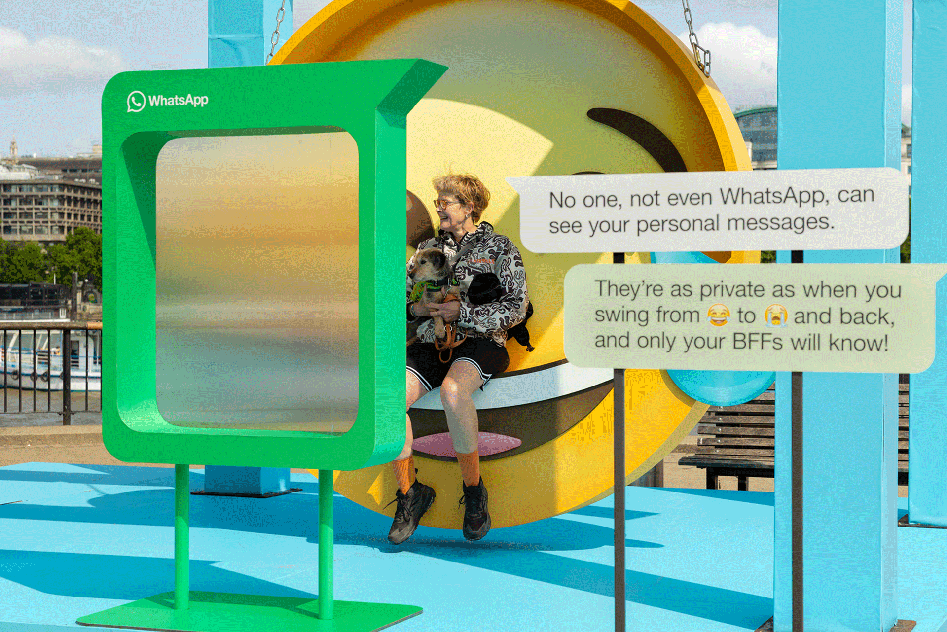
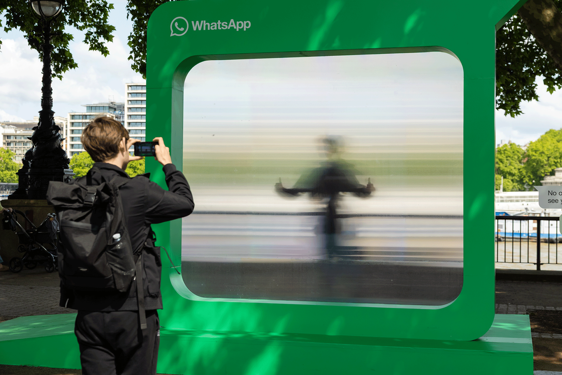
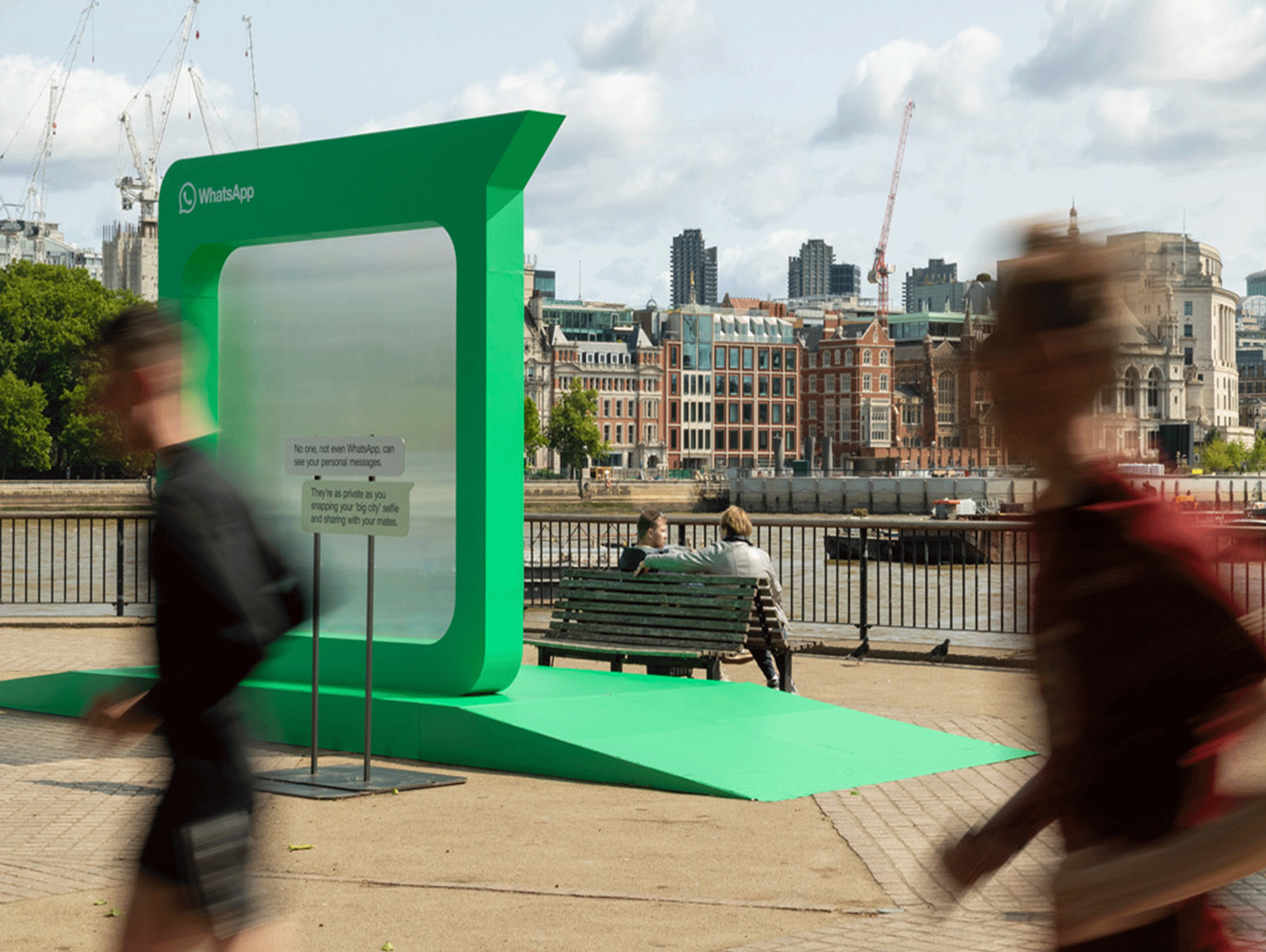
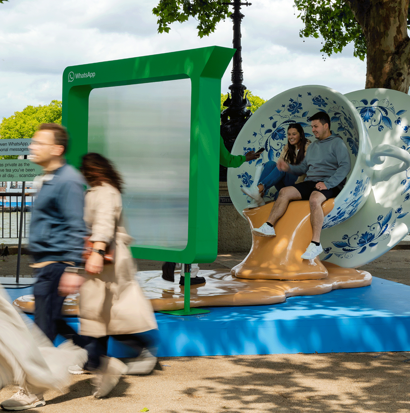
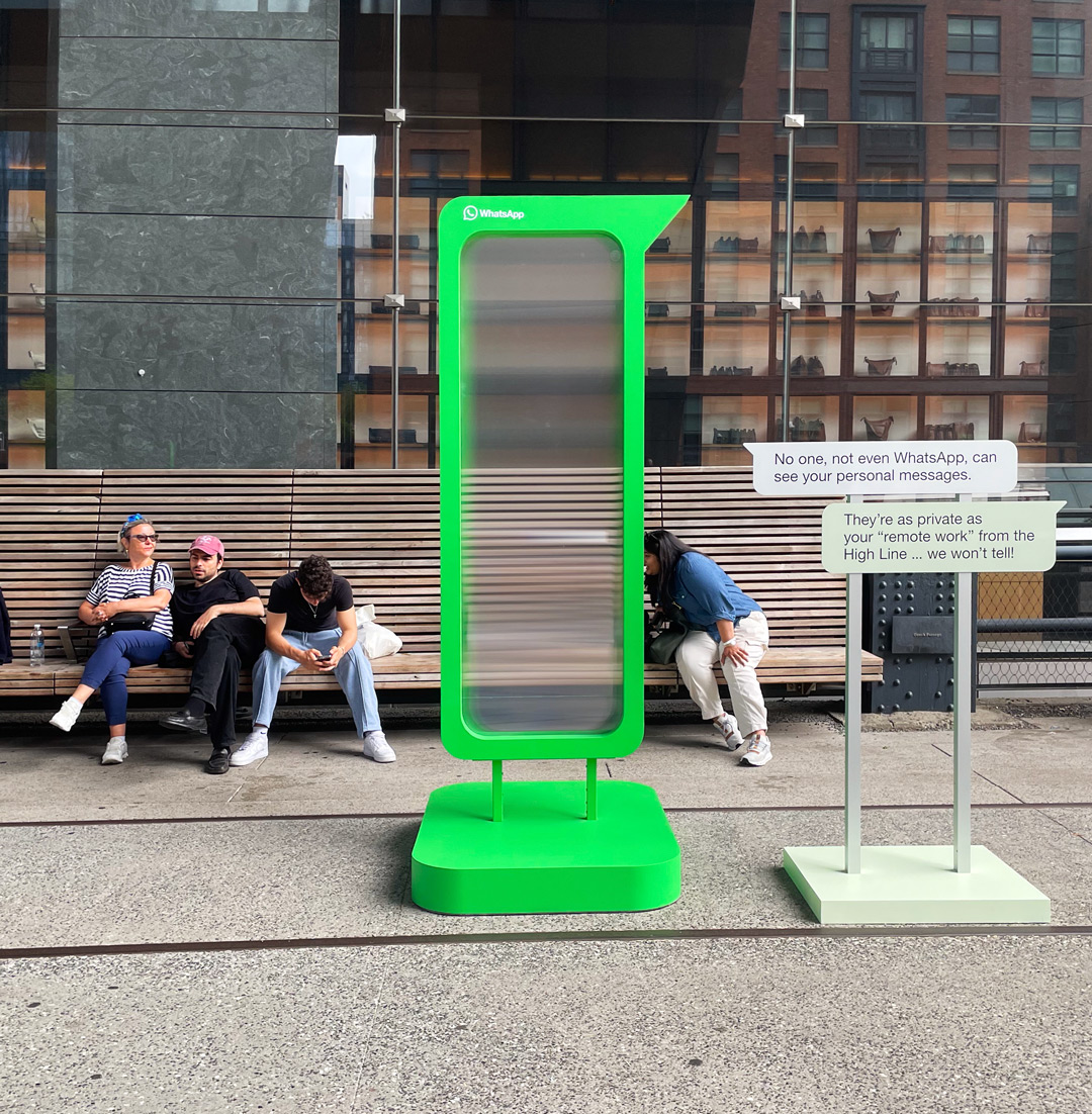
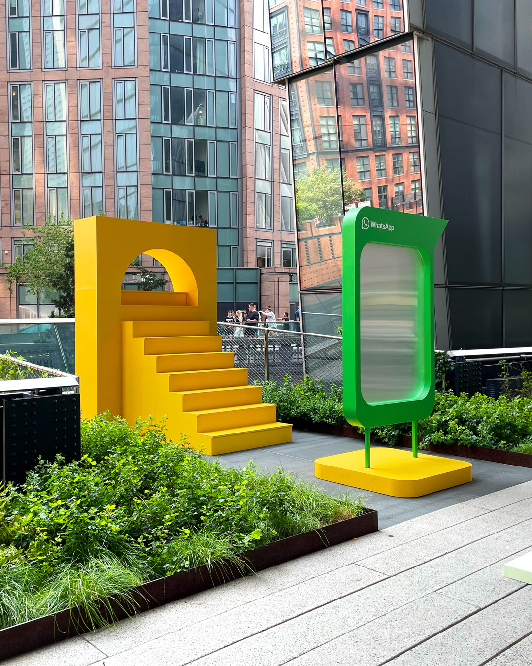
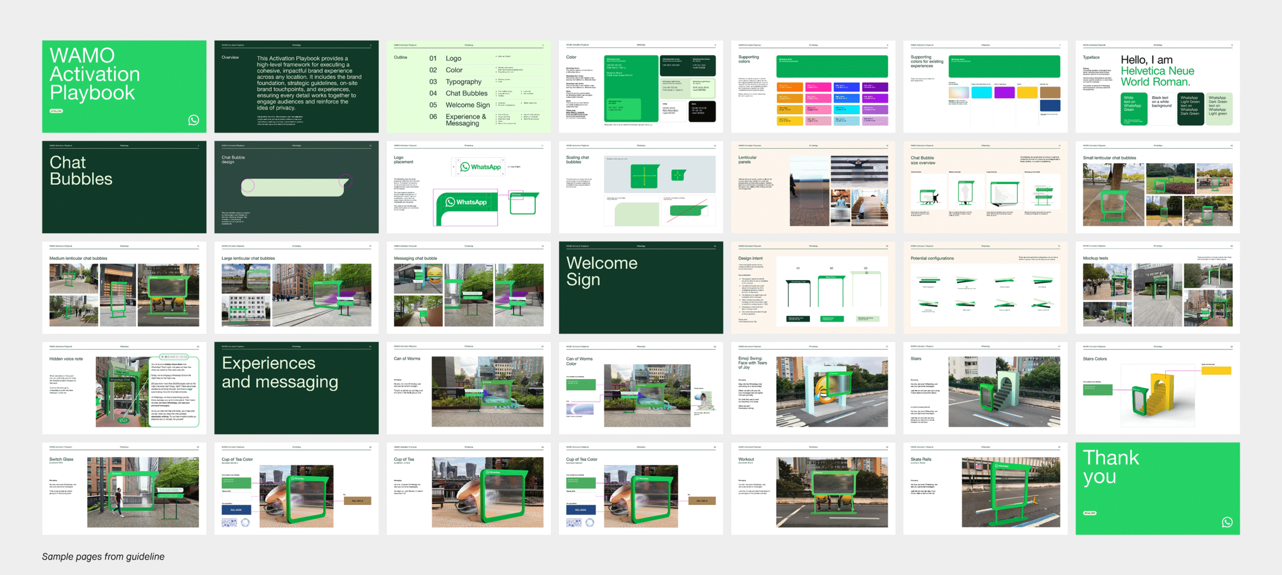
WhatsApp's "Not Even WhatsApp" campaign expanded into a global experiential activation across London, São Paulo, New Delhi, and New York City, transforming its privacy promise into immersive public experiences. Interactive installations, obscured visuals, and playful encrypted moments made end-to-end encryption tangible, allowing audiences to see, hear, and engage with privacy in distinctly WhatsApp ways.
Brand experience
Brand activation
Design system
Environmental design
Guidelines
⟵
(or press esc)
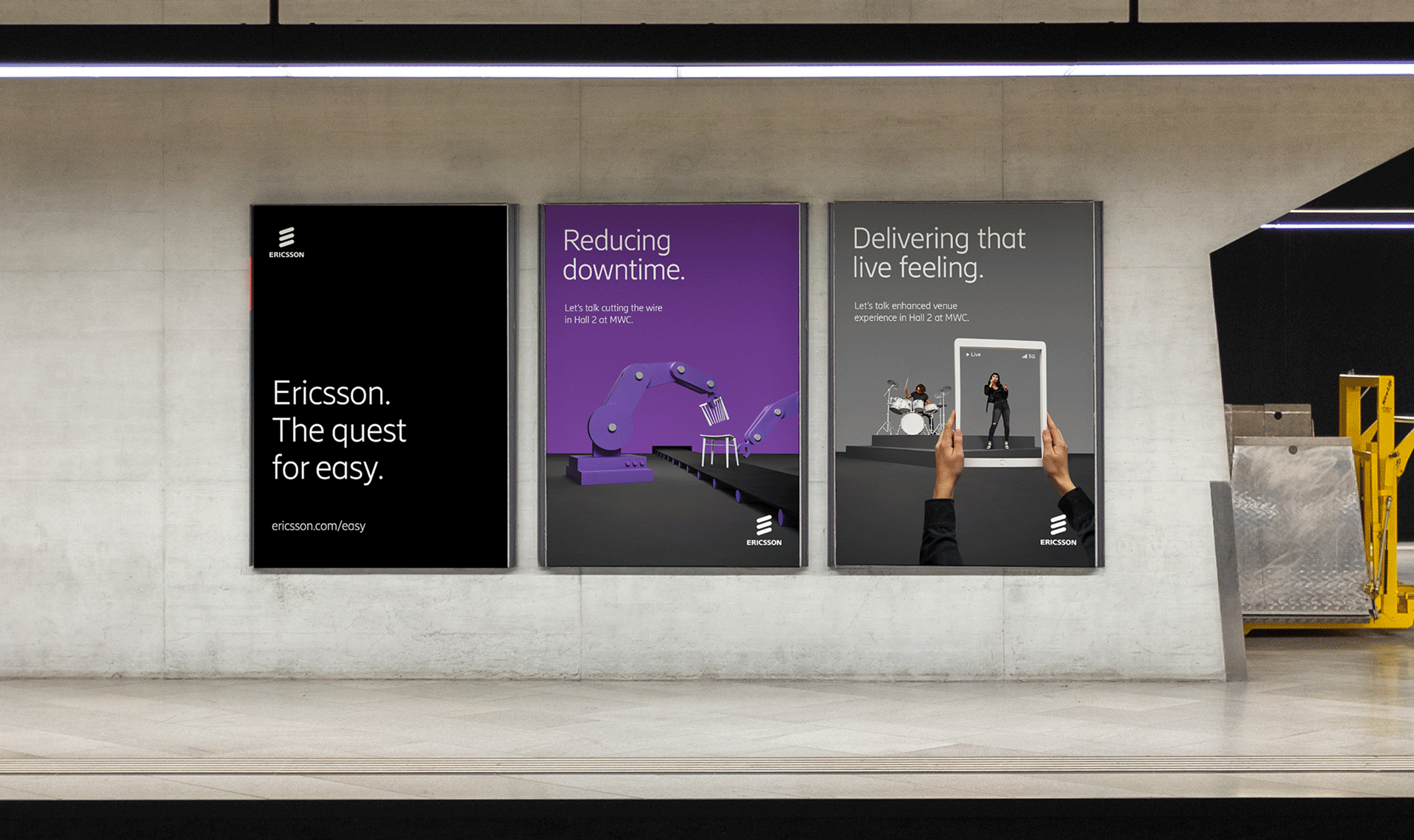
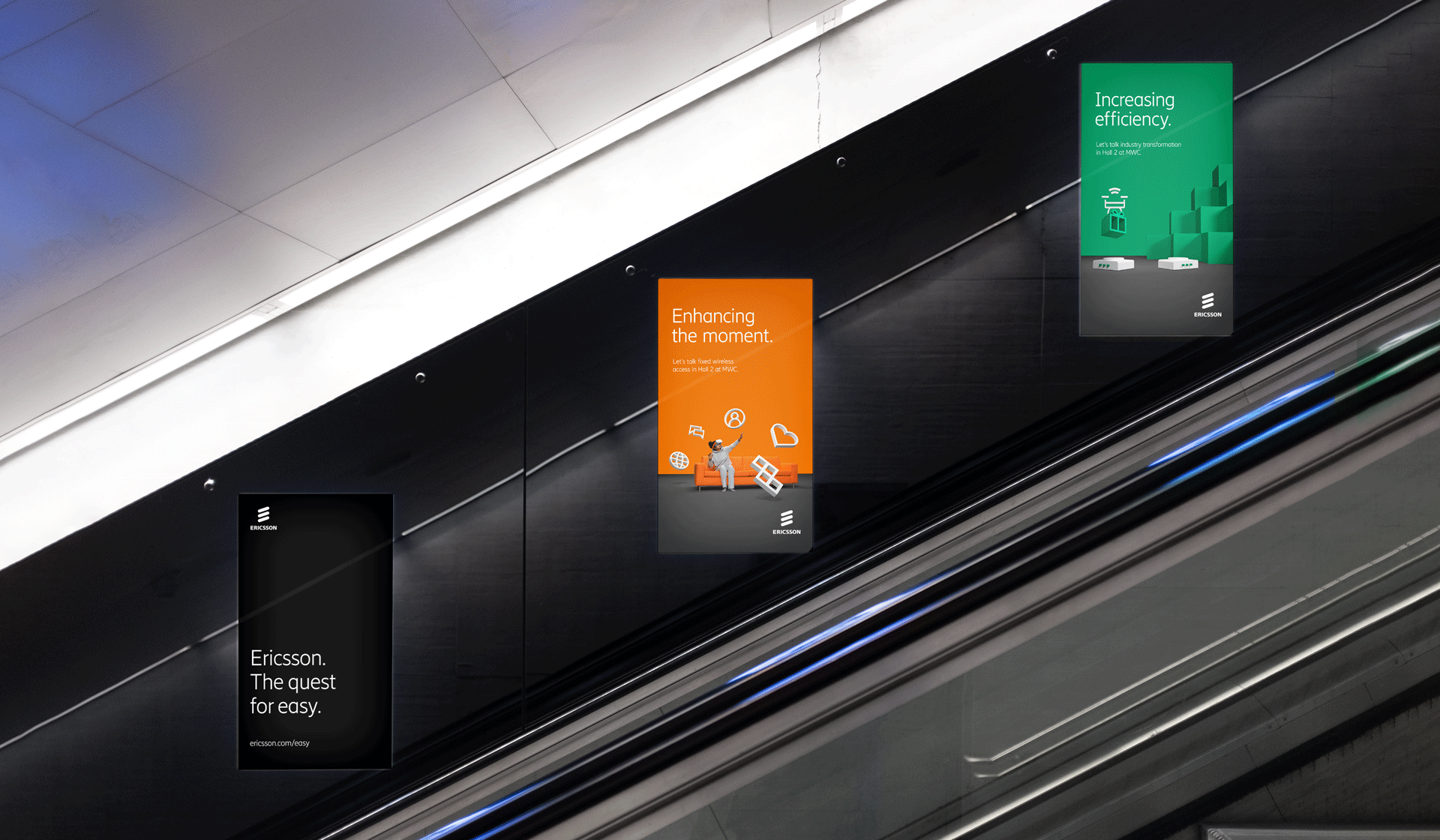
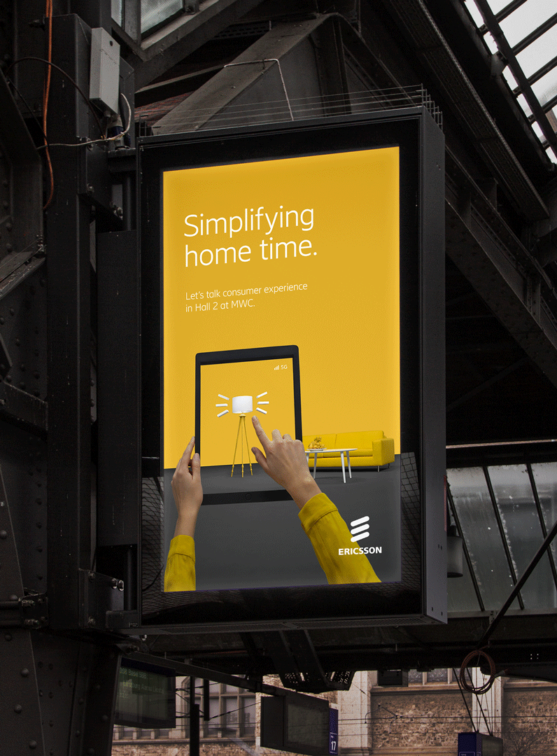
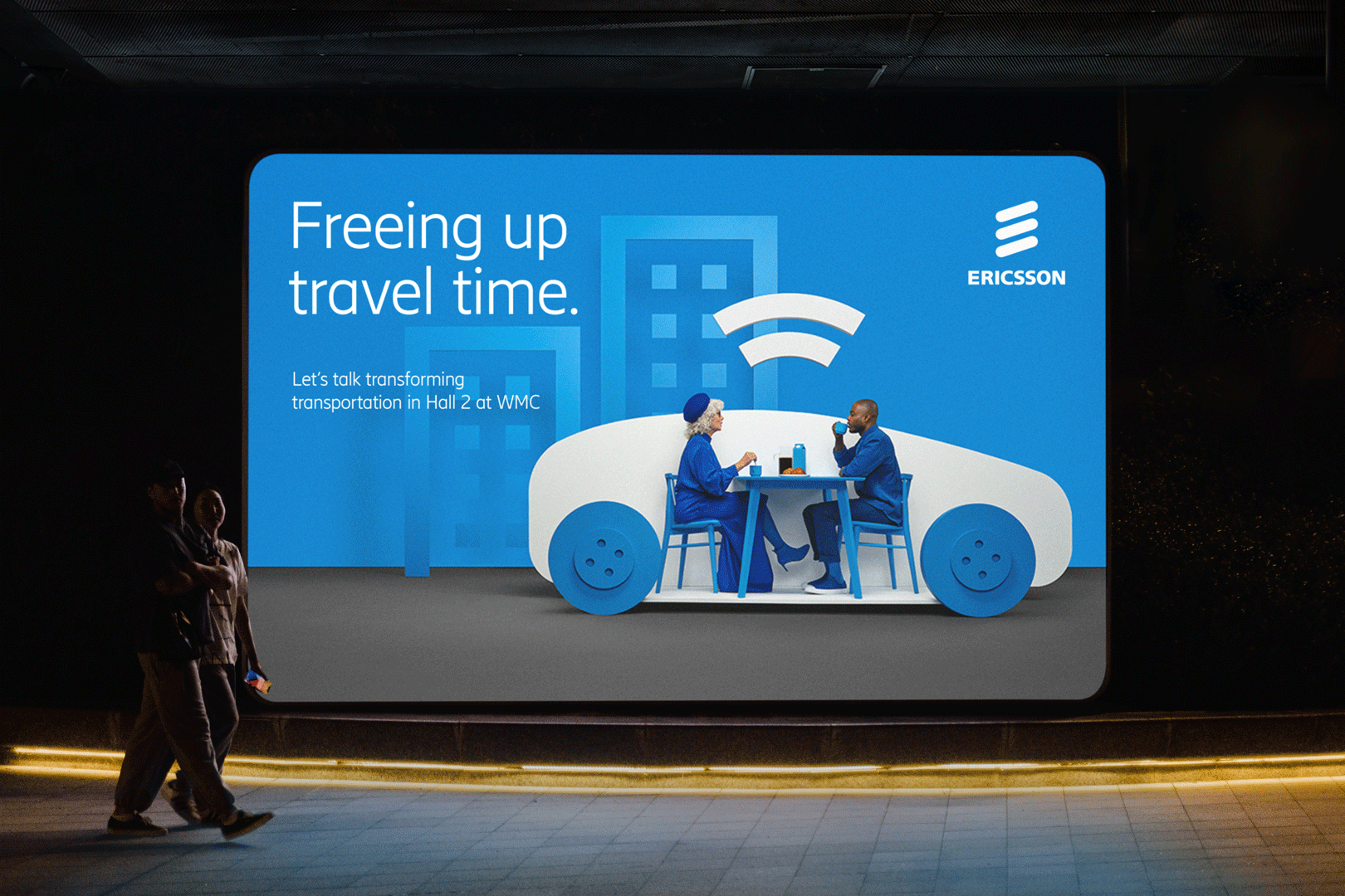
Ericsson: Power of Easy
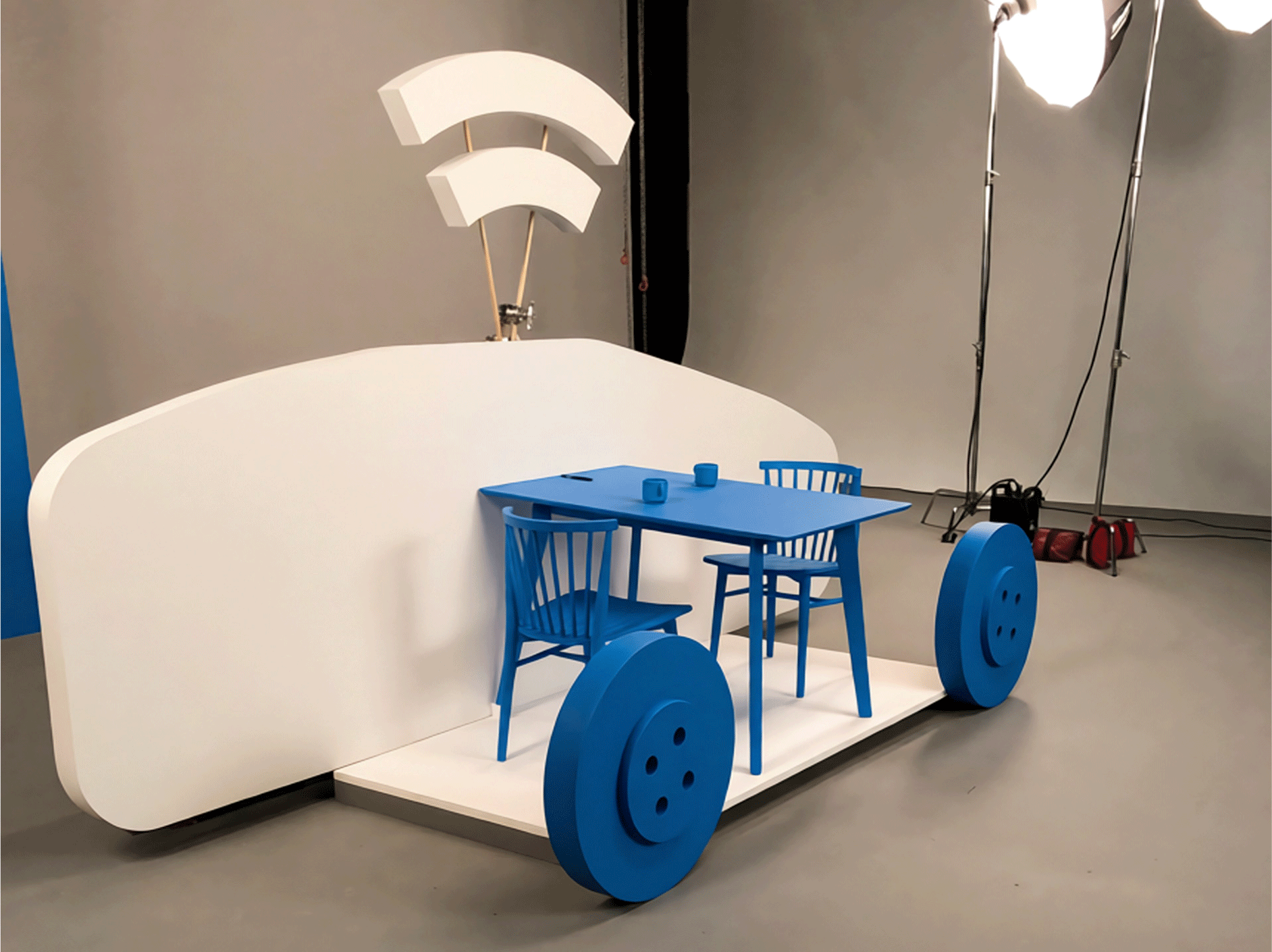
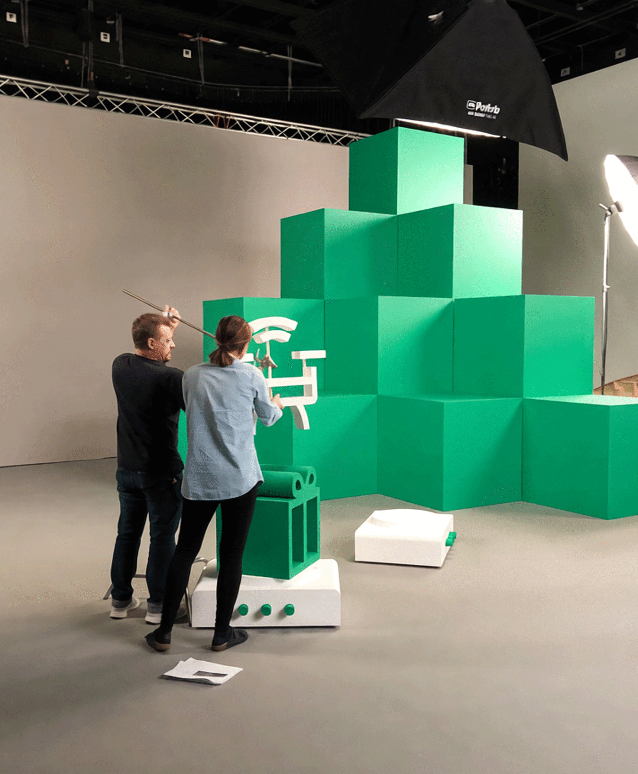
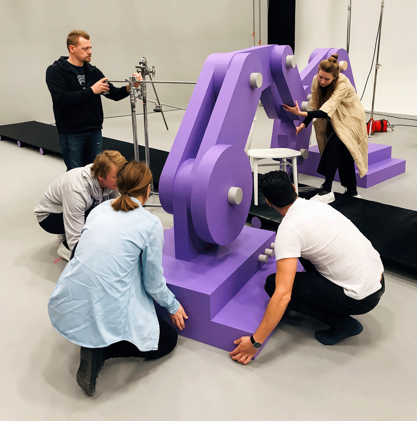
Power of Easy turned complexity into simplicity, bringing Ericsson's Easy concept to life with a playful, colorful world. The campaign transformed complex technology and ideas into engaging stories that illustrate a more intelligent, sustainable, and connected future.
Brand communications
Campaign
Art direction
Photography
⟵
(or press esc)
Xfinity
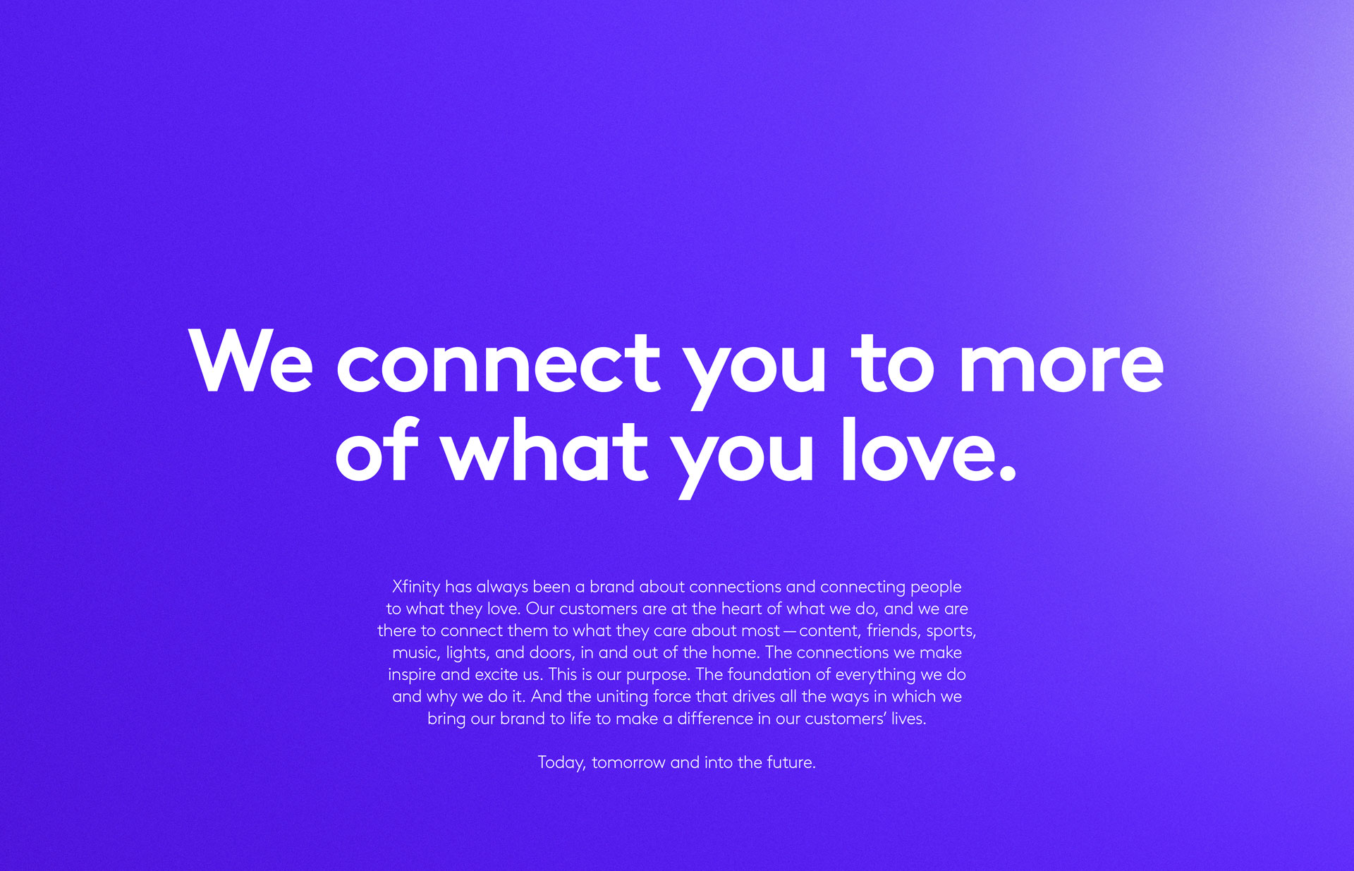
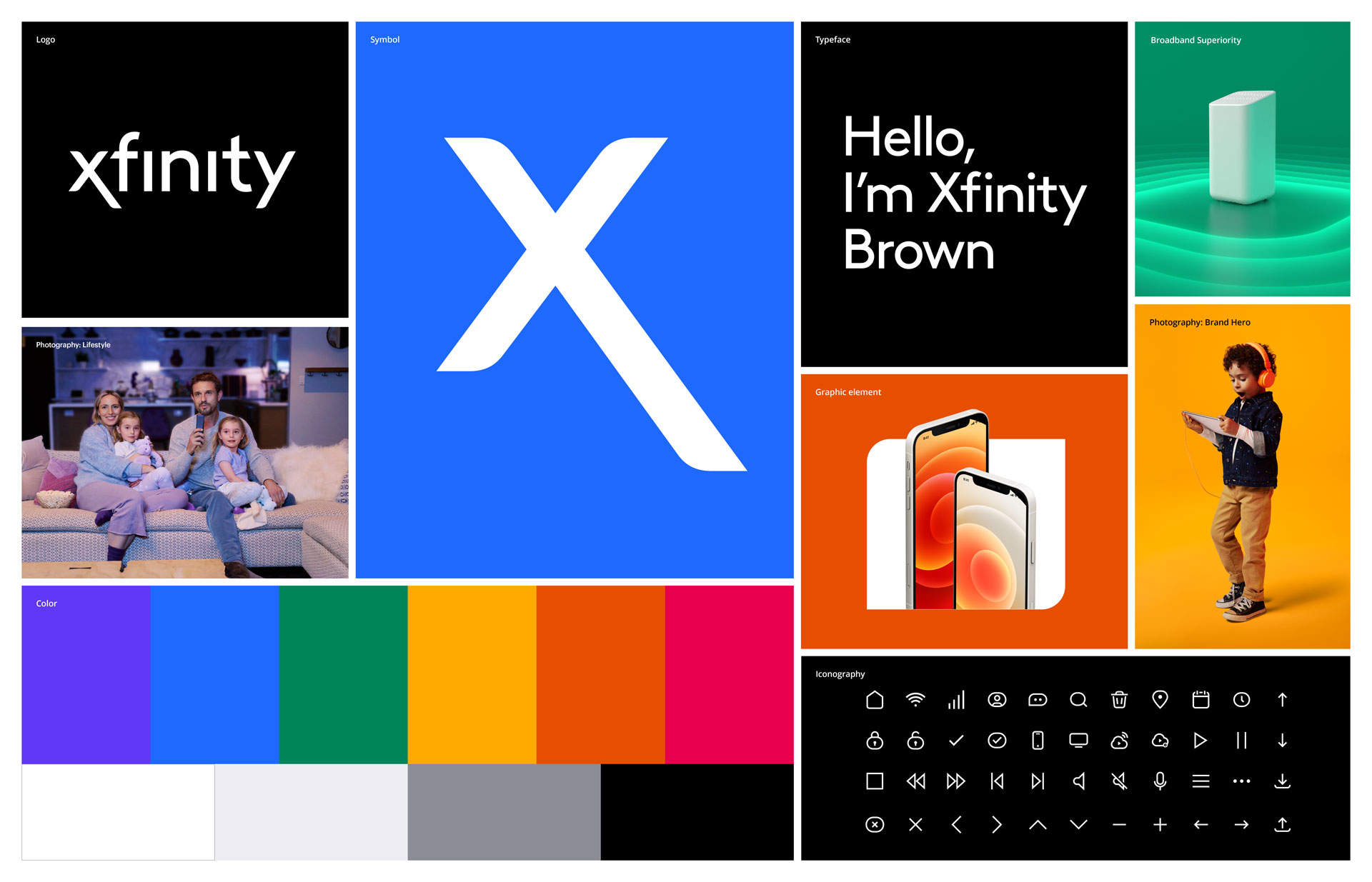
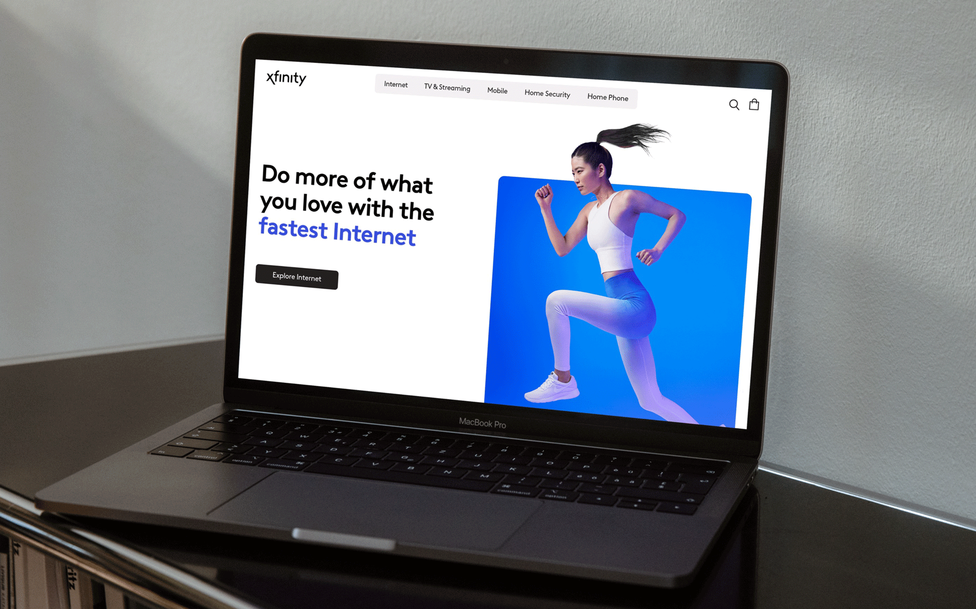
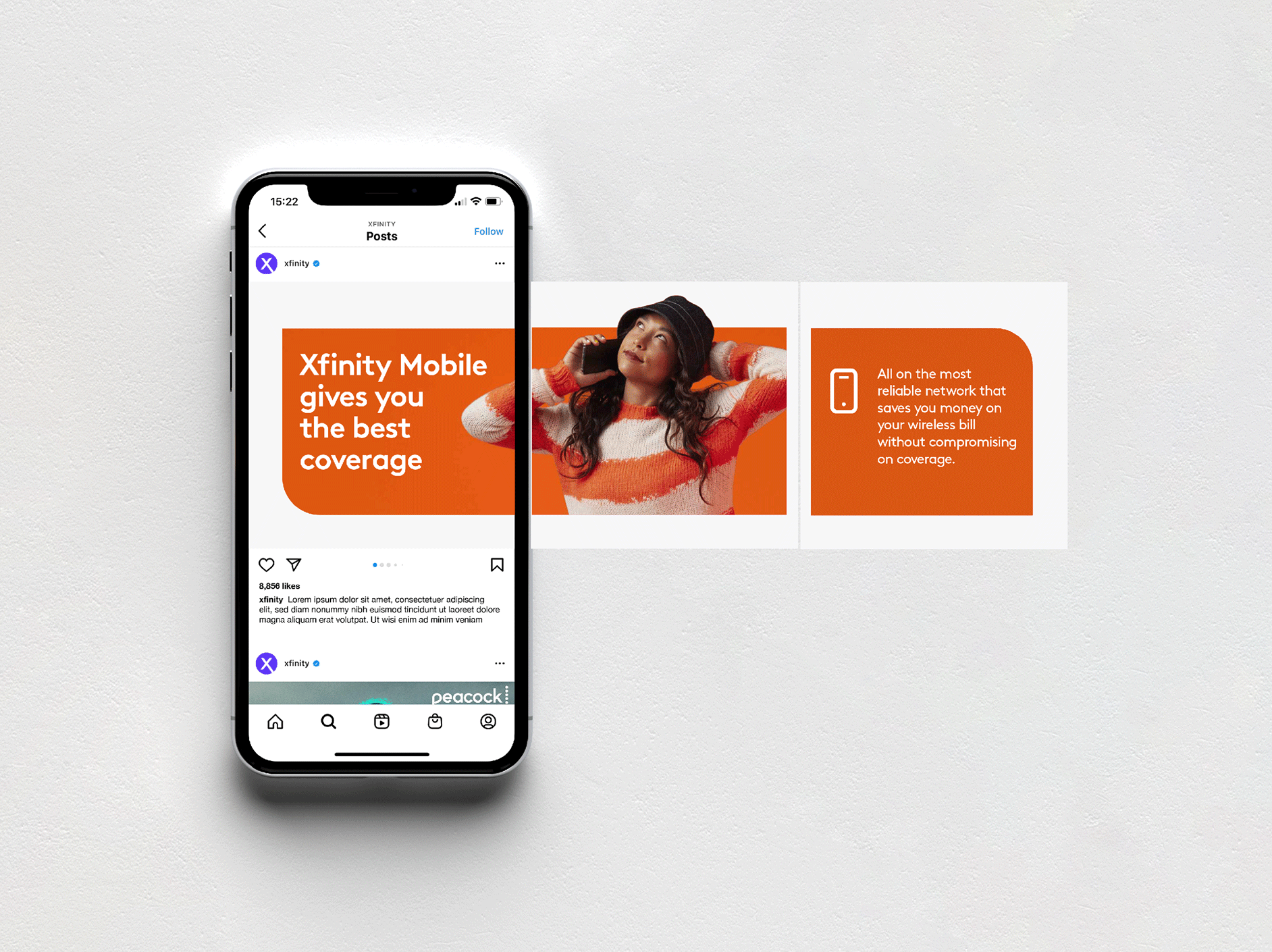
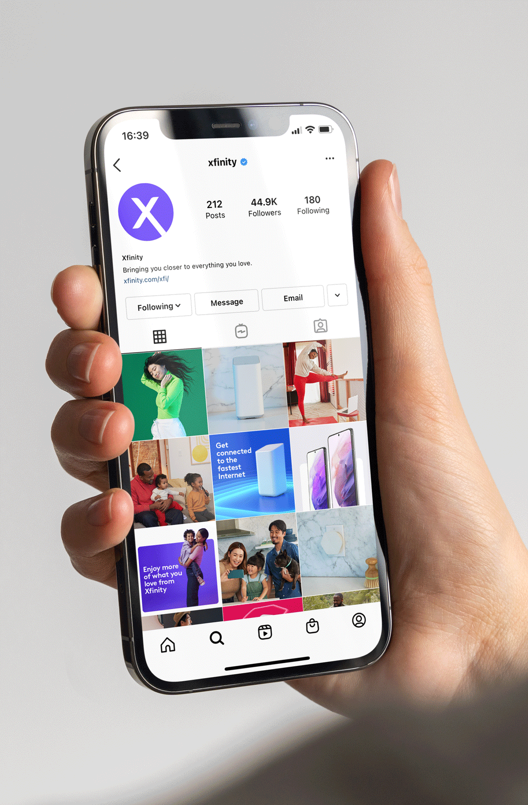
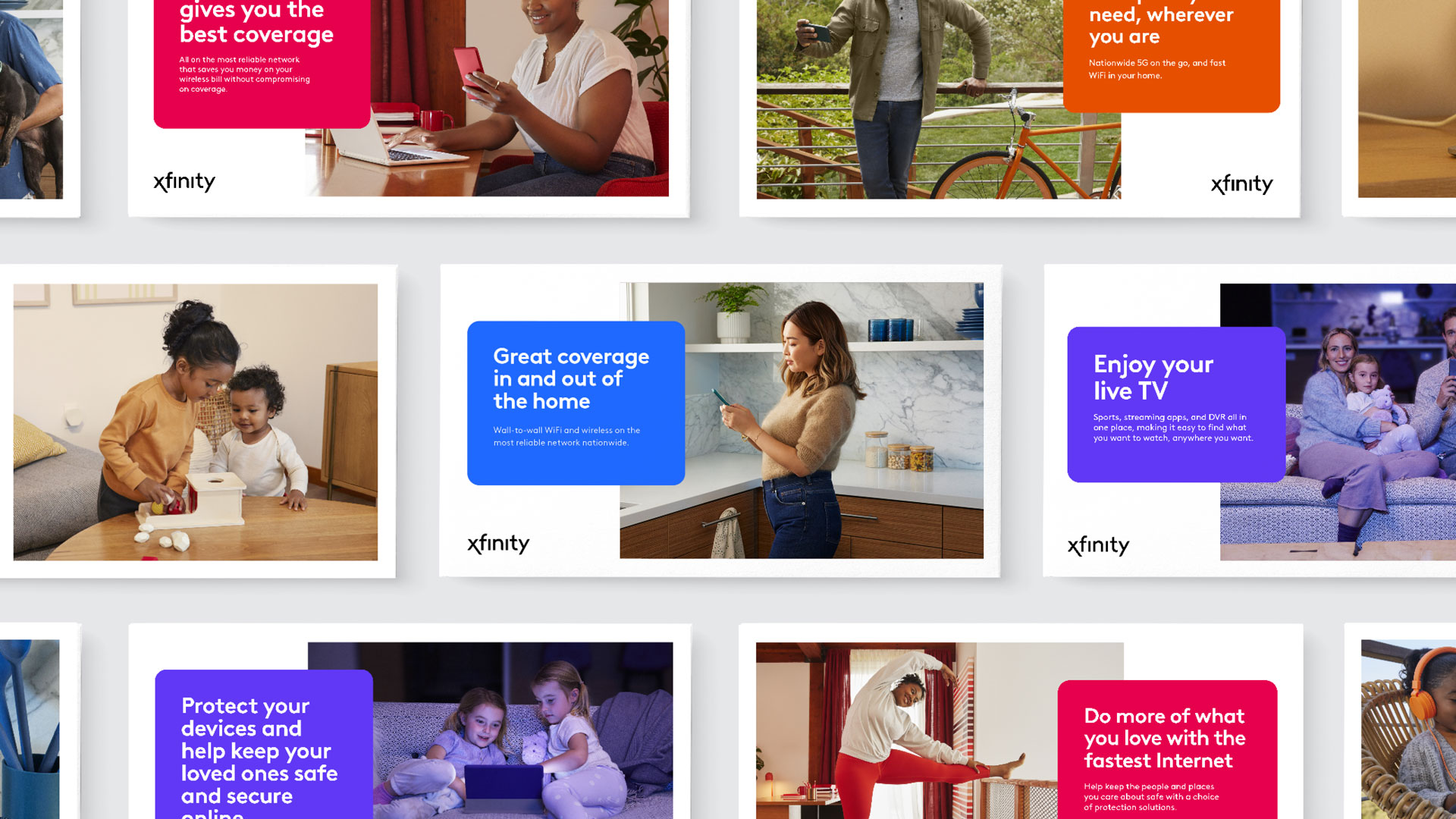
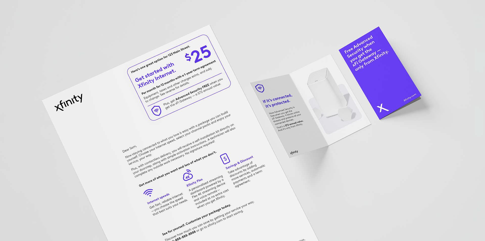
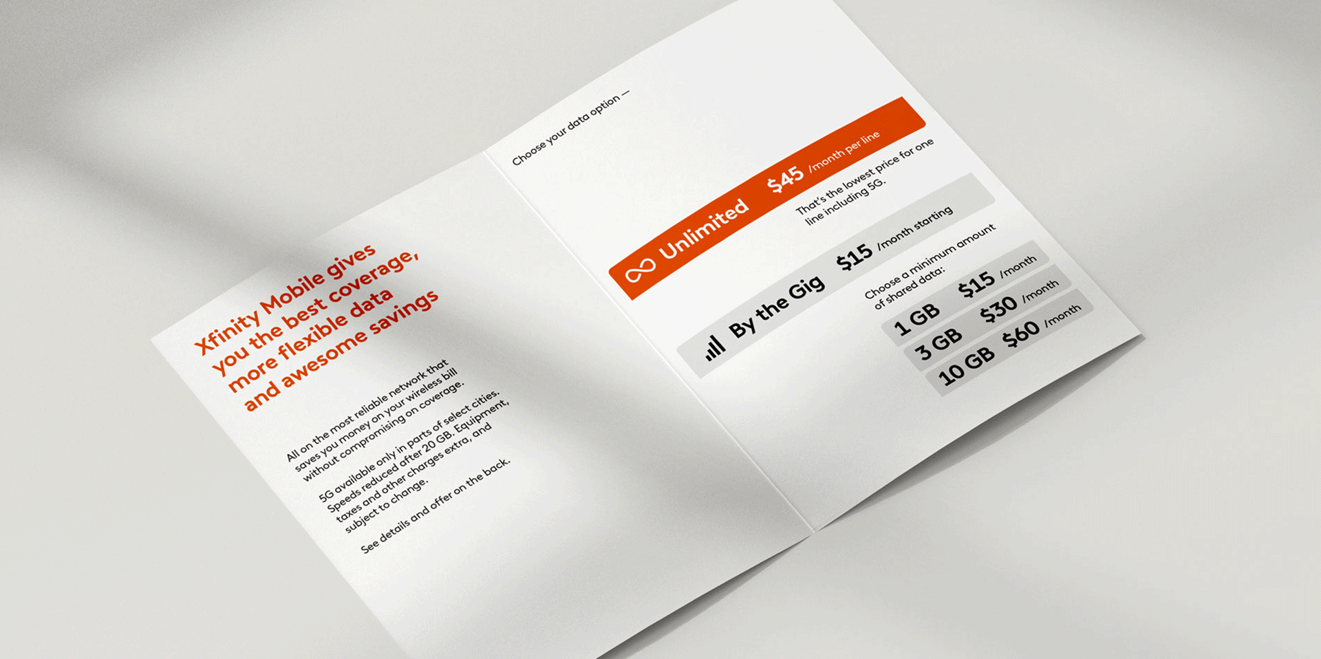
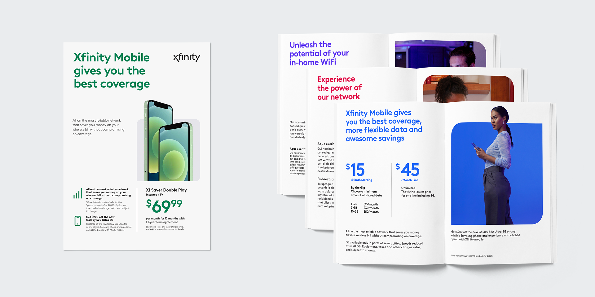
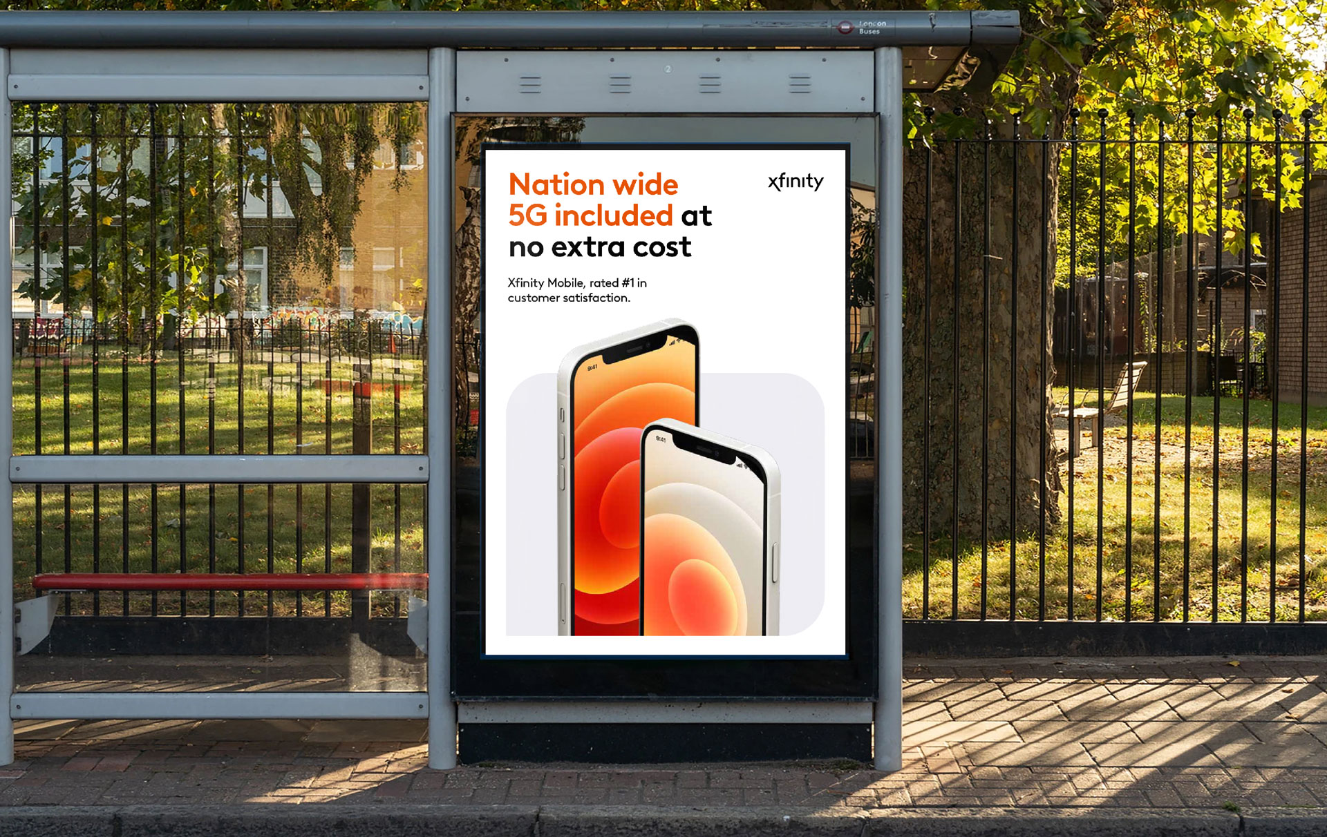
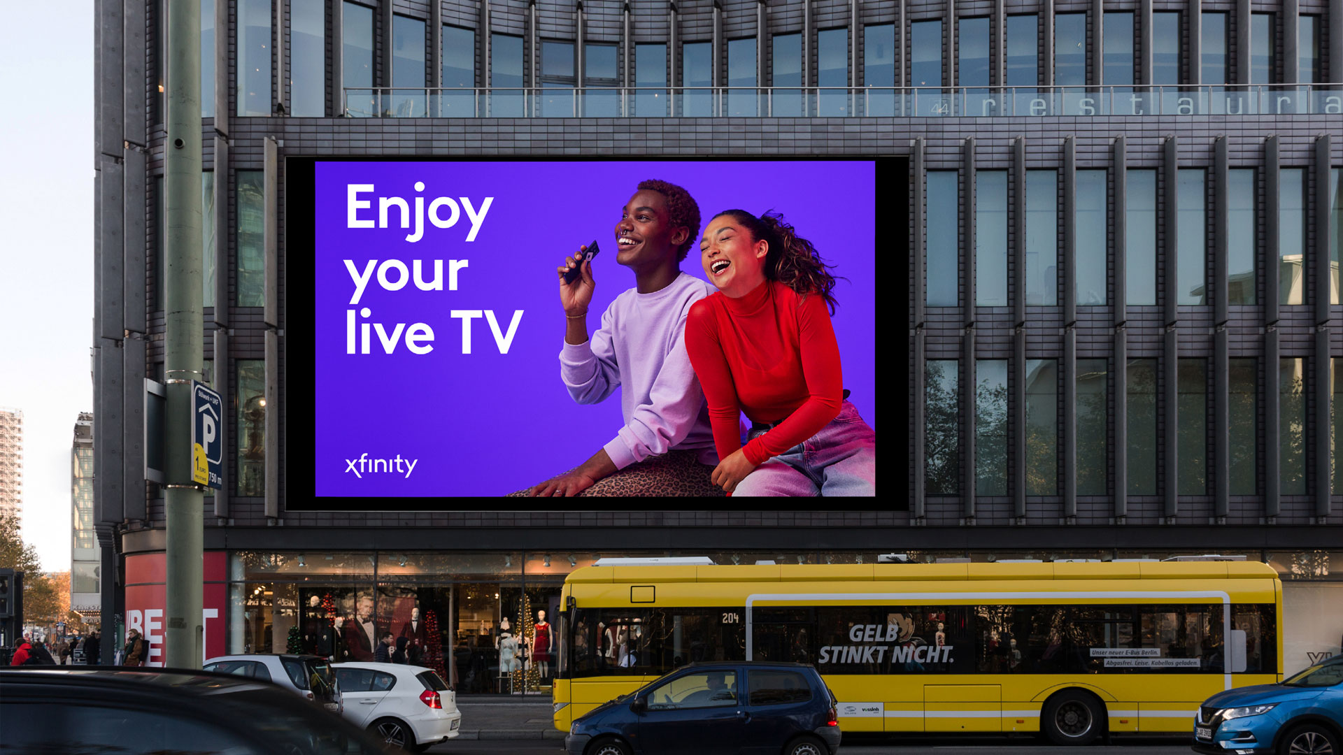
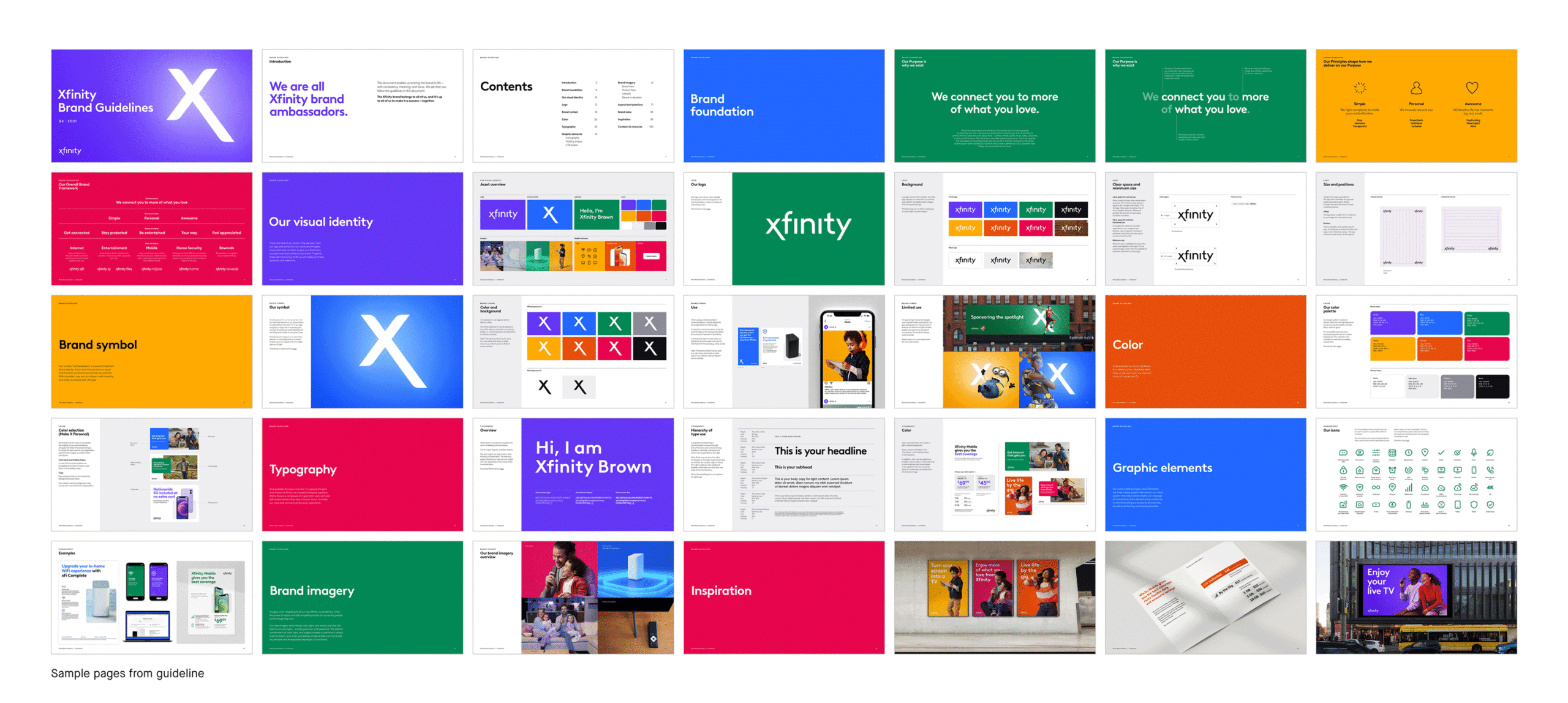
Xfinity set out to evolve from a product-first cable company into a more human brand centered on its customers and the content they love. A flexible visual identity system that combines bold colors, graphic assets, and photography brought this shift to life, creating a more empathetic, inclusive expression that puts people first.
Brand strategy
Visual identity system
Motion
Environmental design
Photography
Guidelines

⟵
(or press esc)
Xfinity Olympic Partnership
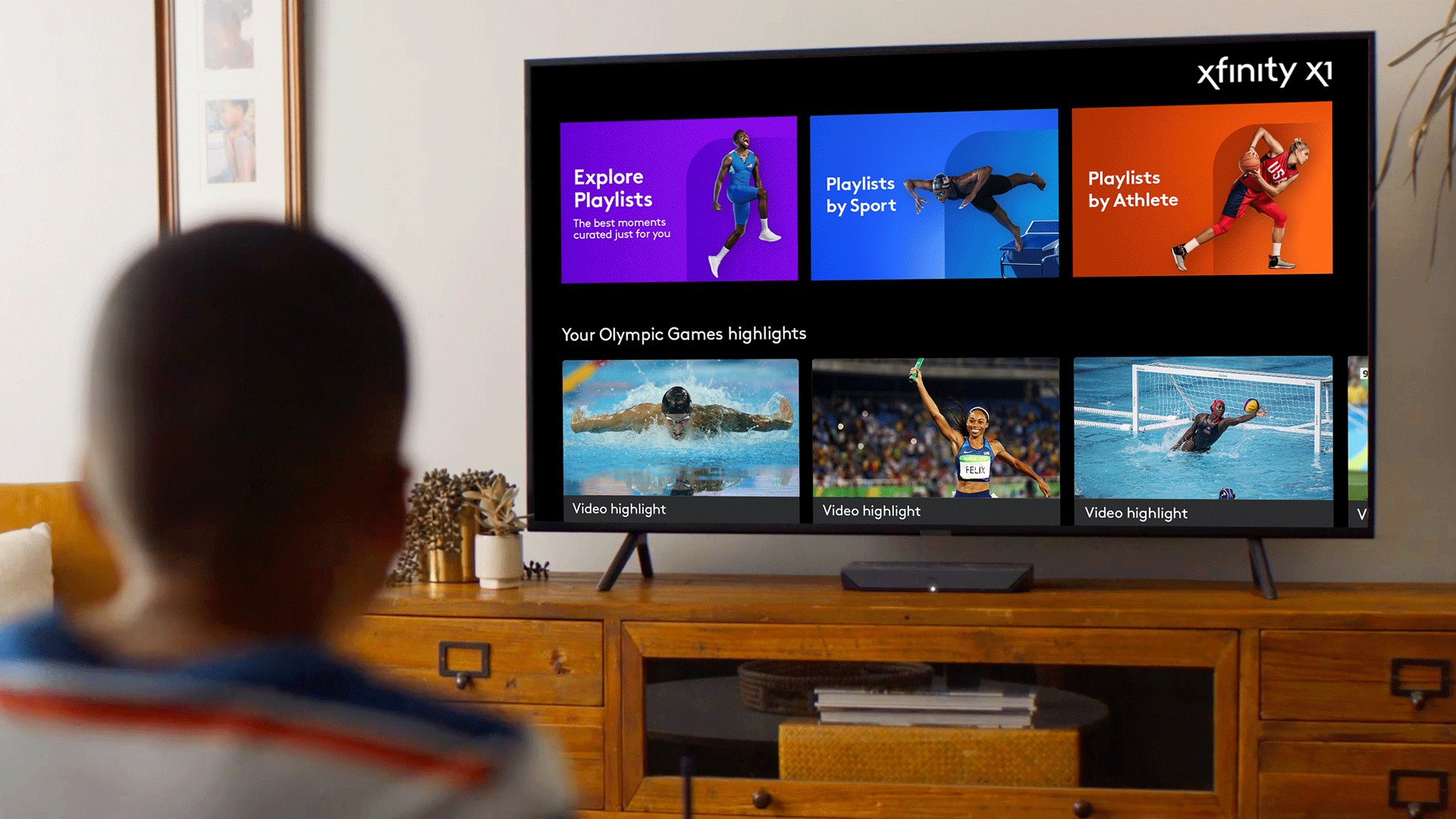
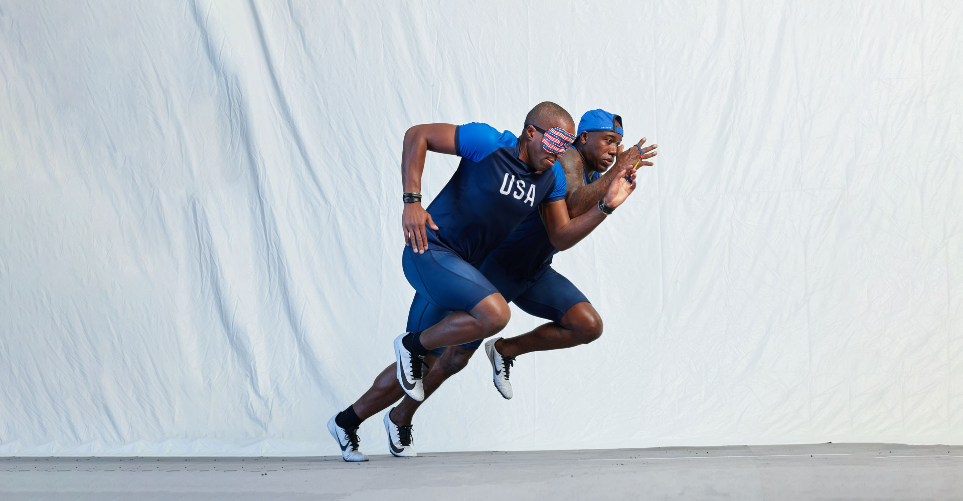
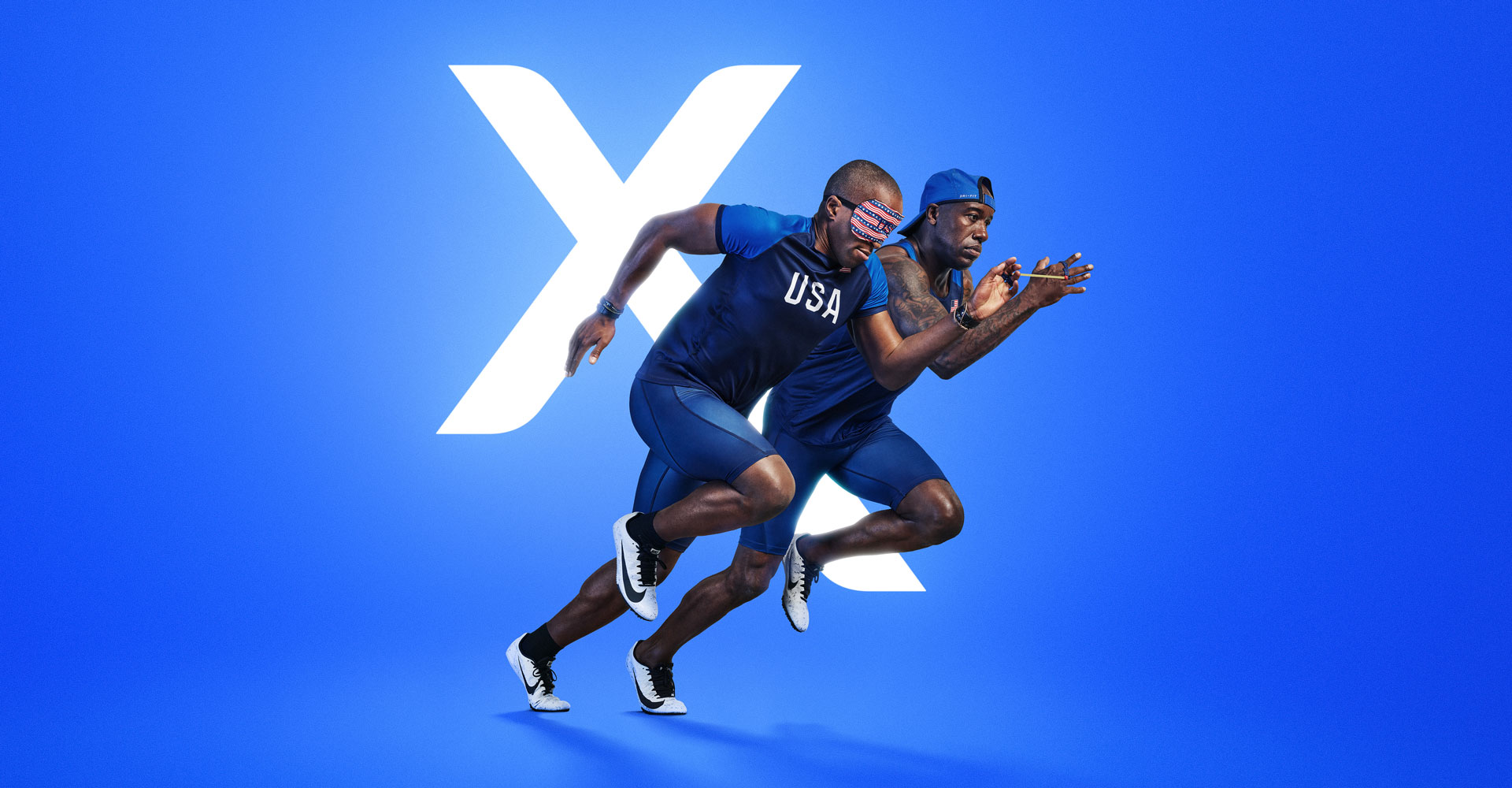
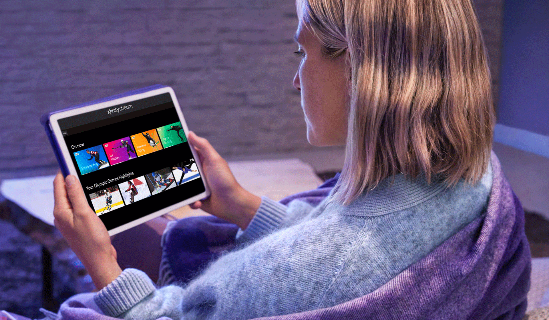
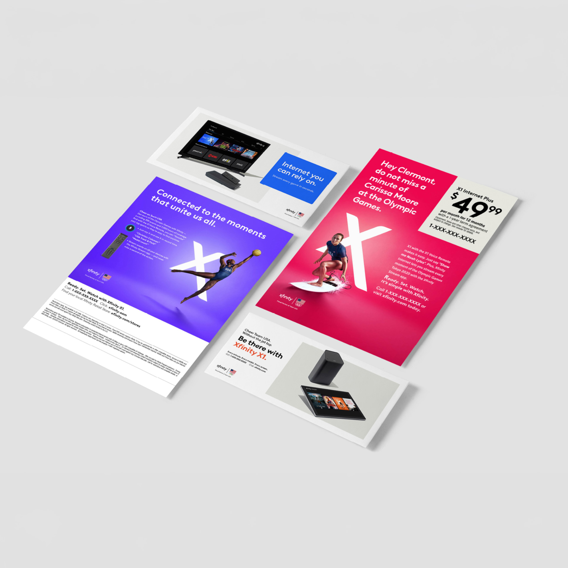
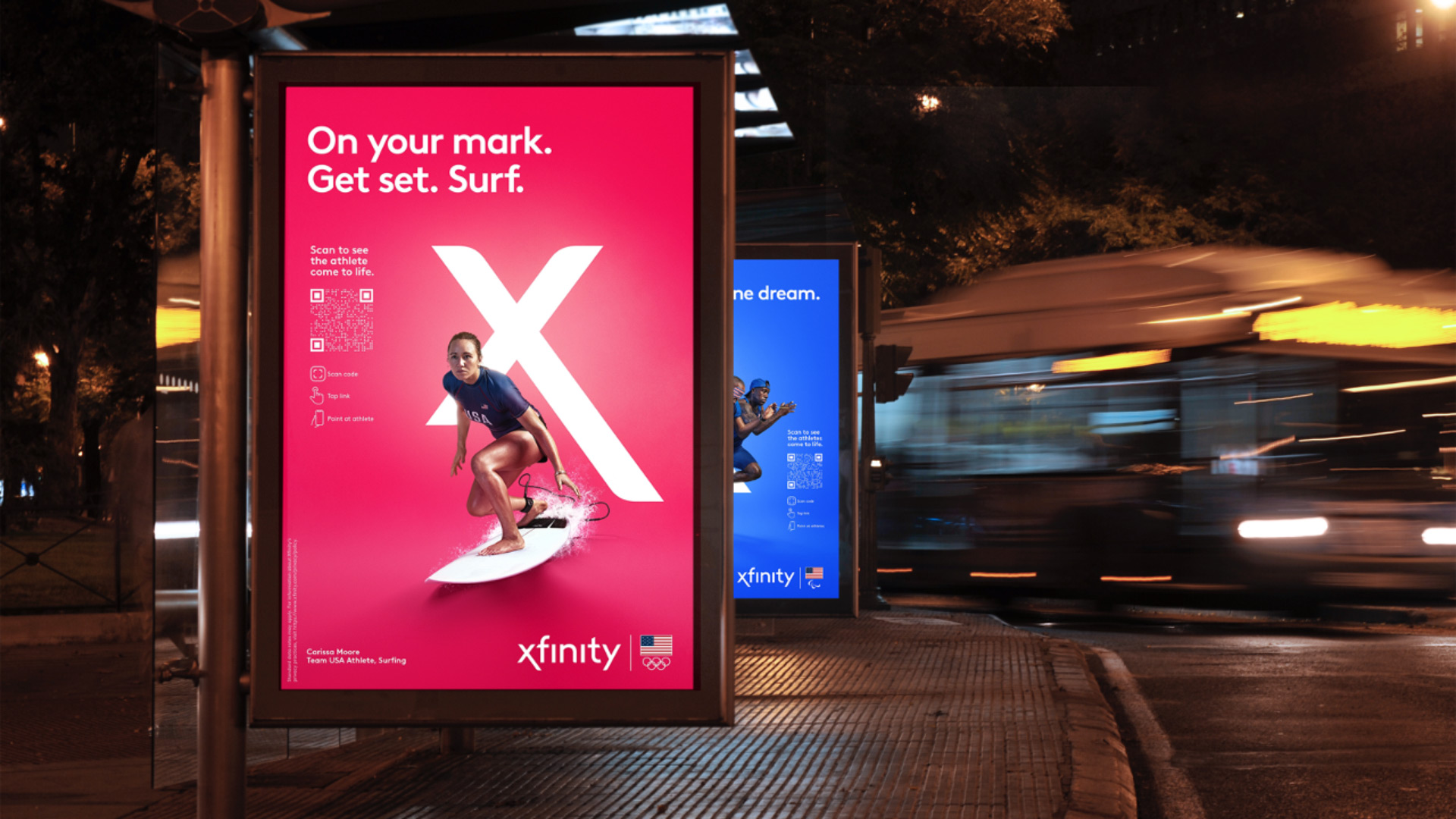
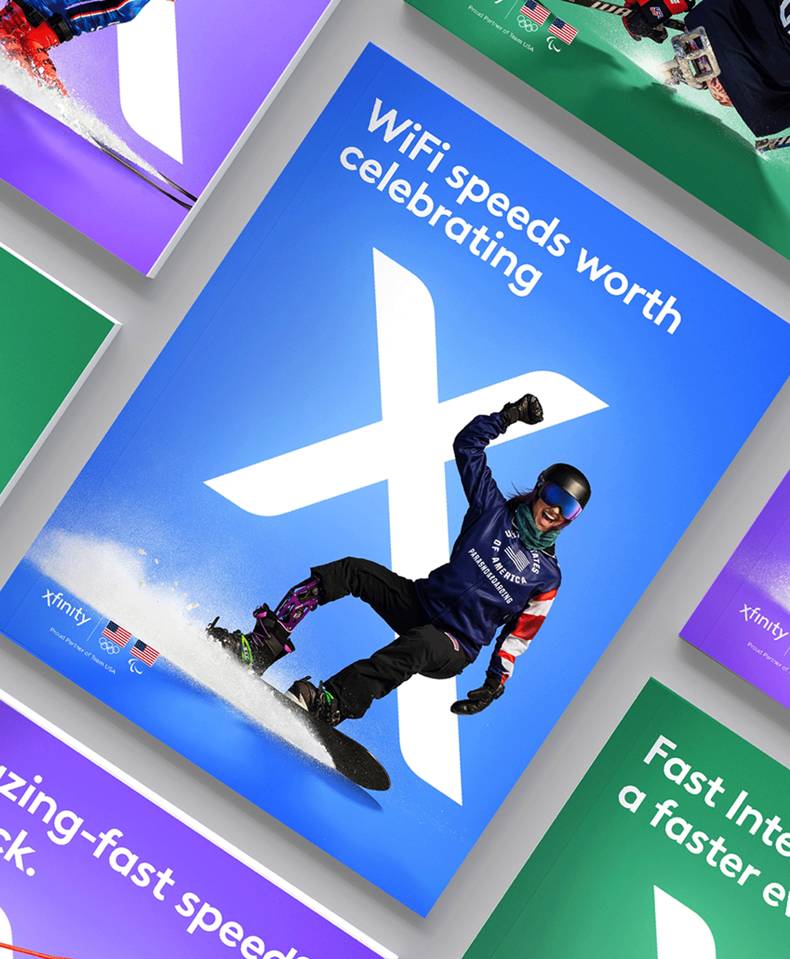
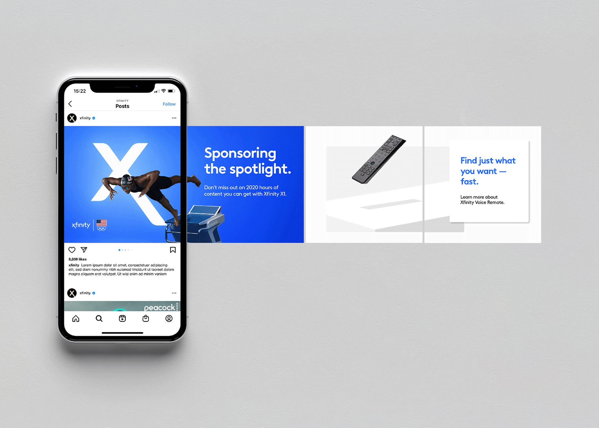
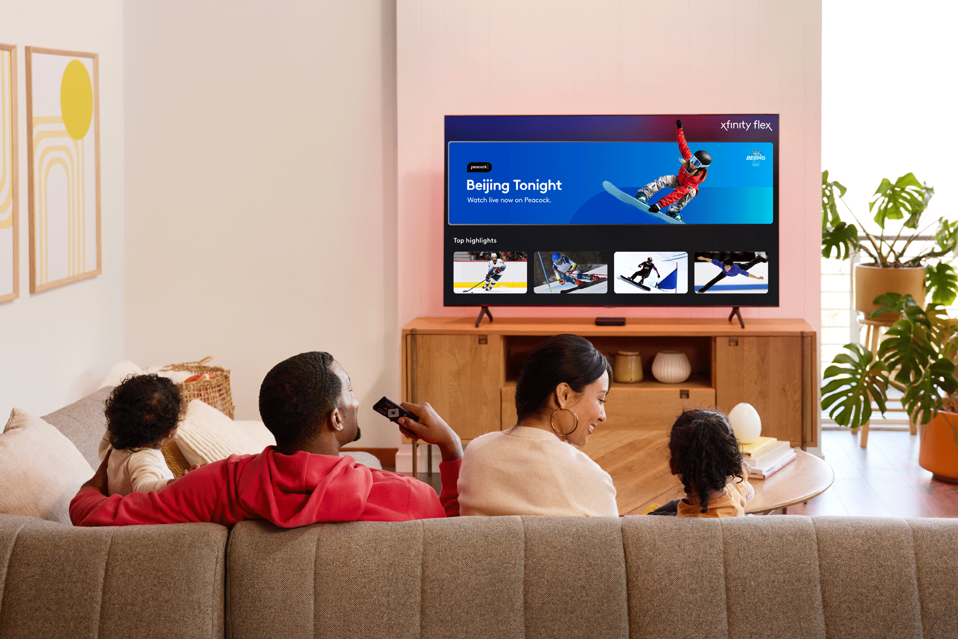
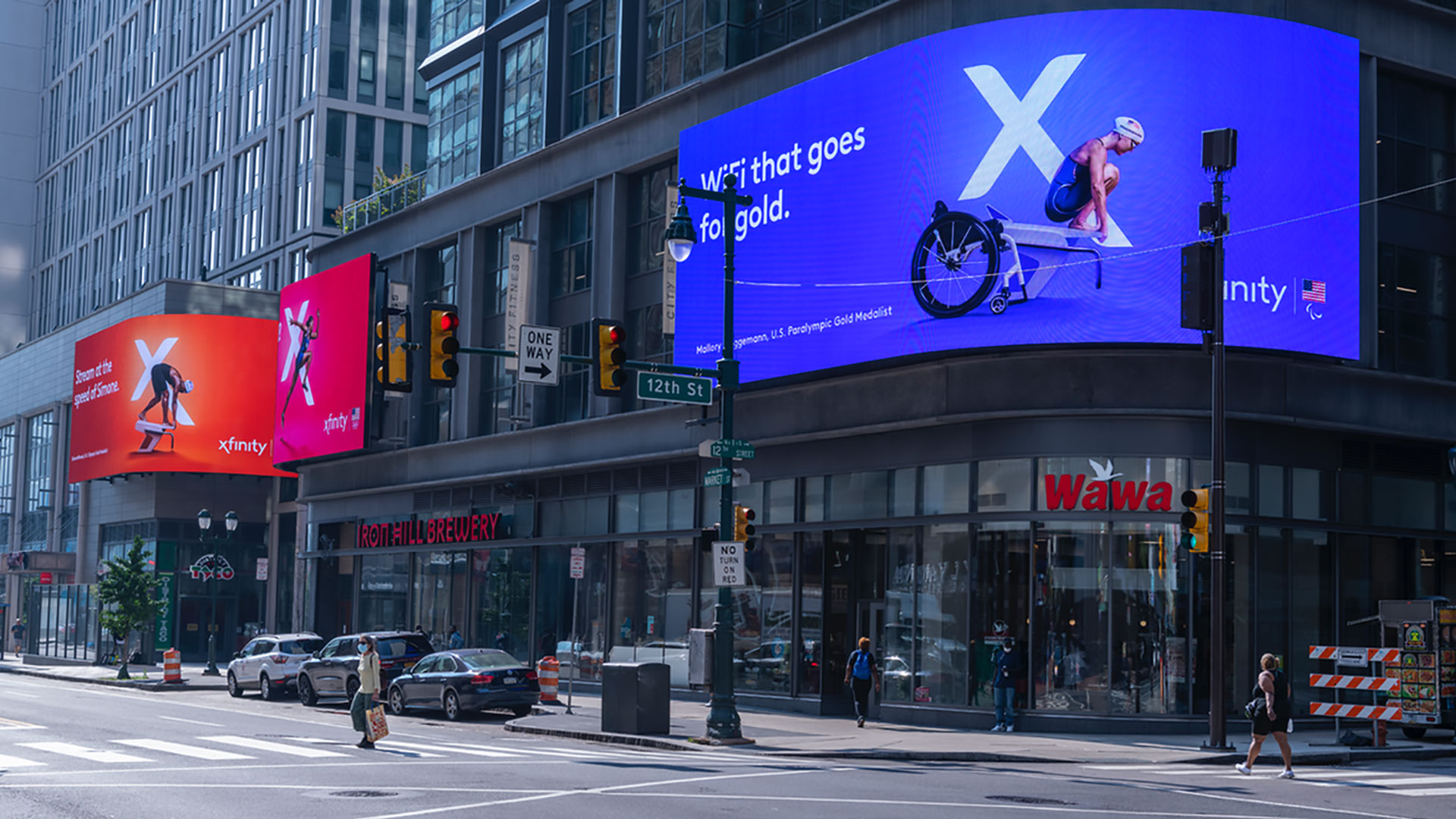
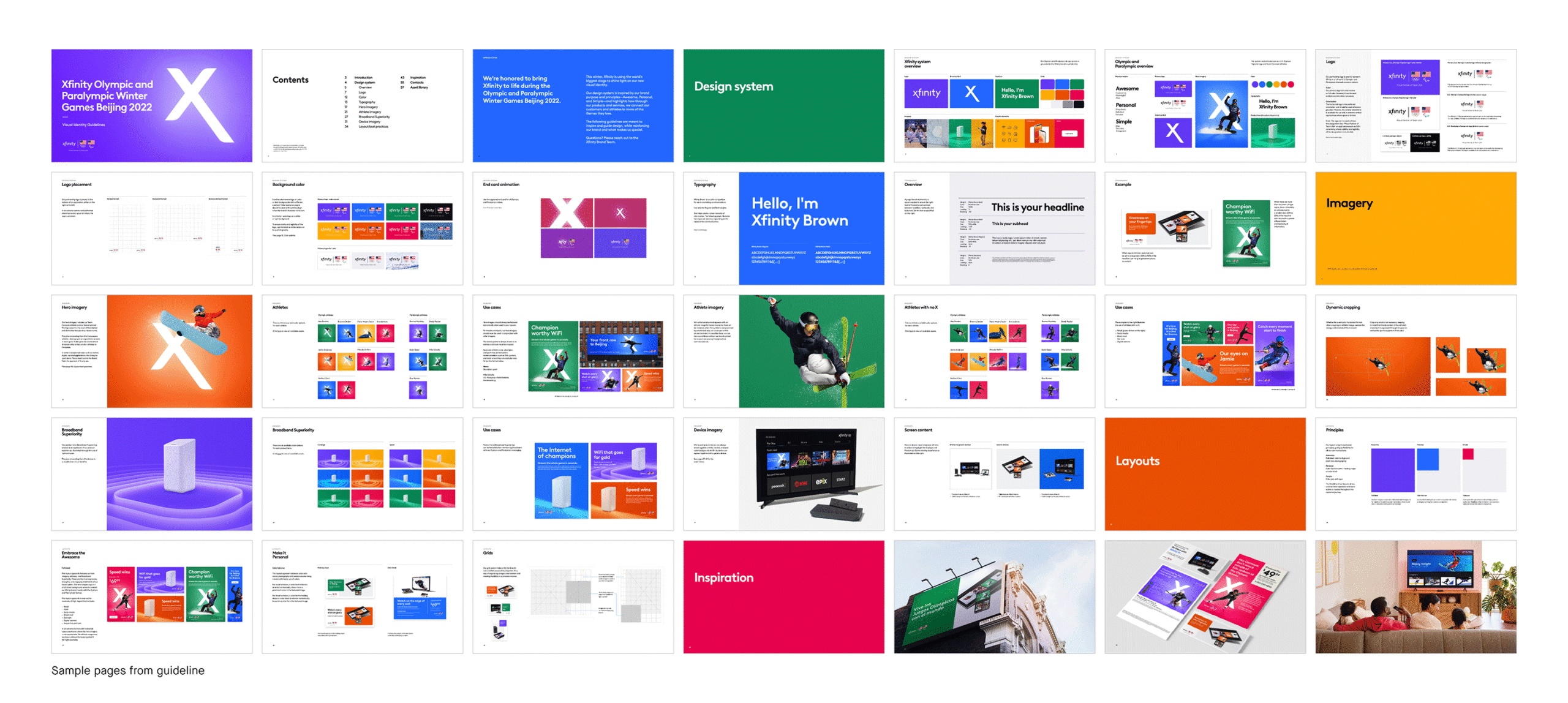
Xfinity’s partnership with the U.S. Olympic & Paralympic Committee provided a global stage to debut its new visual identity, positioning the brand as a symbol of connection and empowerment for athletes and audiences. More than 10 agencies adopted a cohesive design system and bespoke athlete photography, bringing them to life across TV, OOH, social, digital, retail, and experiential channels.
Visual identity system
Art direction
Photography
Guidelines
Implementation
⟵
(or press esc)
Stack New Condensed
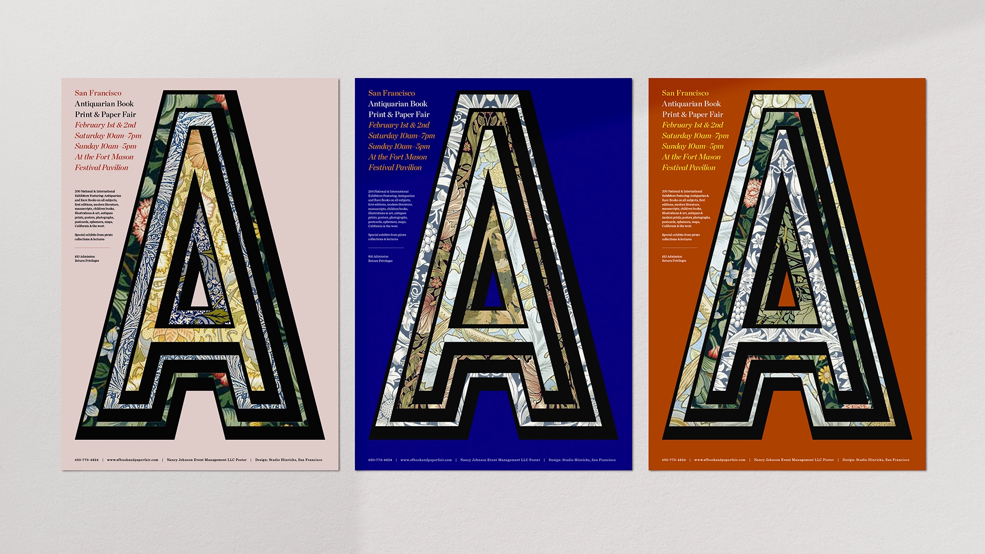
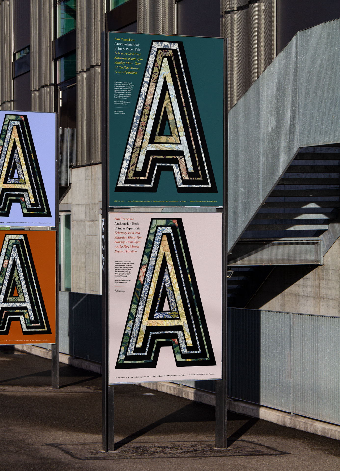
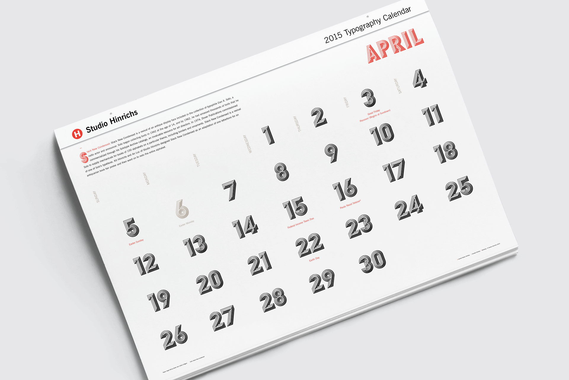
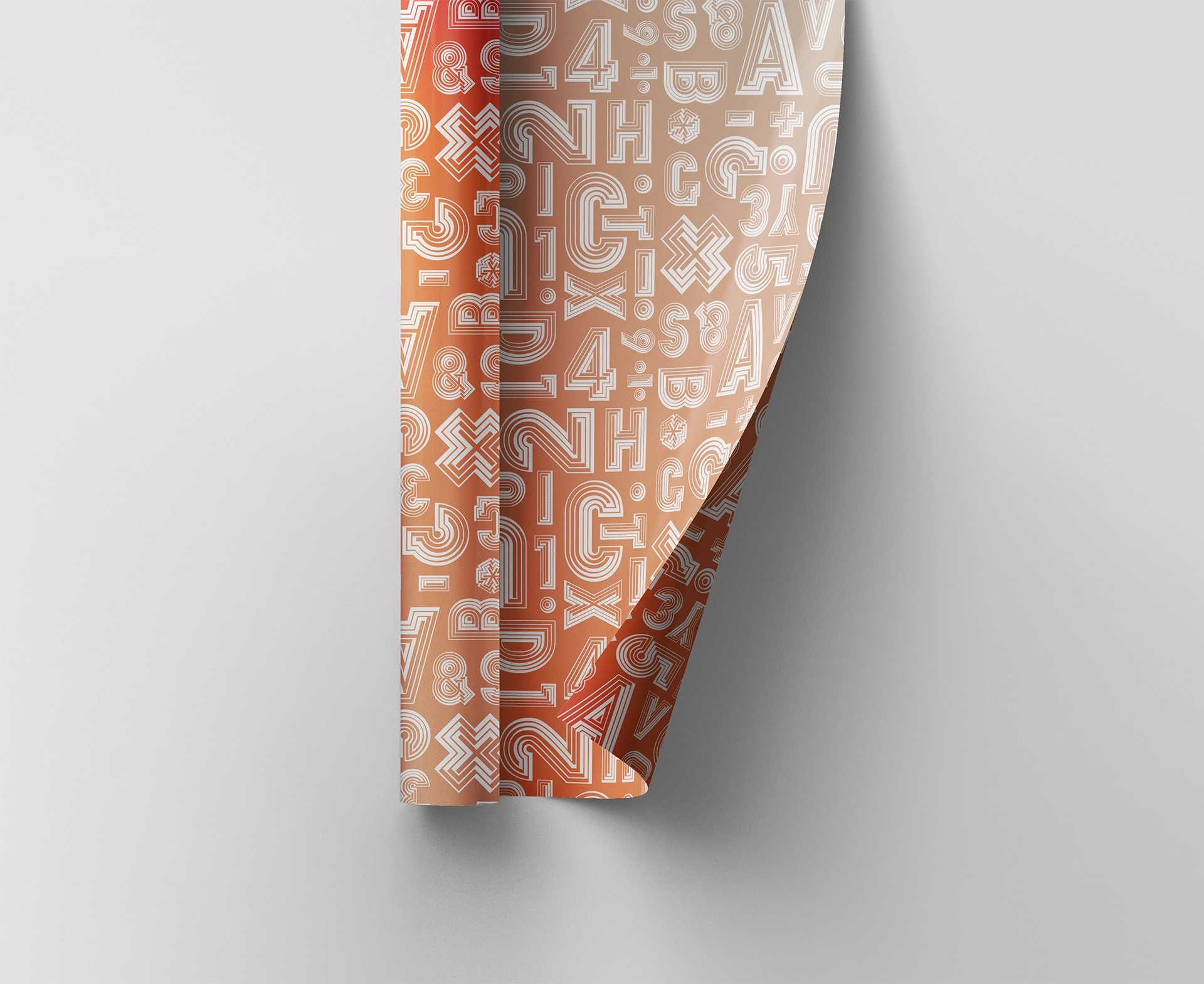
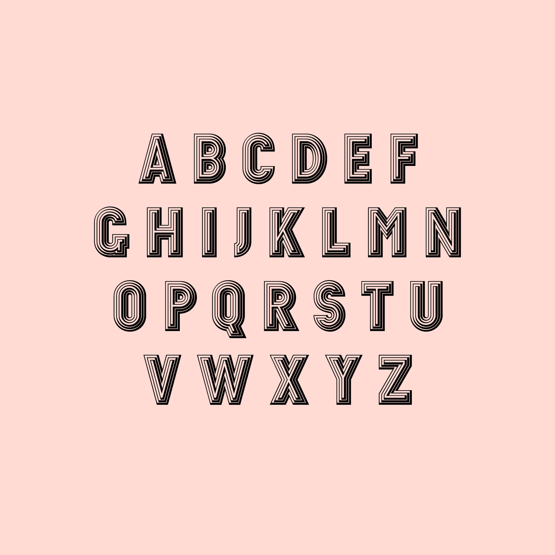
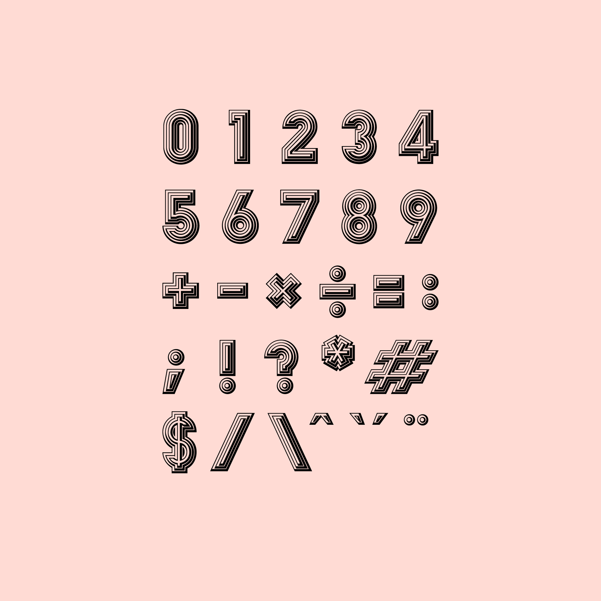
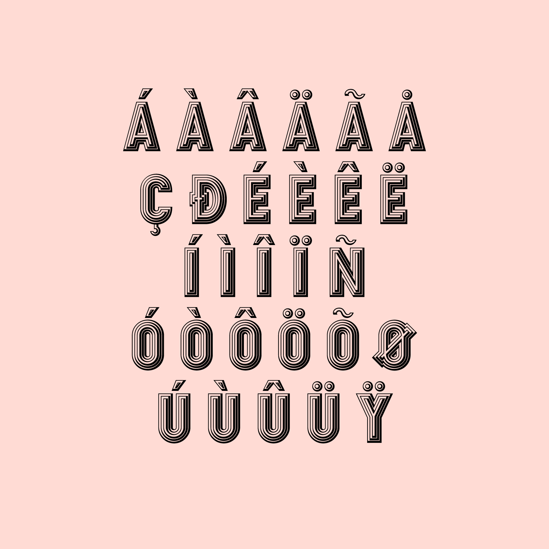
Stack New Condensed is a revival of an antique display typeface from the Solotype Archive, originally redrawn for the San Francisco Antiquarian Book Fair. What began as a single adapted letterform evolved into a complete working typeface, earning recognition in the 365 Typography Calendar, Sappi promotional materials, and a Silver award from Graphis.
Type design
Poster design
Print
Implementation

⟵
(or press esc)
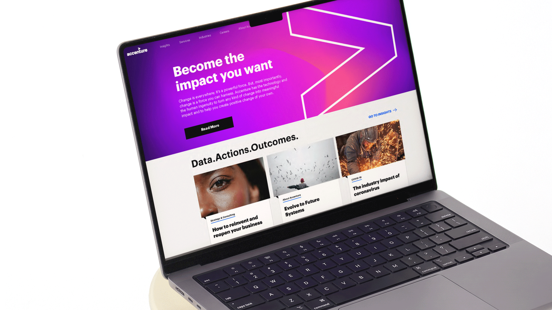
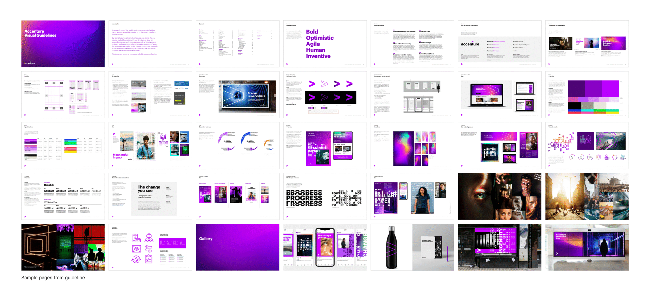
Accenture
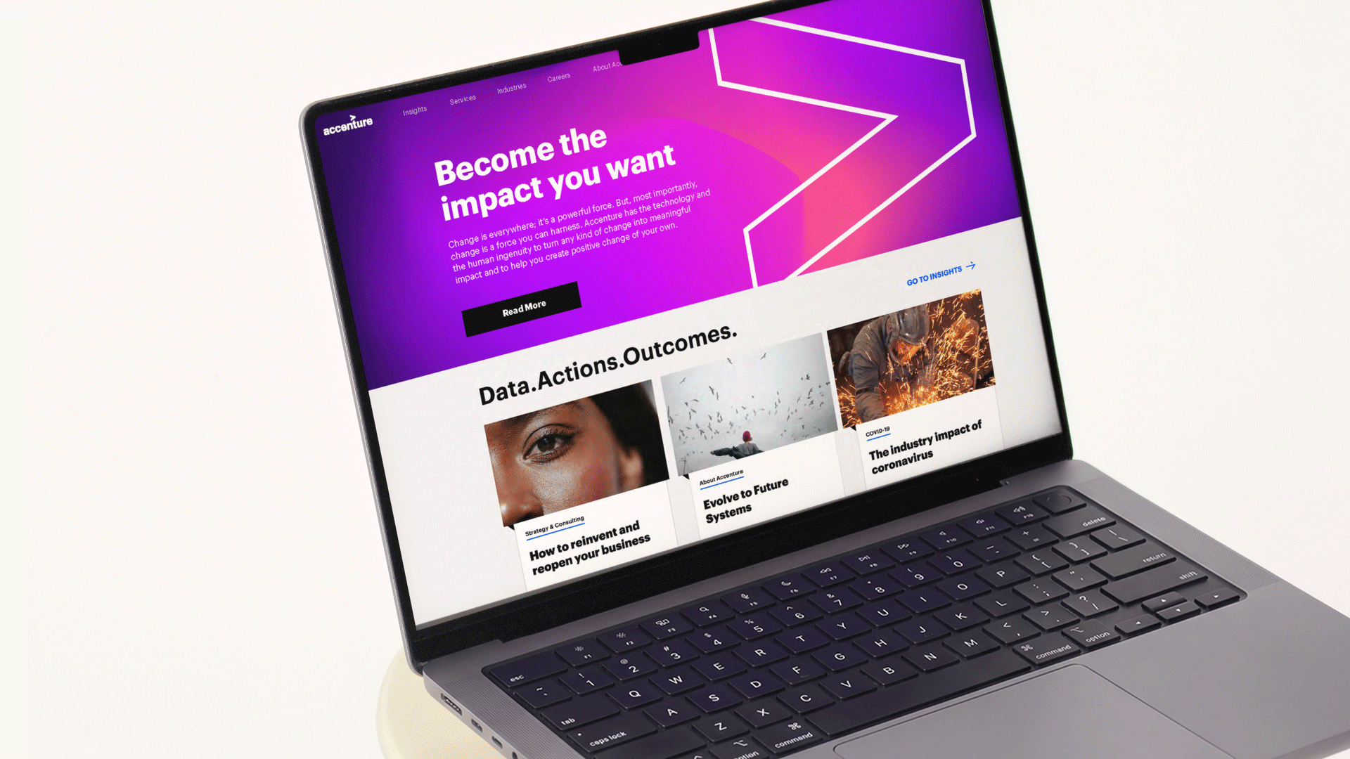
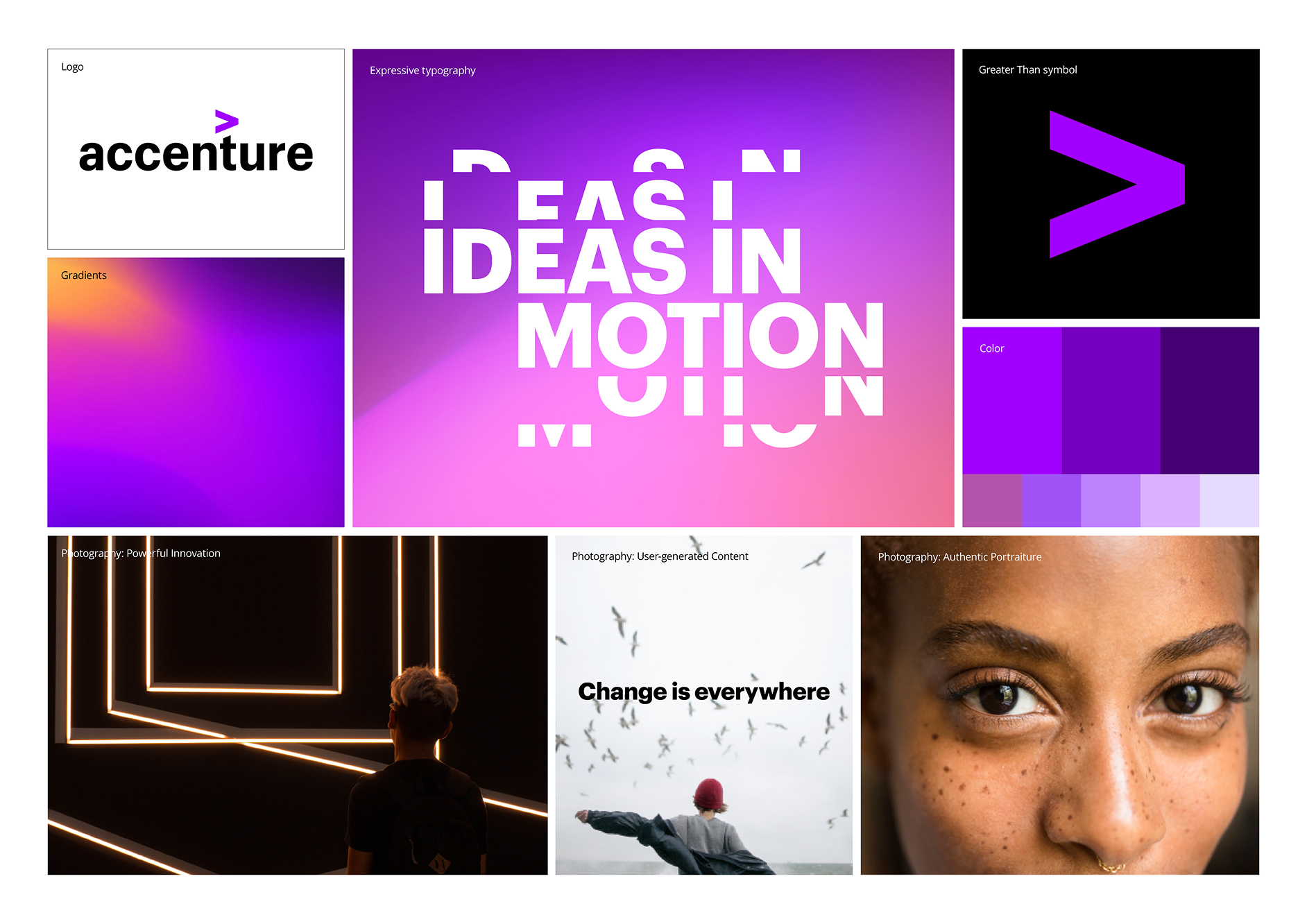
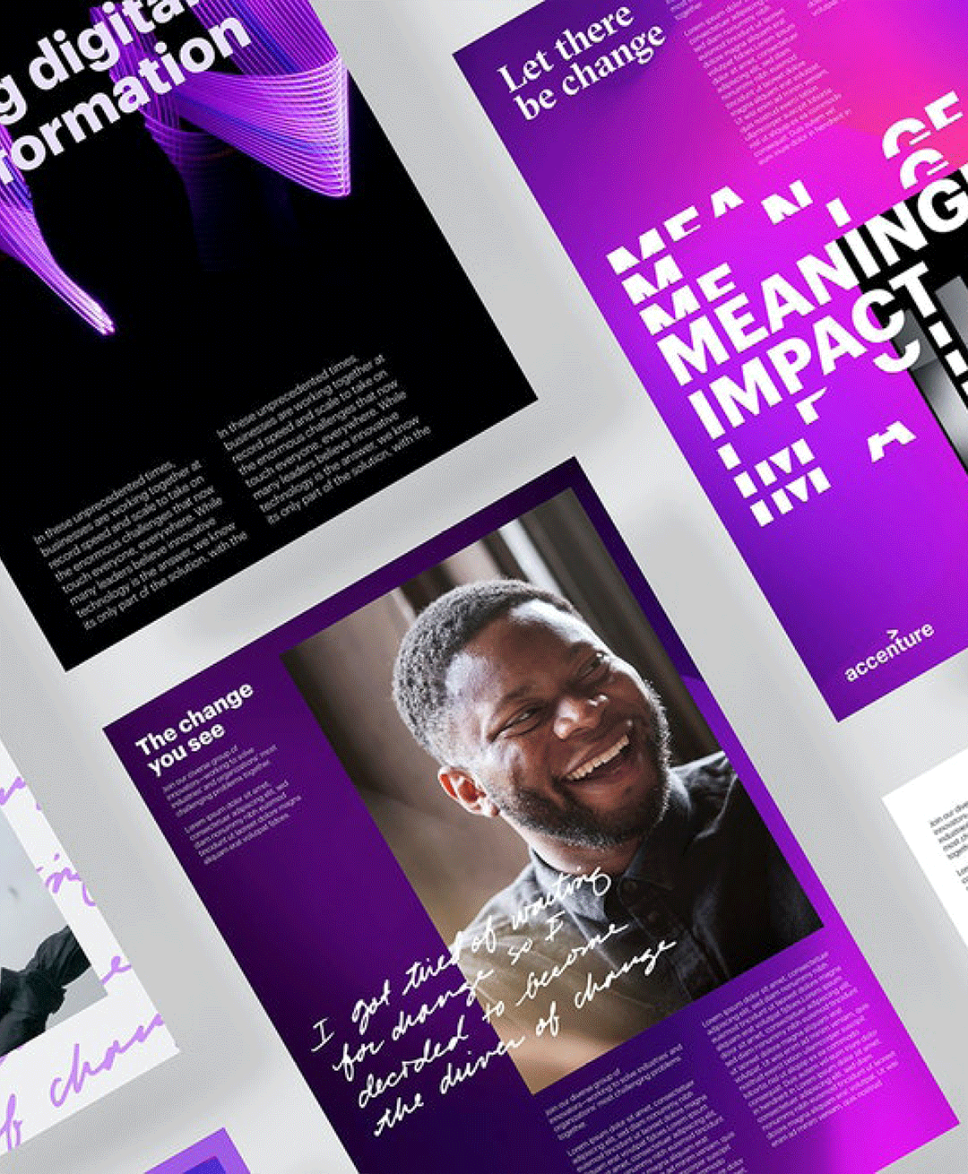
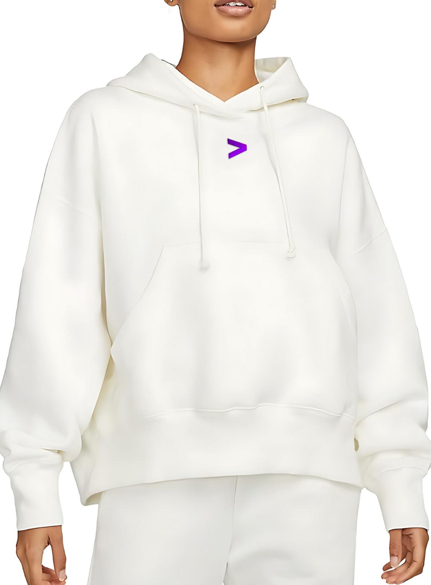
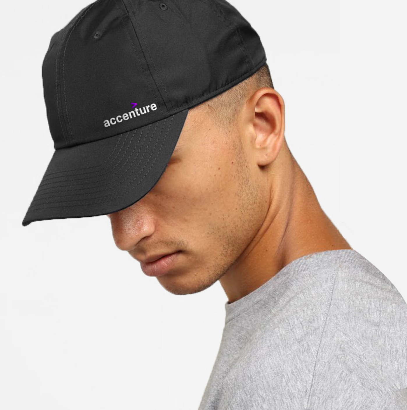
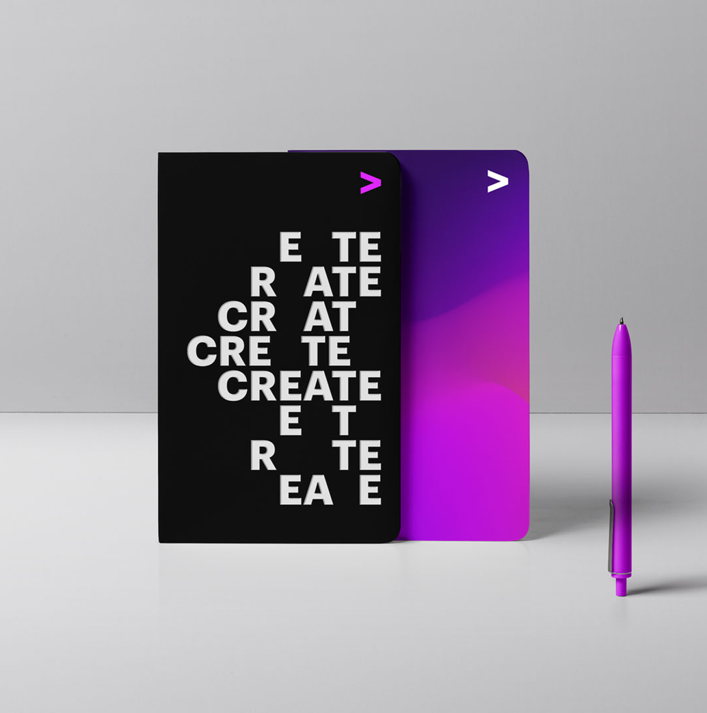
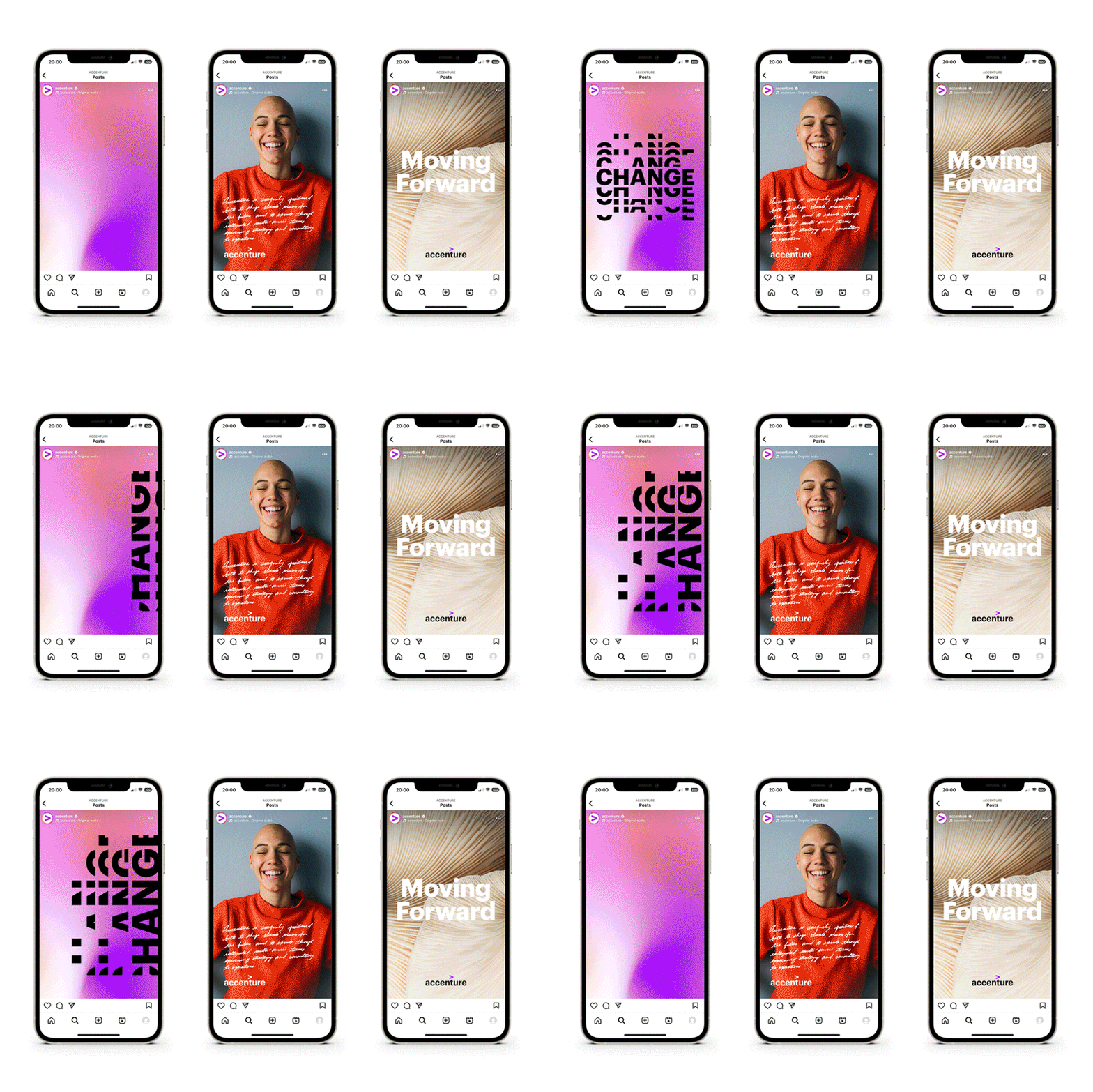
Accenture unified its services under one core brand, introducing a new positioning and purpose centered on humanity and change. The evolved visual identity created a more vibrant, emotional, and approachable expression of the brand, bringing together the power of technology and human ingenuity.
Visual identity system
Art direction
Guidelines
Implementation
⟵
(or press esc)
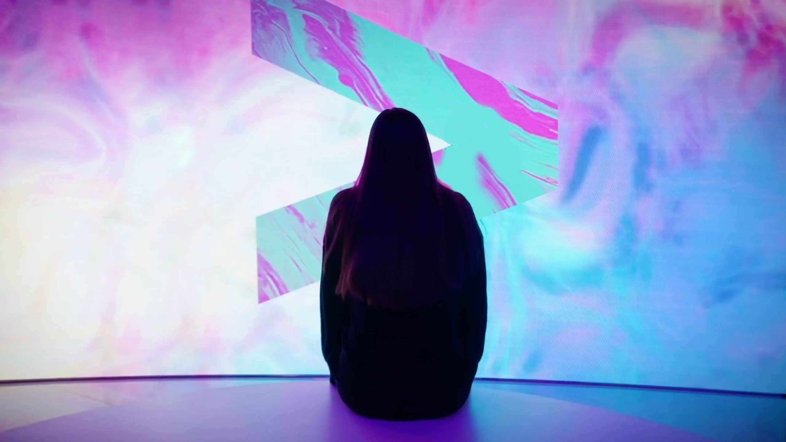
Accenture Mobile World Congress
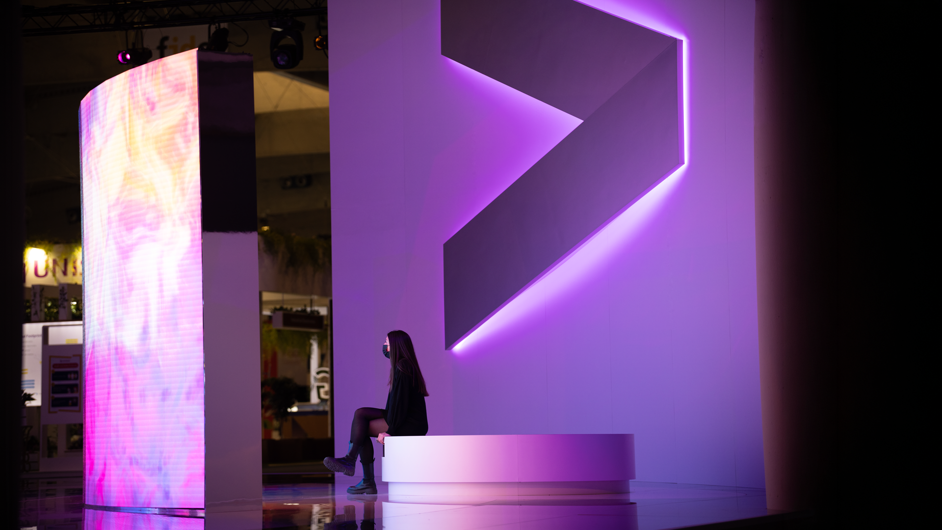
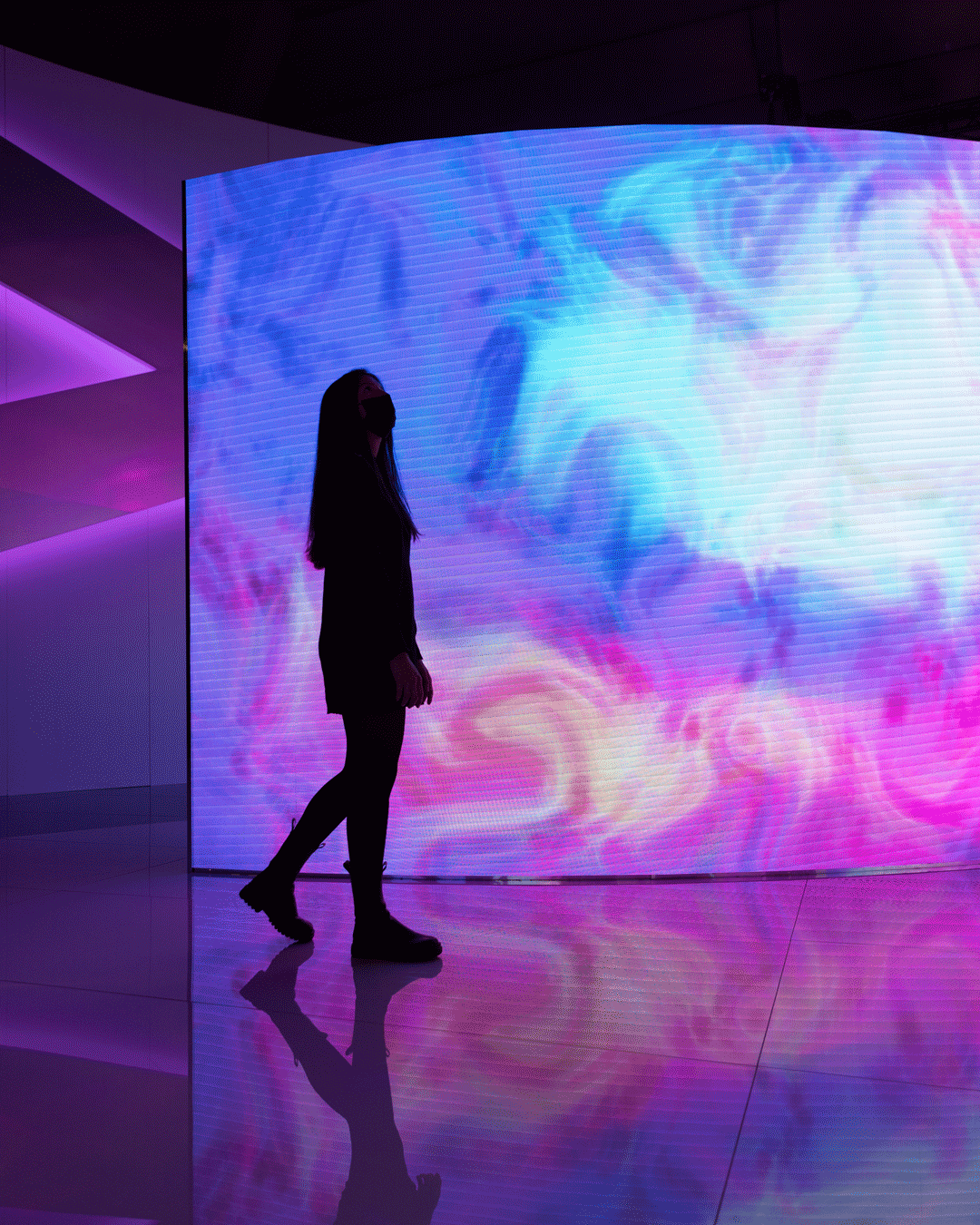
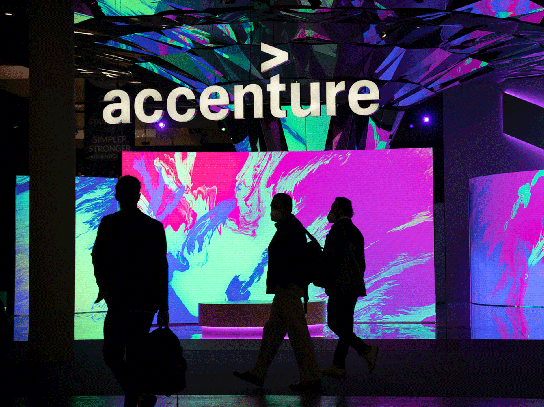
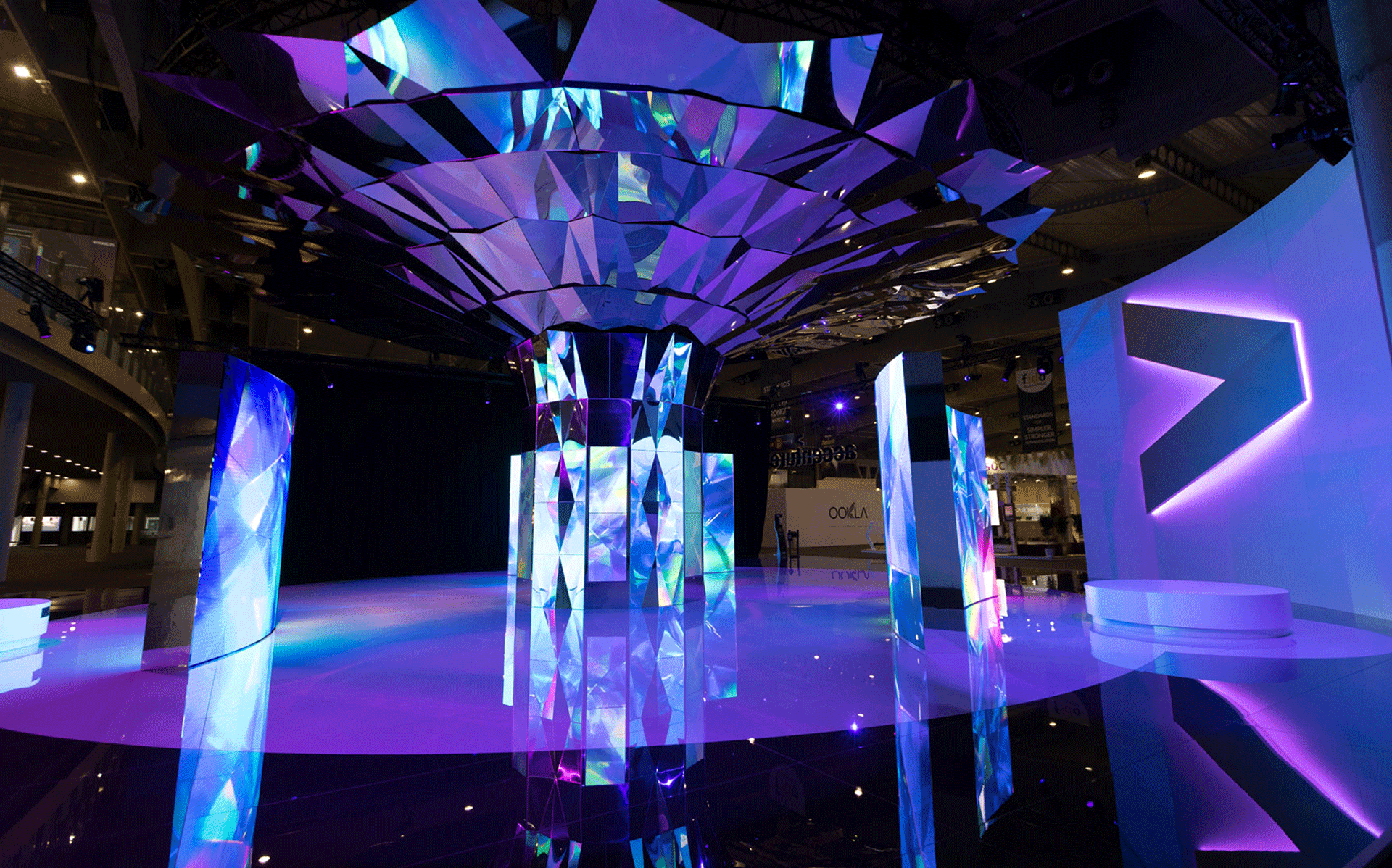
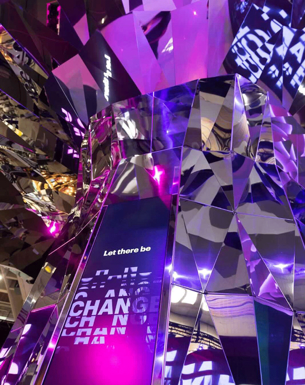
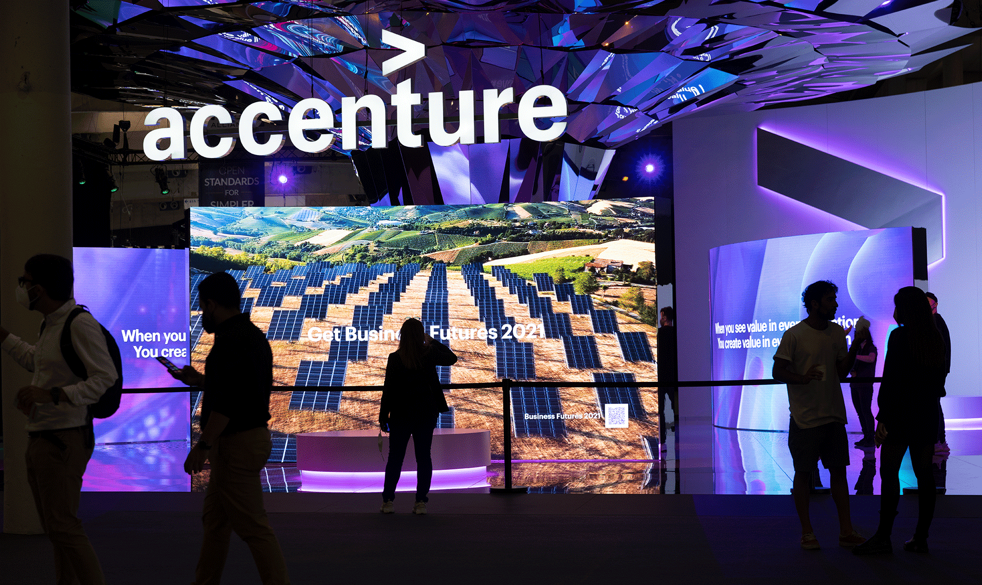
At Mobile World Congress, Accenture set out to break traditional trade show conventions and showcase its end-to-end technology, strategy, and business transformation capabilities in a bold new way. A show-stopping interactive sculpture combined thought leadership, client stories, and immersive visuals, setting a new standard for self-guided experiences and bringing the power of technology and human ingenuity to life.
Brand experience
Art direction
Environmental design
Motion
⟵
(or press esc)
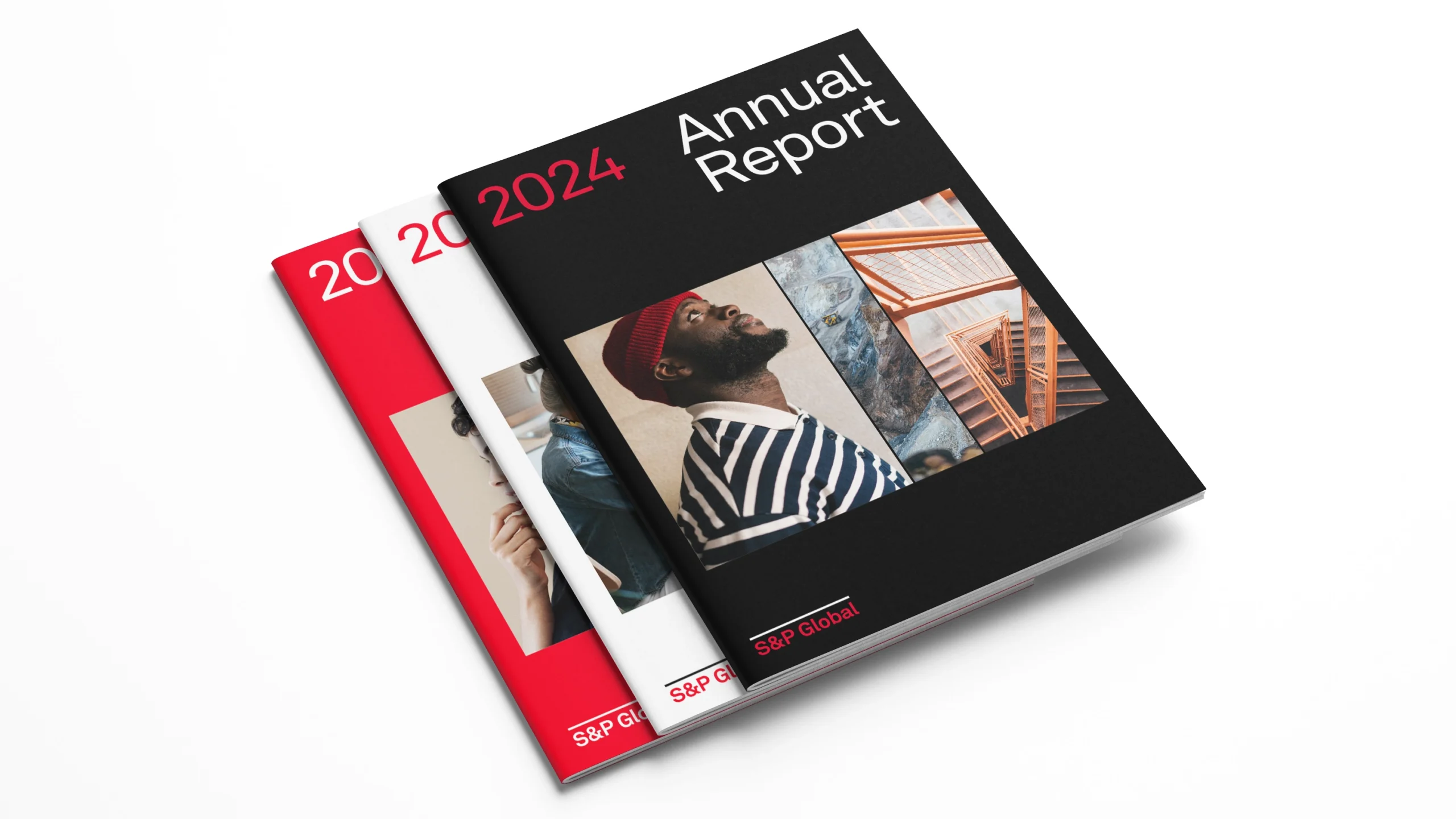
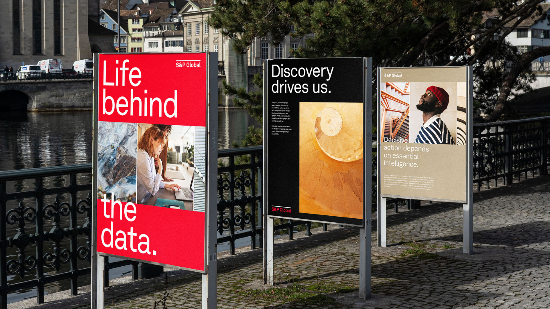
S&P Global
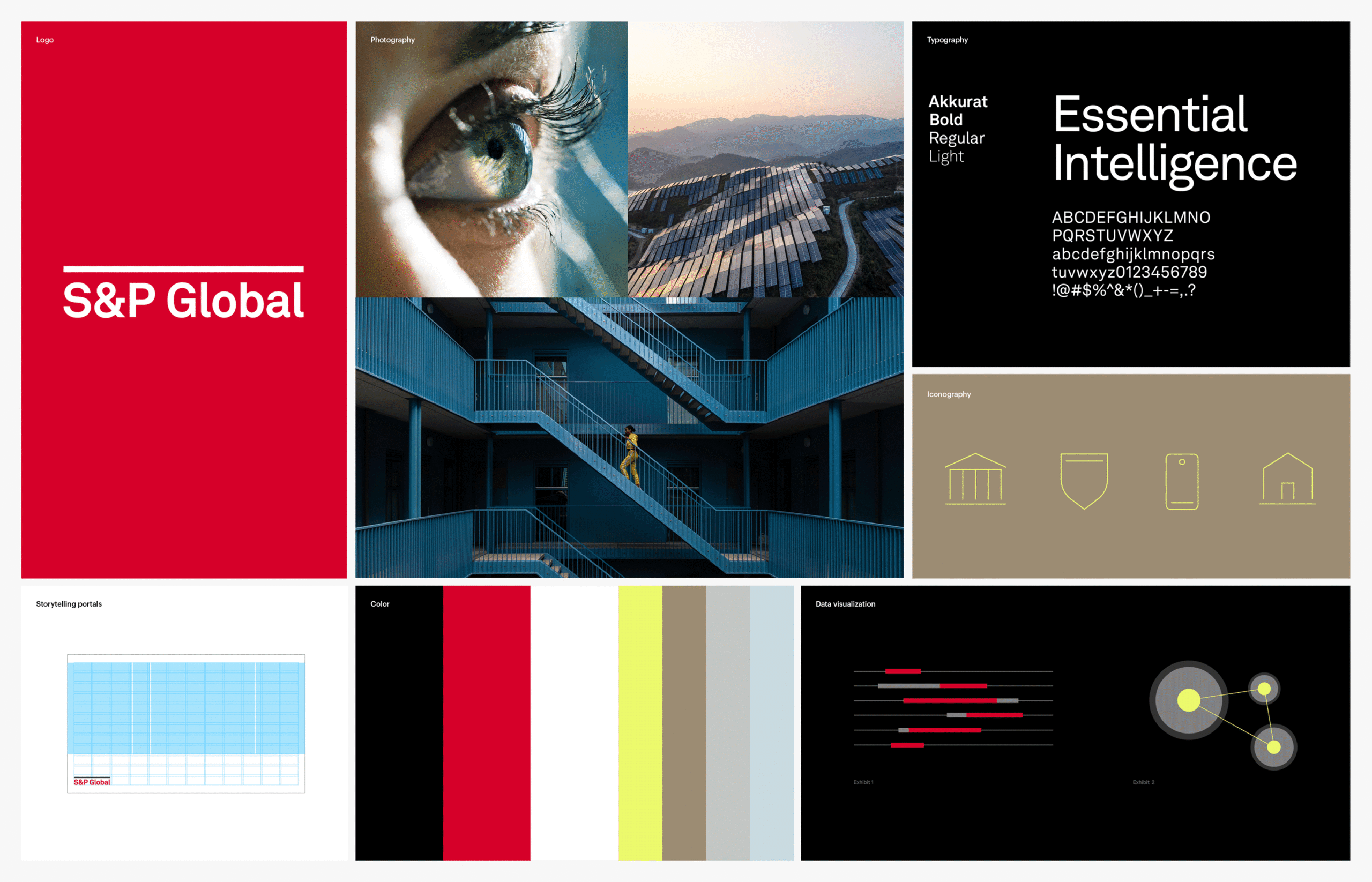
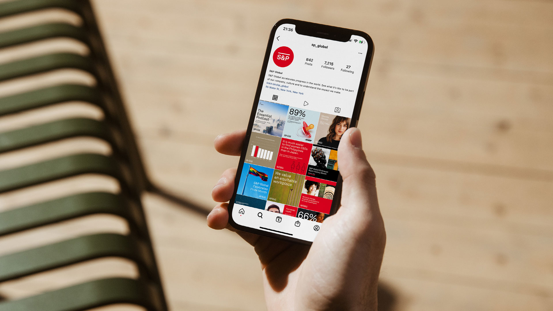
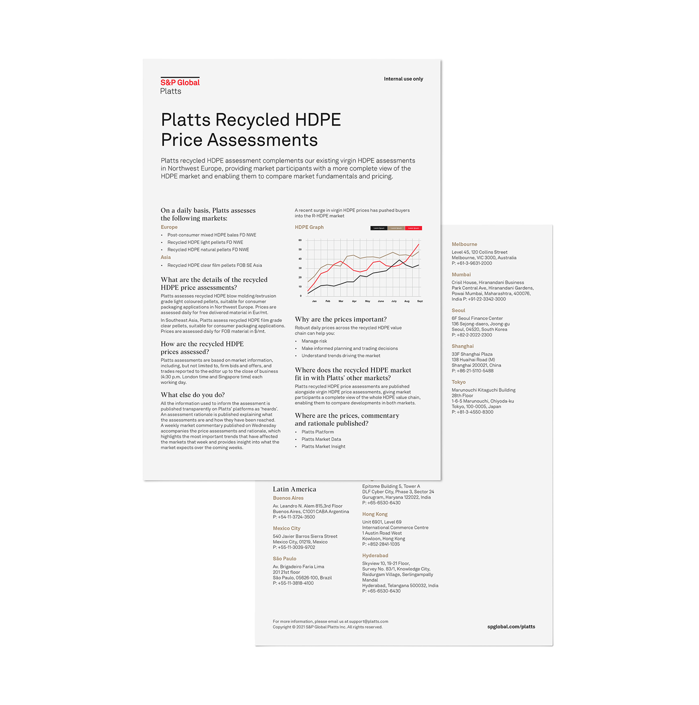
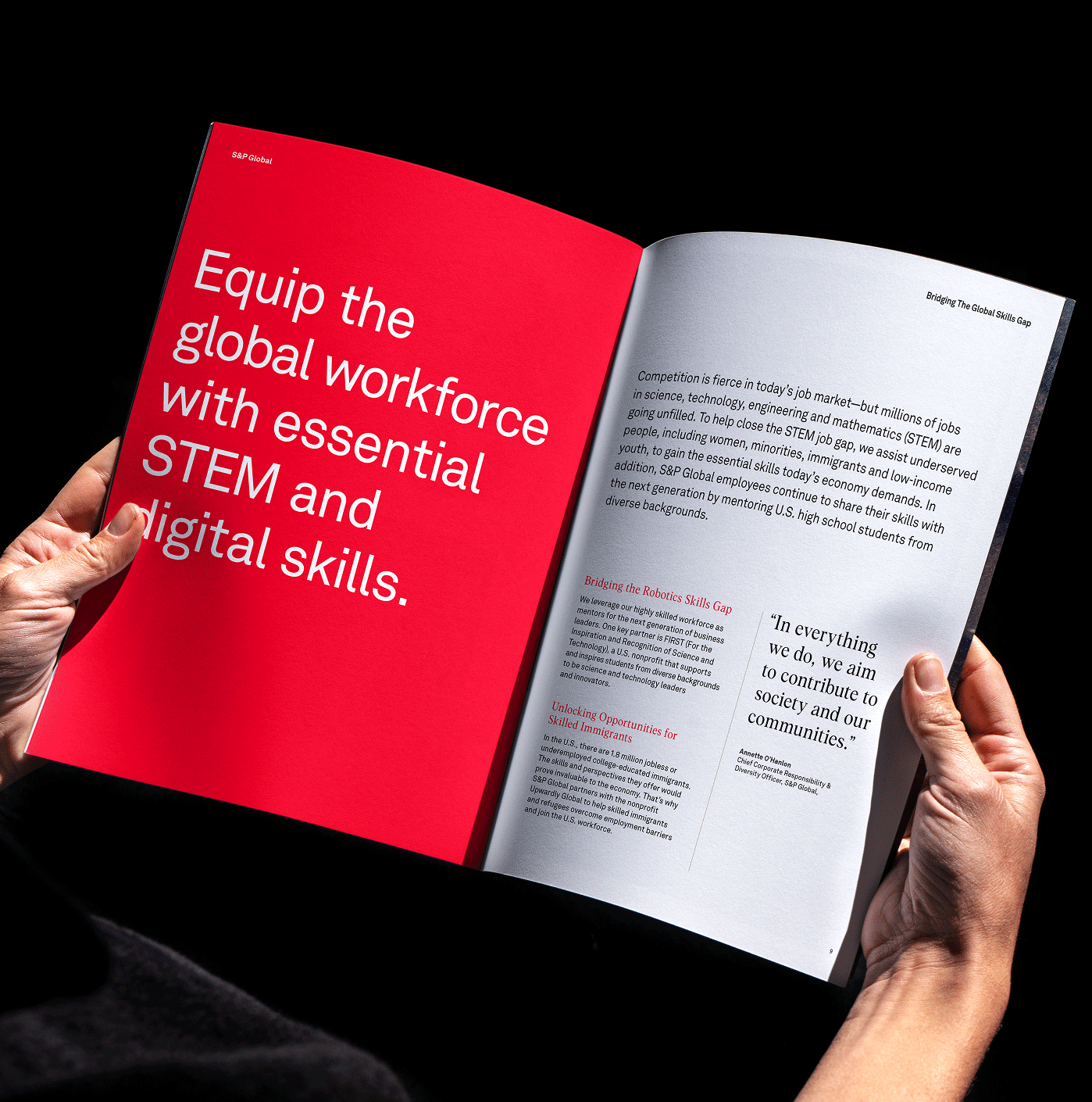
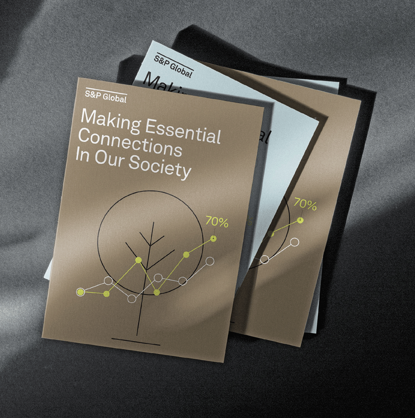
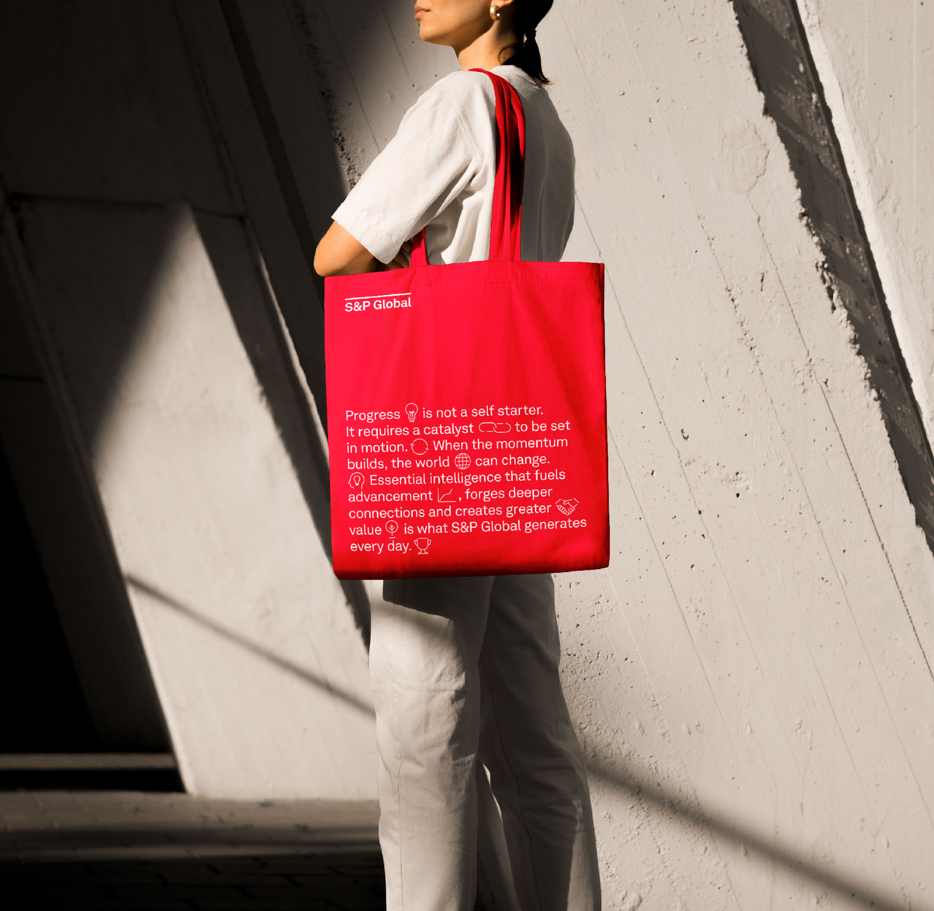
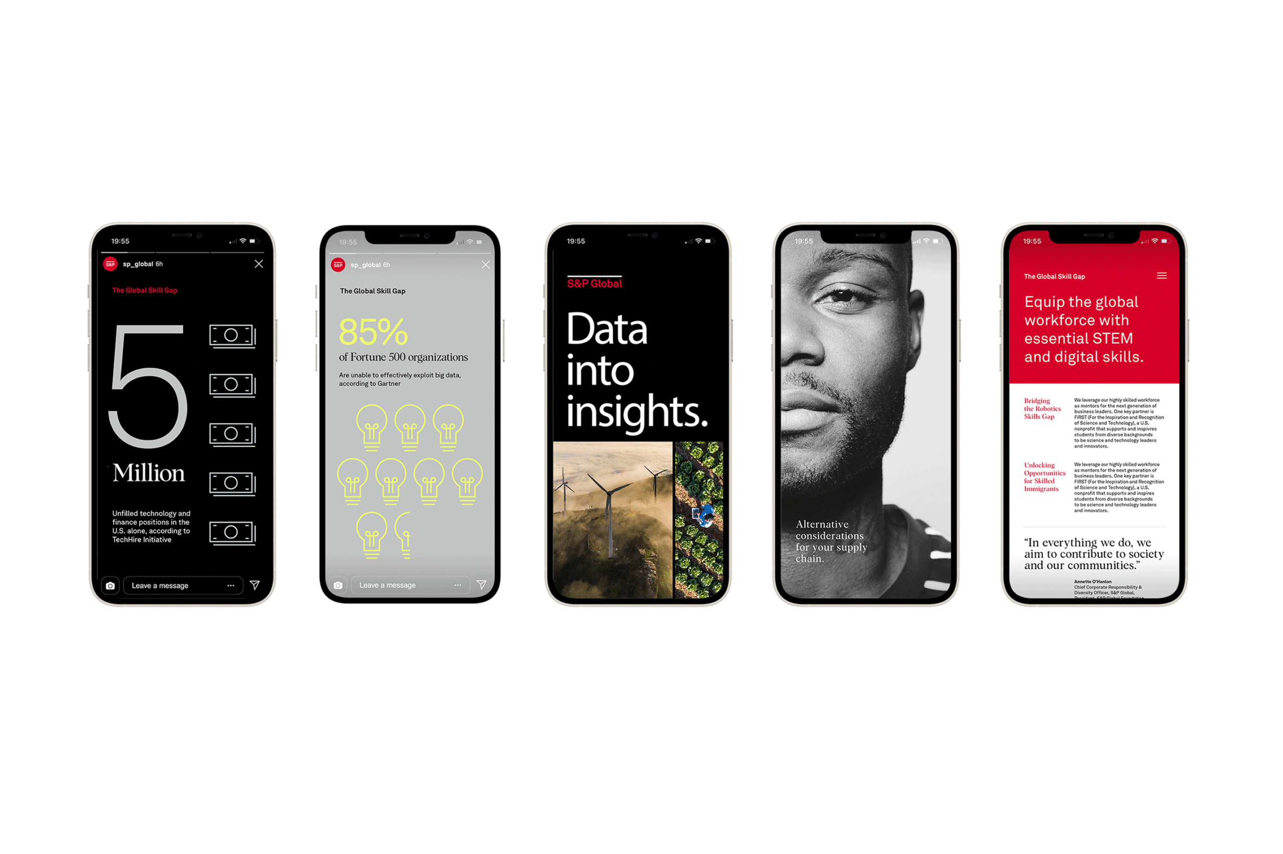
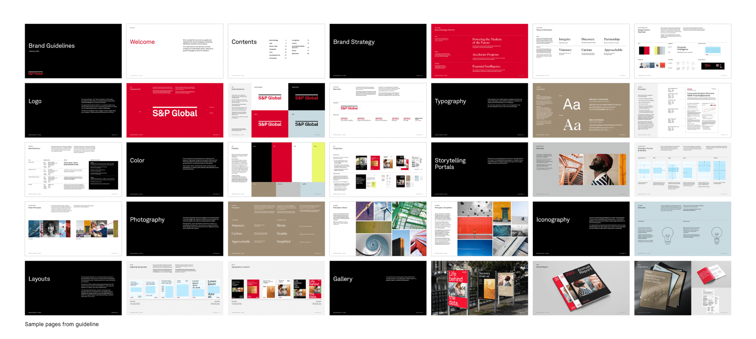
S&P Global redefined its purpose around “Accelerate Progress,” building on its “Essential Intelligence” brand idea to reflect its role in driving advancement, connection, and value. This strategic evolution led to a clean, minimalist visual identity system that conveys clarity and confidence while positioning the brand for a changing world.
Brand strategy
Visual identity system
Motion
Guidelines
⟵
(or press esc)
Fork In The Road
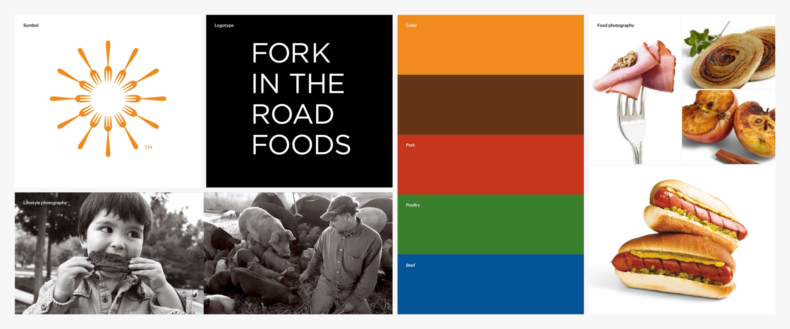
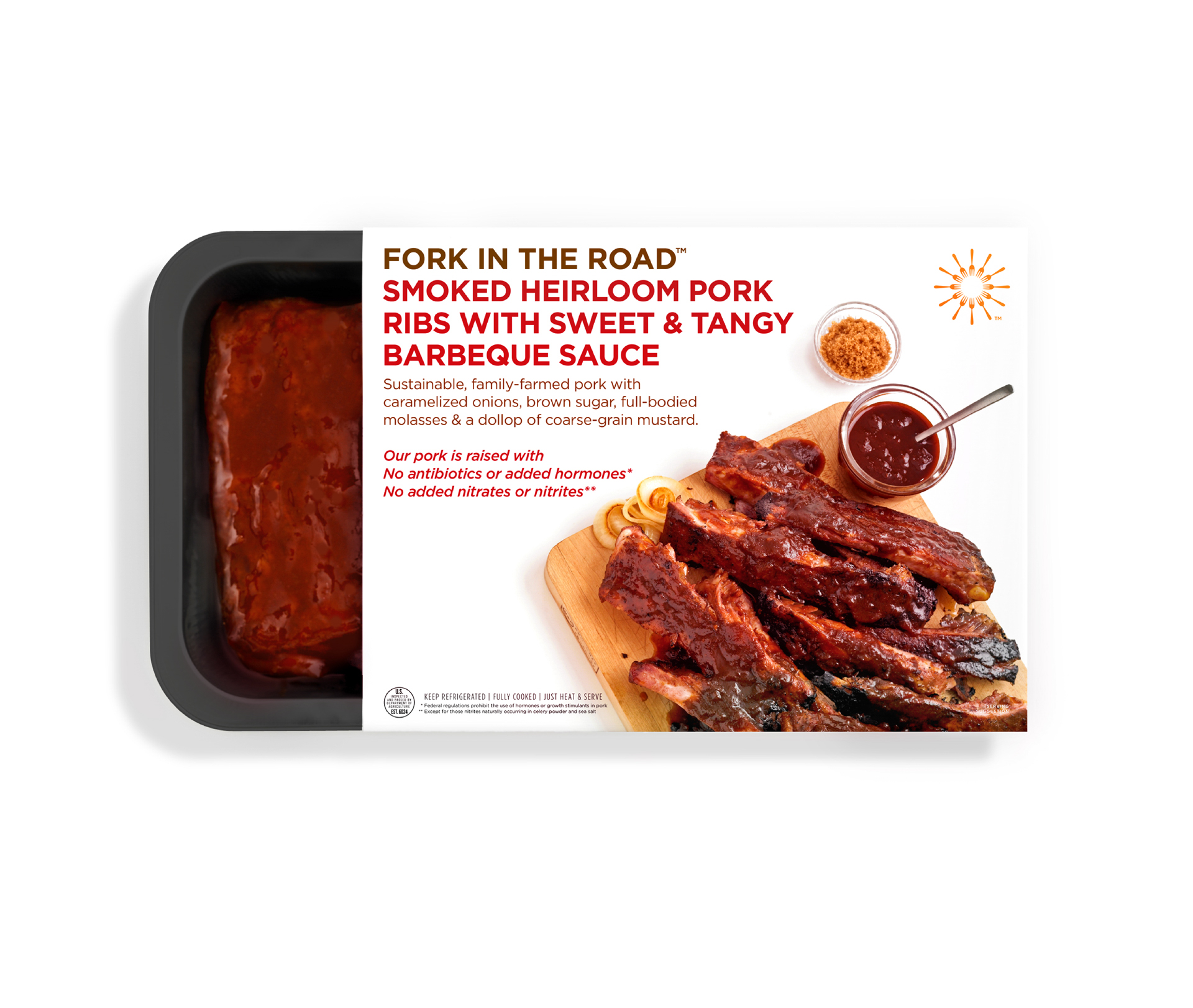
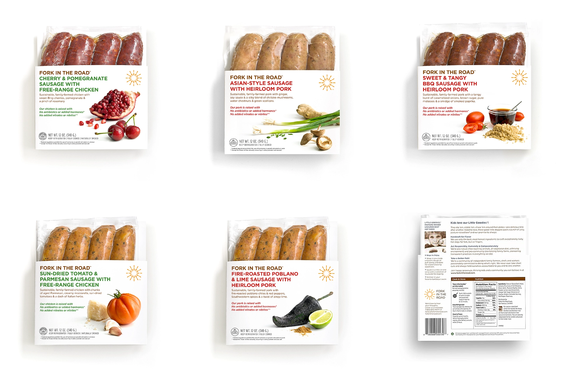
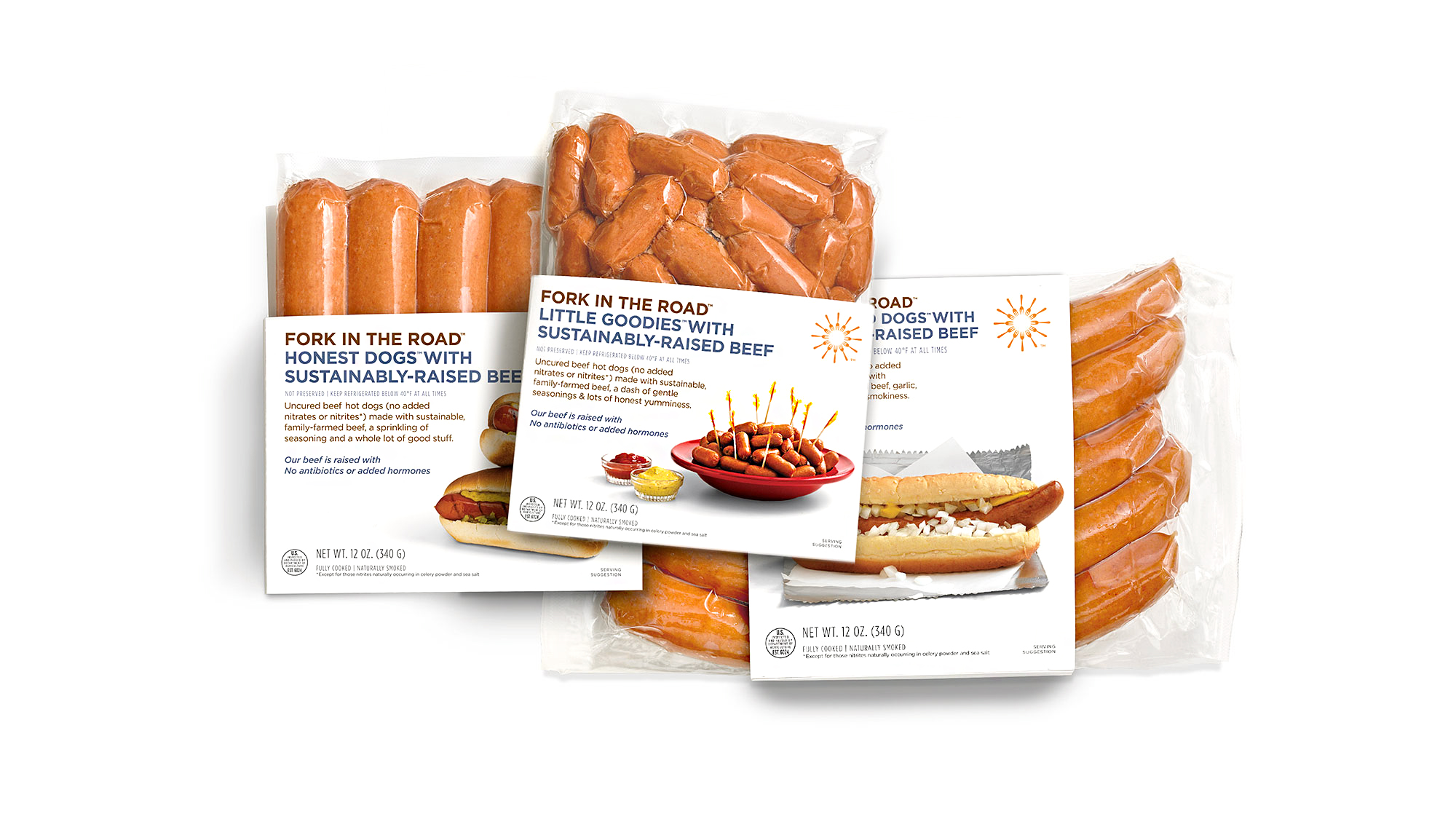
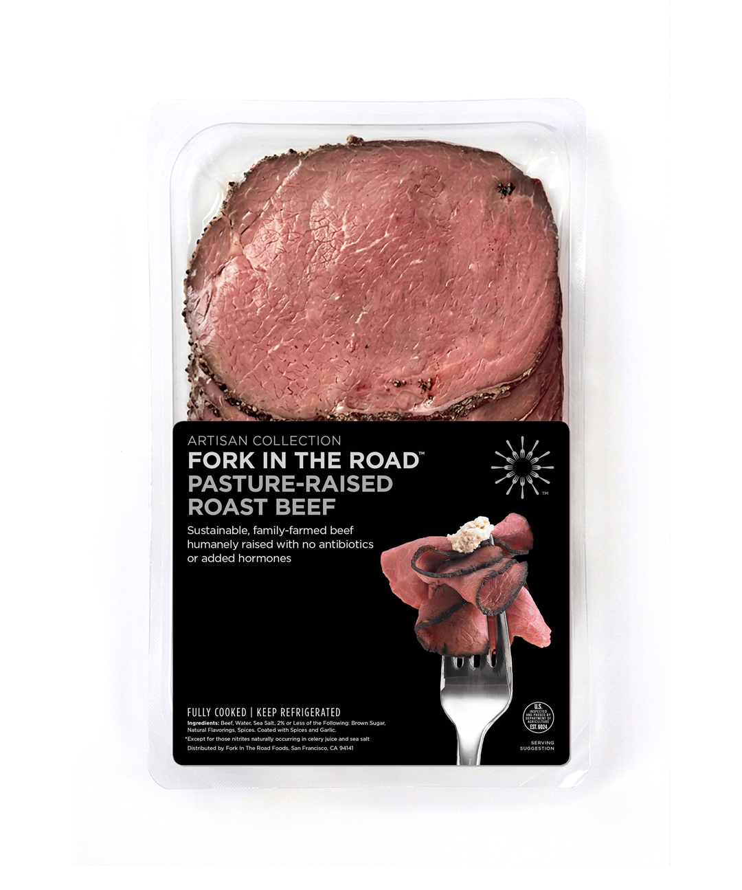
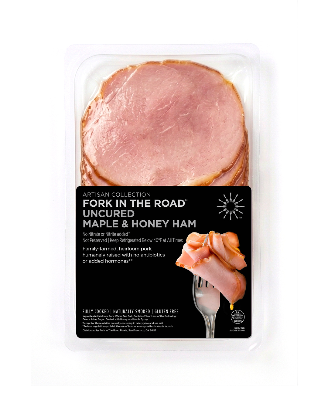
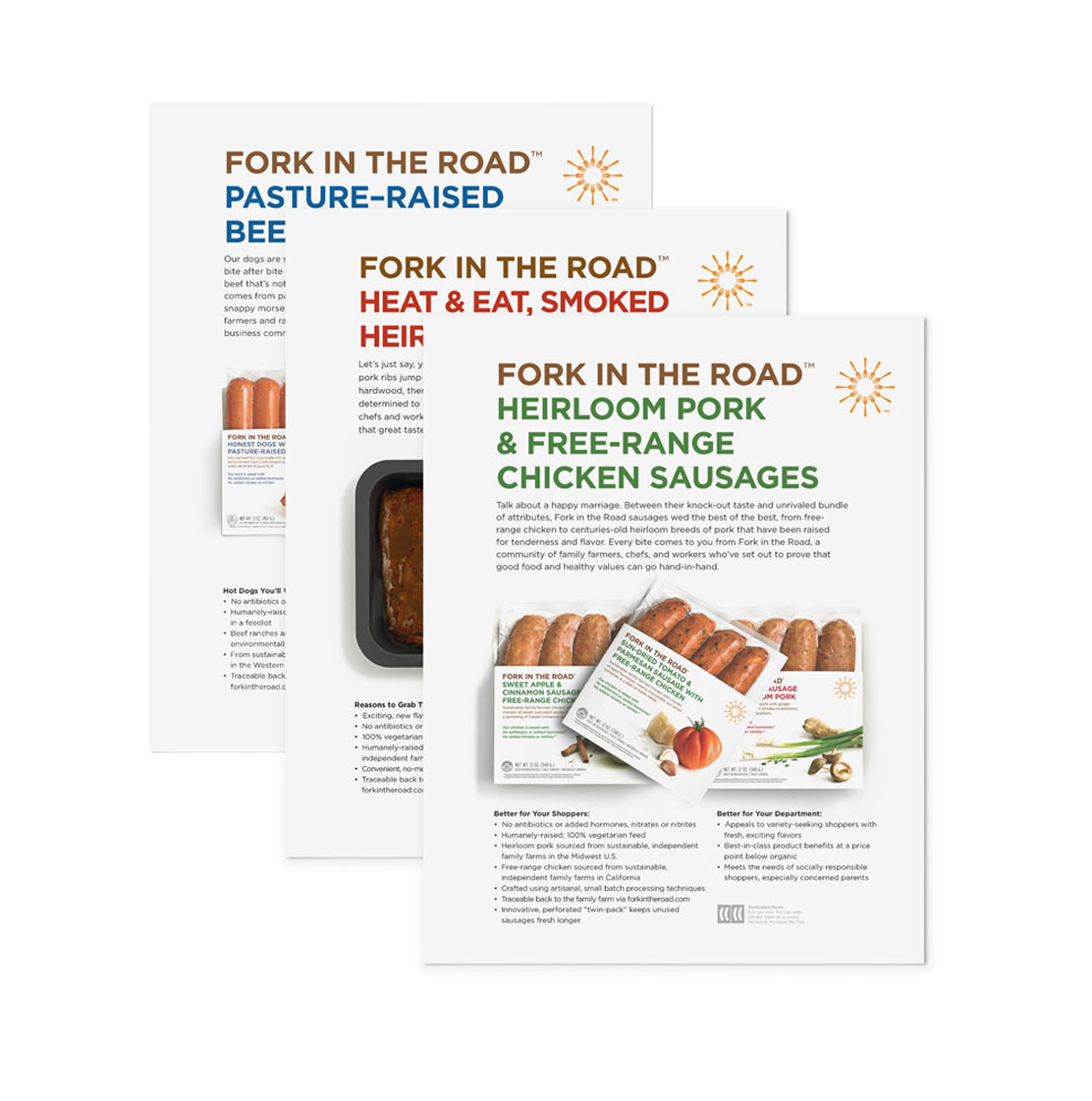
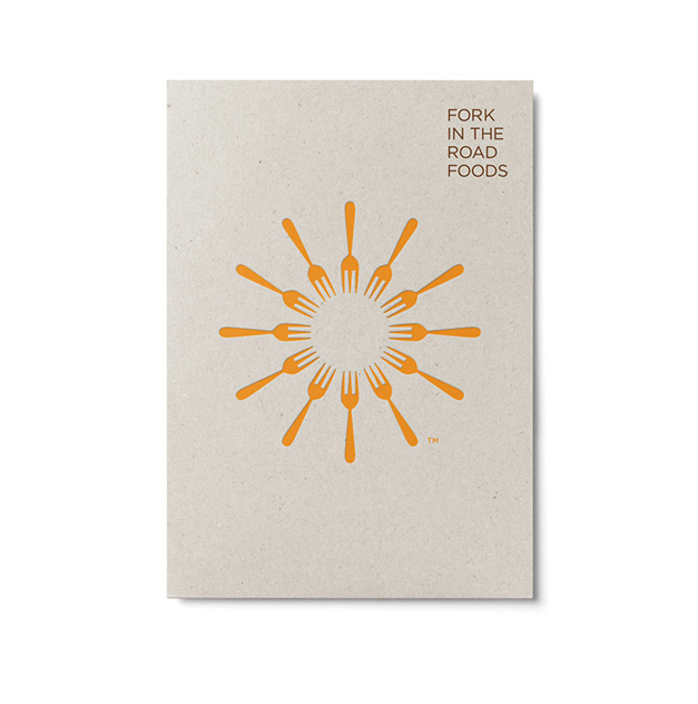
Fork In The Road is a value-driven food brand rooted in quality, sustainable farming, and the humane treatment of animals. The identity brings these principles to life through a distinctive symbol, clean ingredient-focused art direction, and bespoke sustainable packaging designed to stand out on shelves.
Visual identity system
Art direction
Packaging design
Guidelines
Photography

⟵
(or press esc)
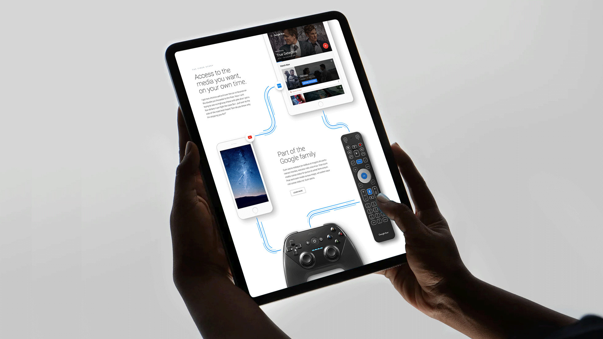
Google Fiber
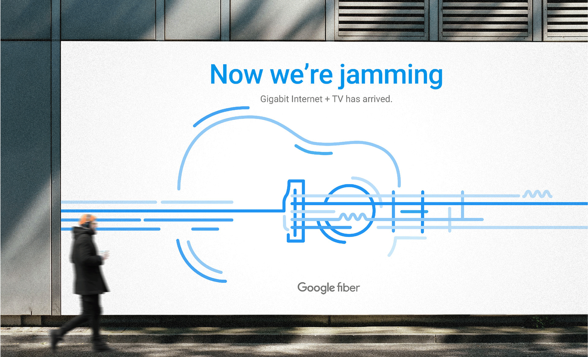
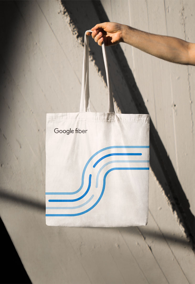
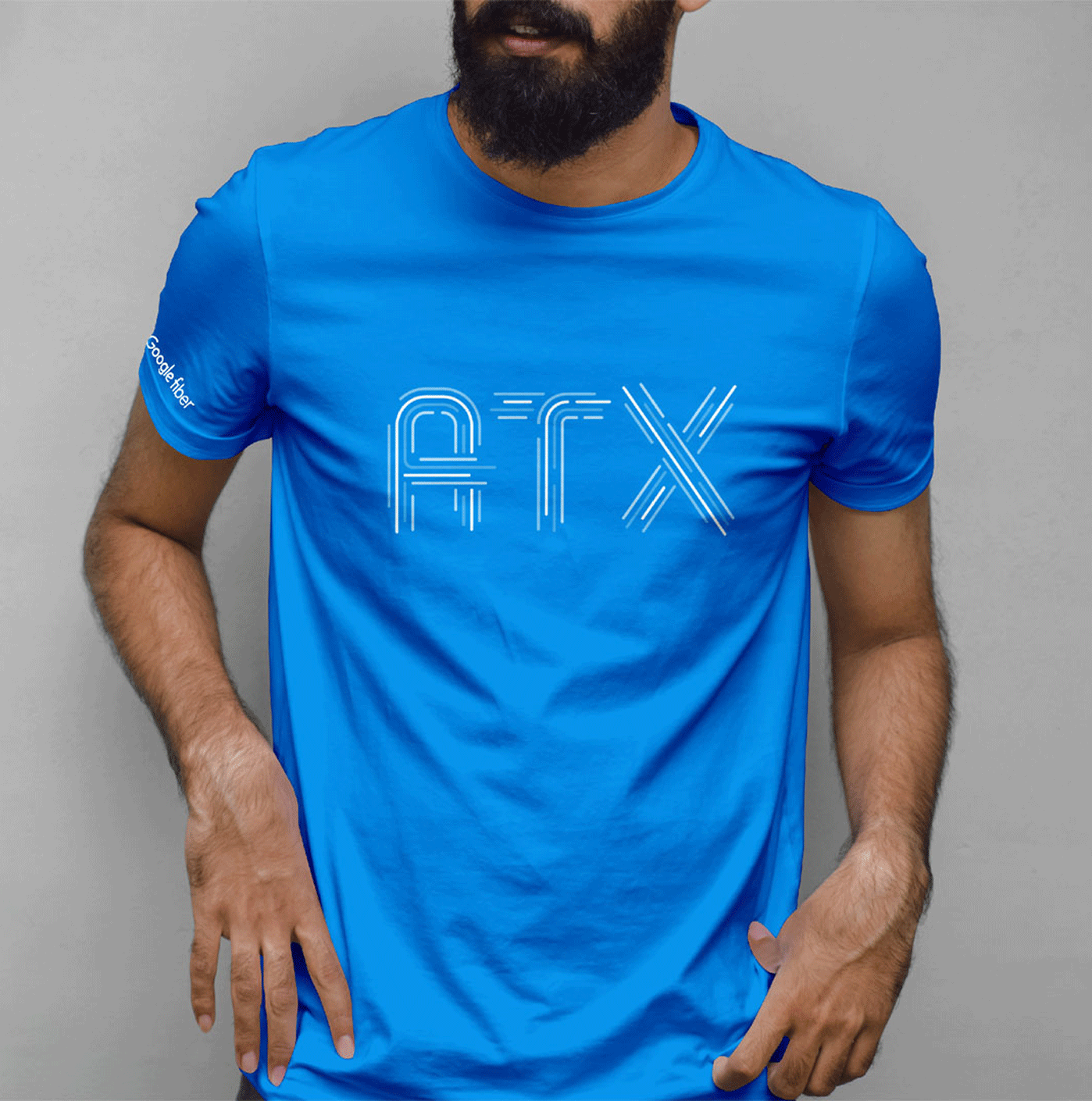
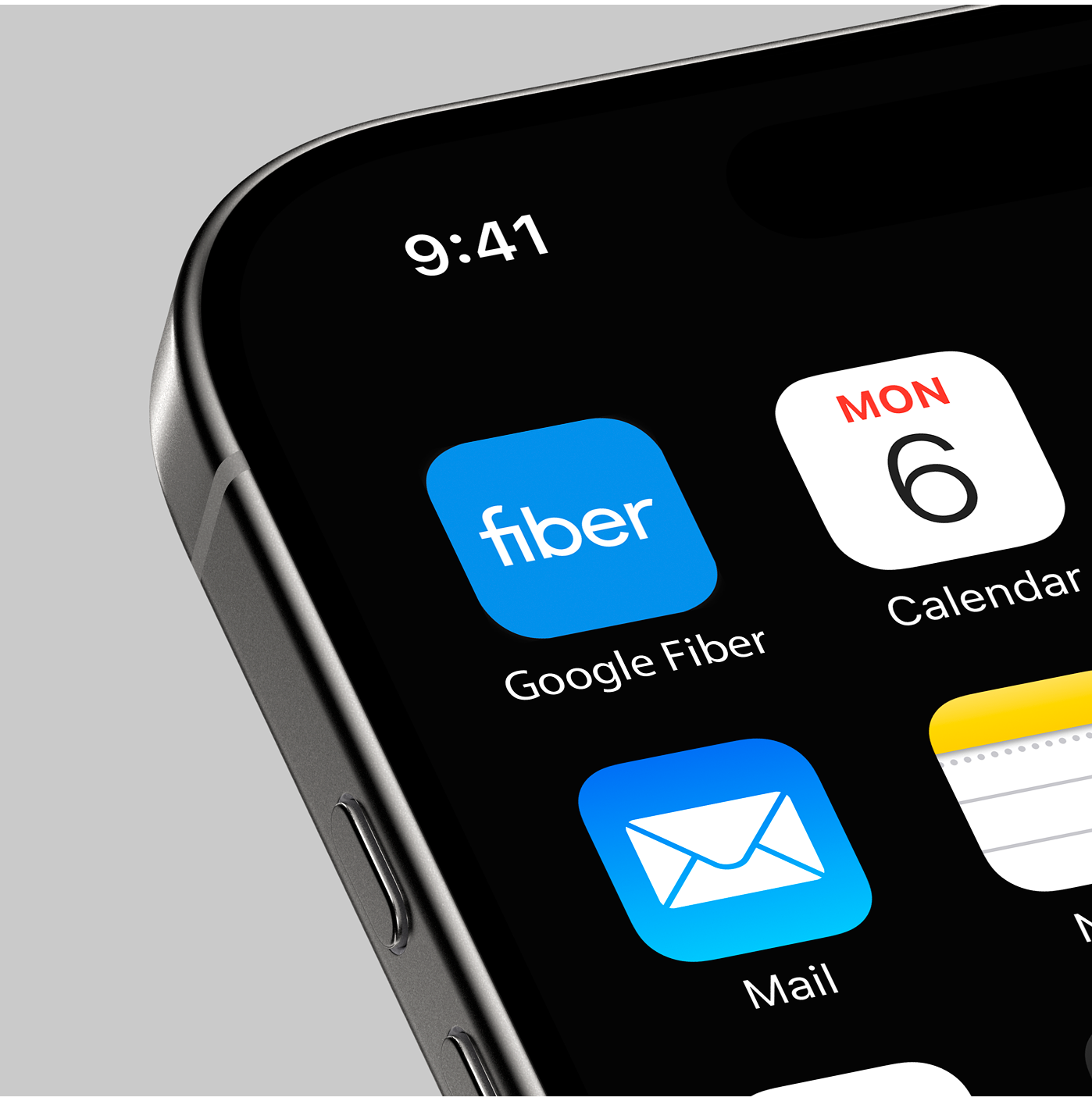
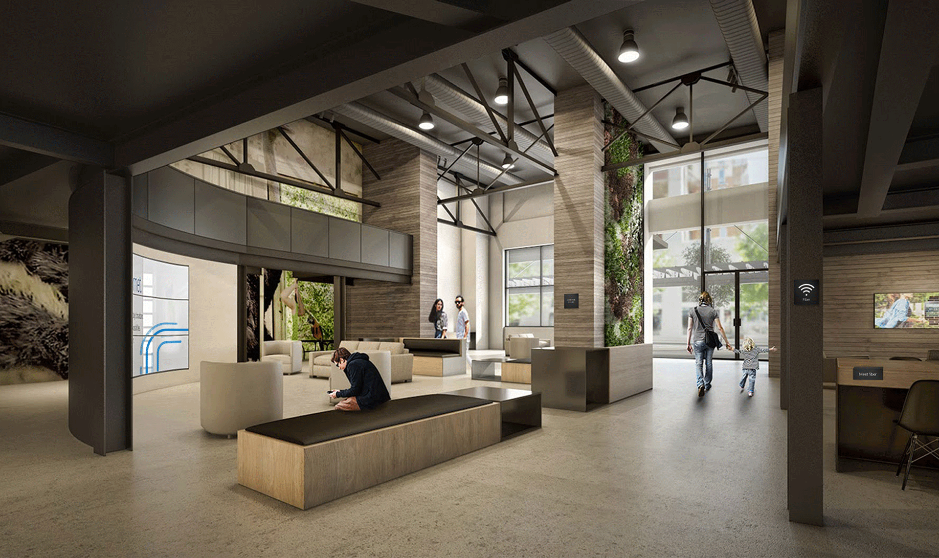
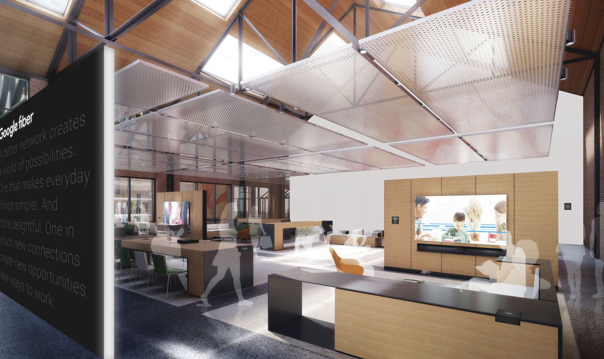
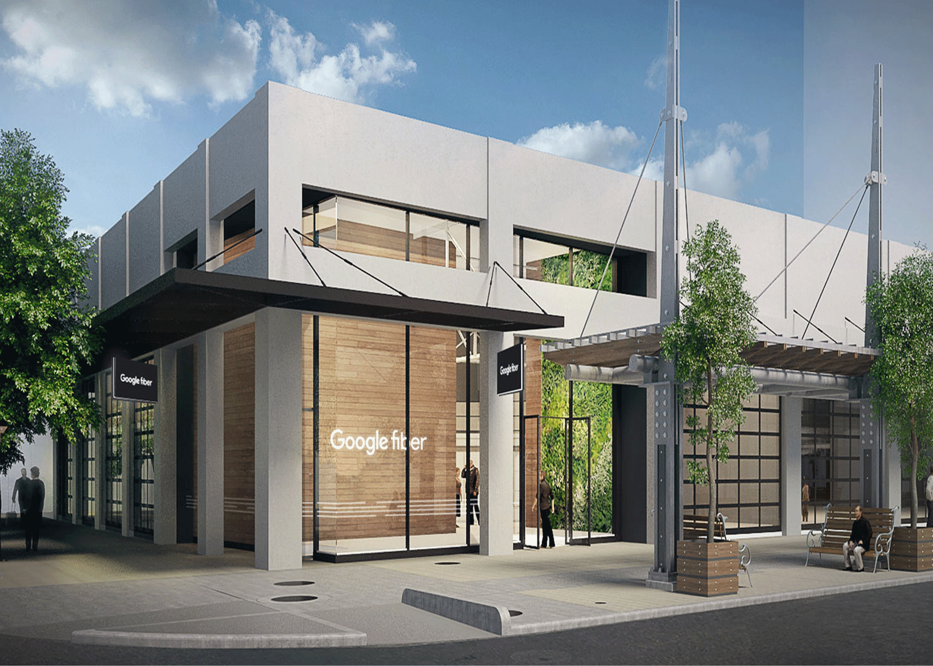
As part of Google’s broader identity evolution, Google Fiber introduced a new logo and visual system that remained rooted in Google’s recognizable visual language. A dynamic system of lines expressed speed, movement, and connectivity, while a flexible approach to localization allowed the brand to adapt to cities across the U.S.
Brand strategy
Visual identity system
Brand activation
Motion
Guidelines

⟵
(or press esc)
Alvin Ailey American Dance Theater
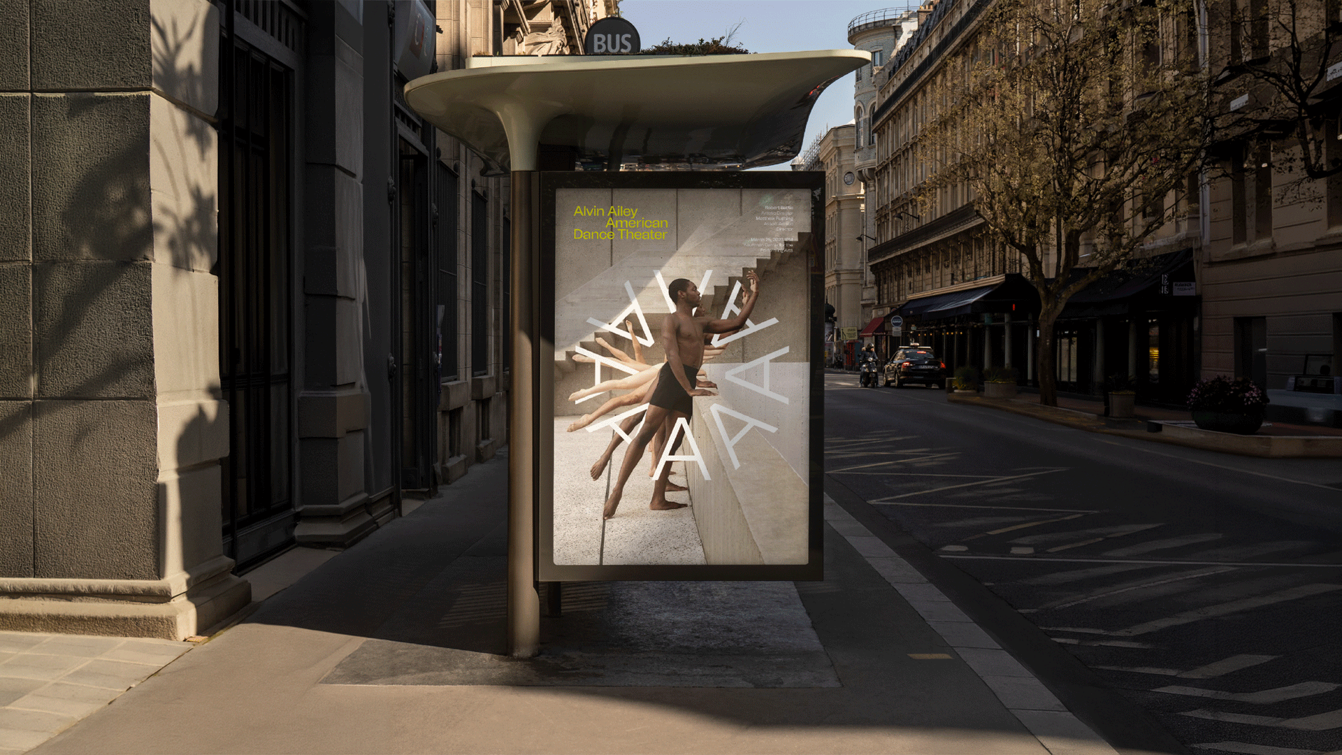
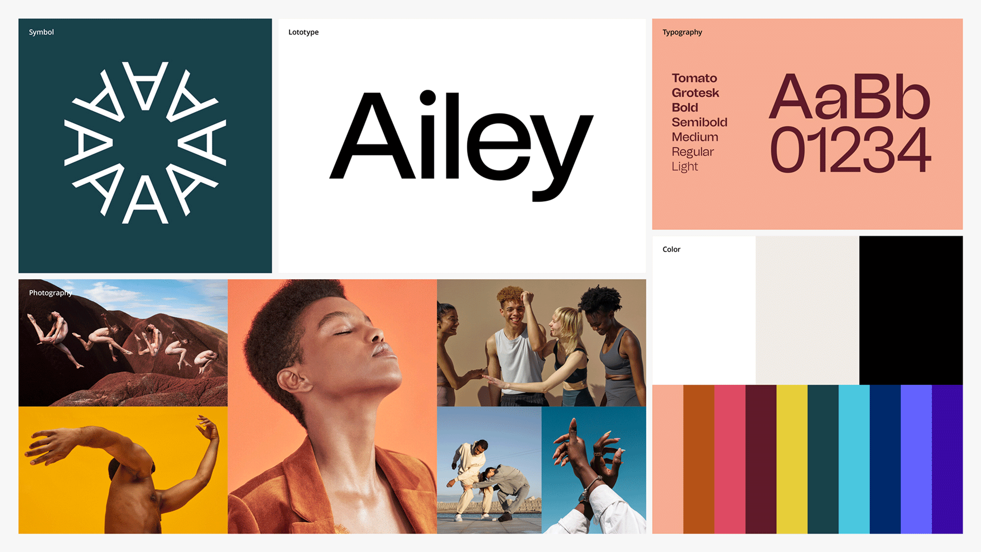
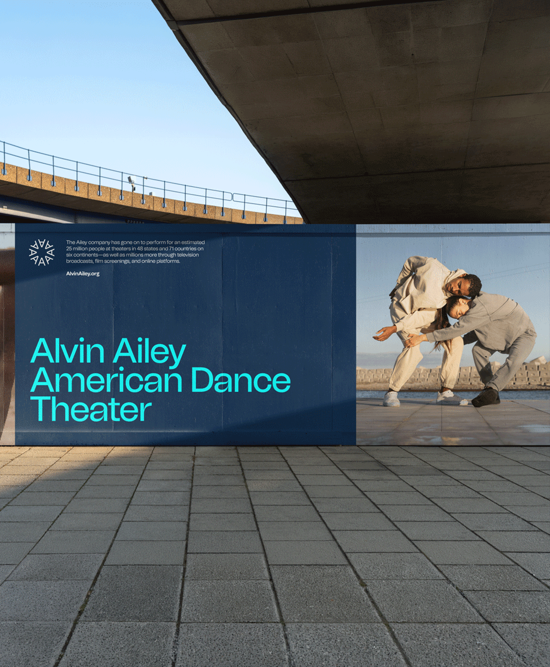
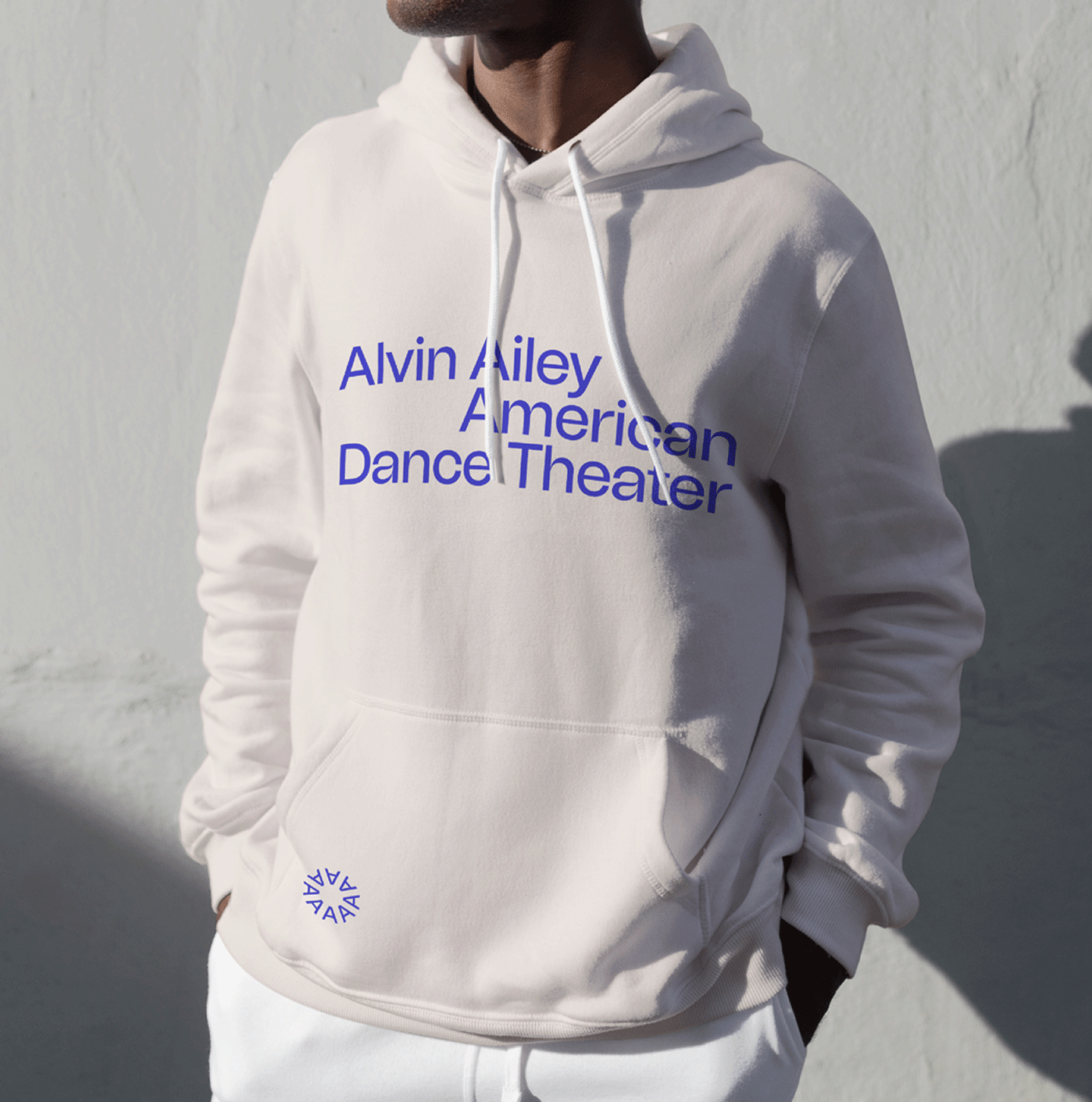
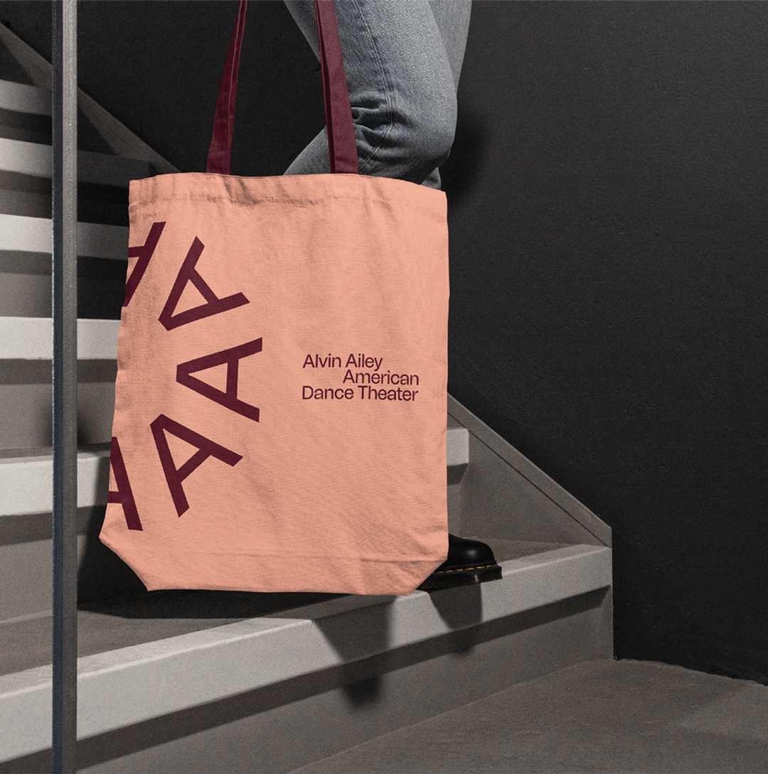
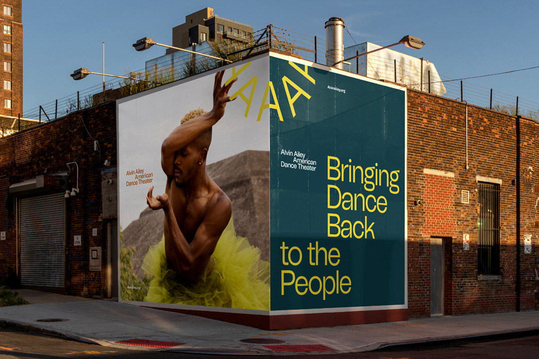
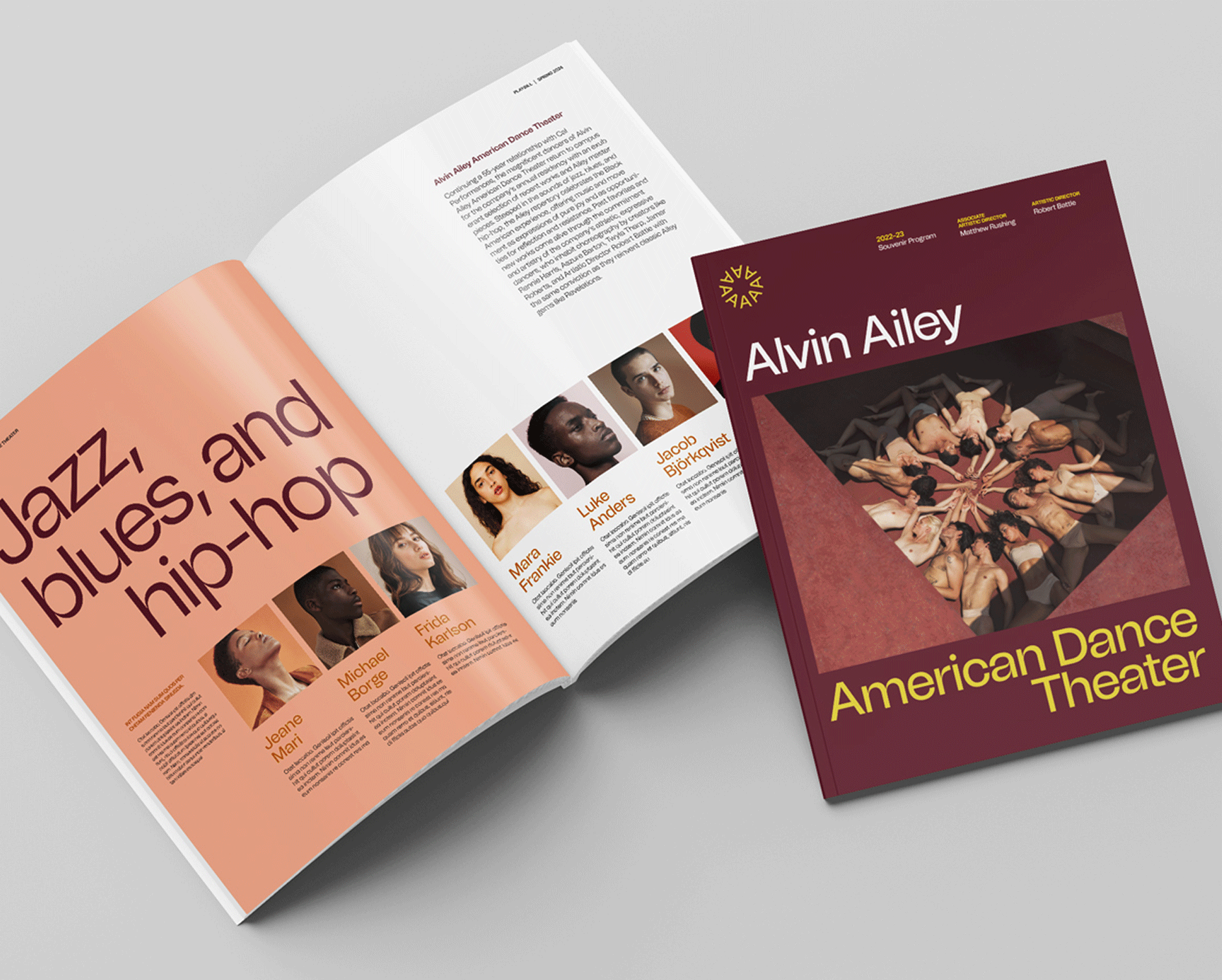
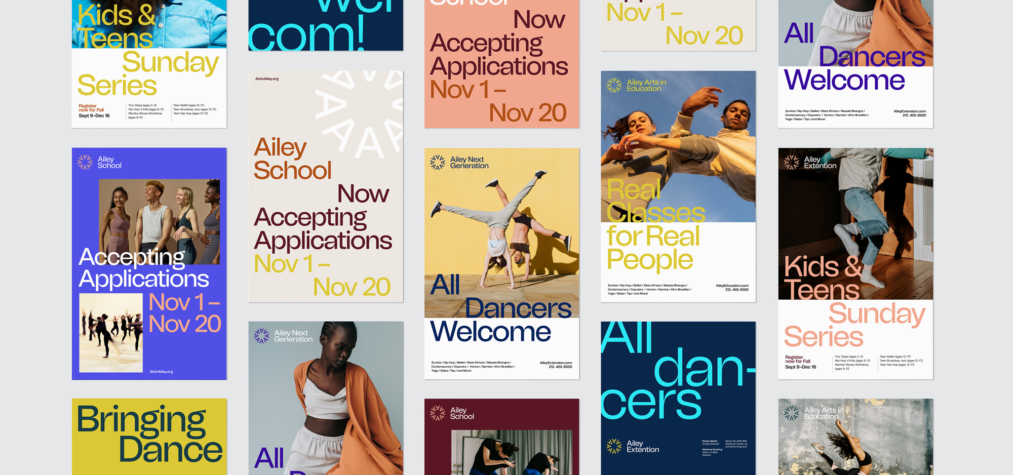
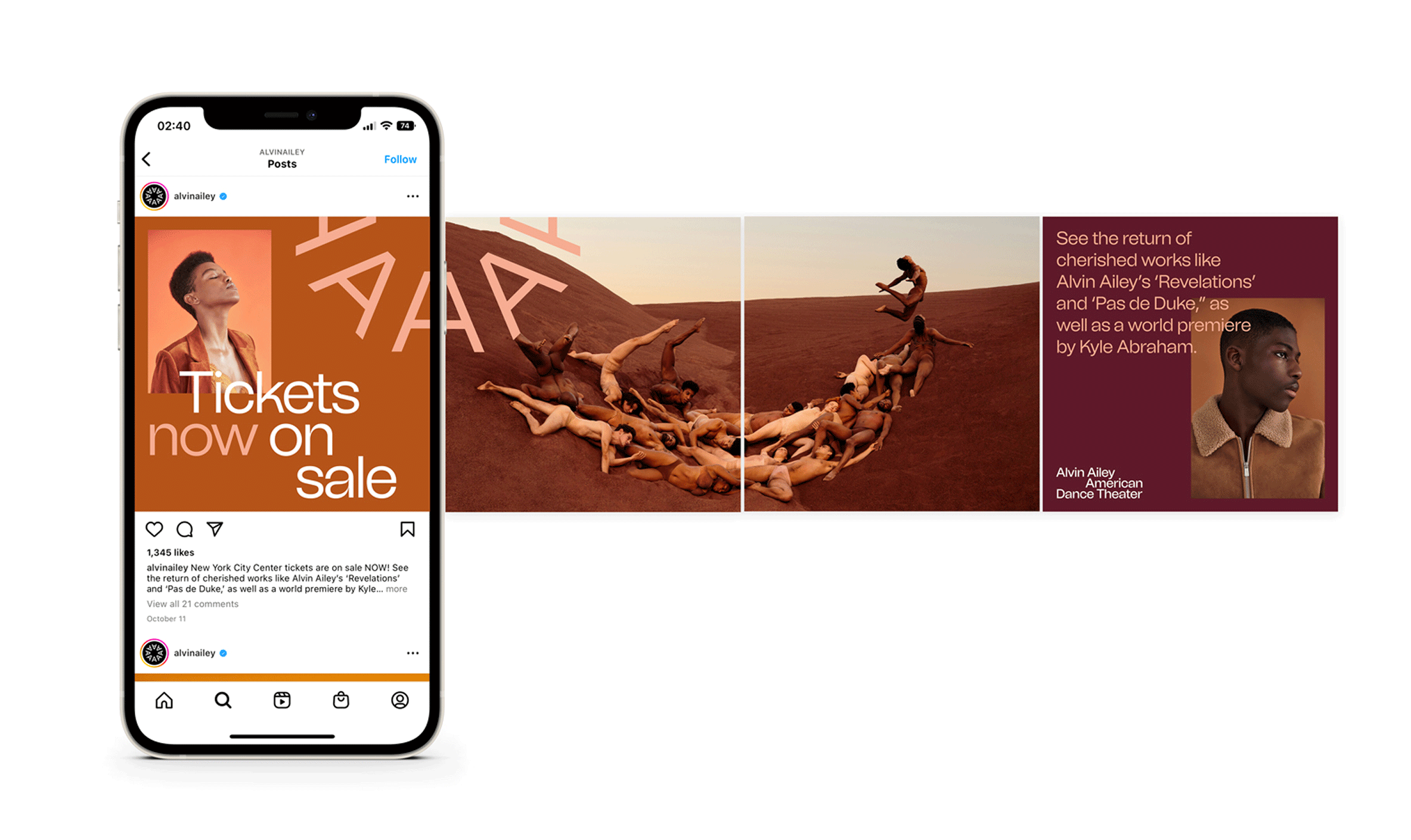
As Alvin Ailey American Dance Theater evolved into a broader parent brand, a new visual identity was created to honor Alvin Ailey’s legacy while supporting the organization’s future. At its center, The Spark choreographs the letter A into a circular symbol of movement and community, supported by a palette inspired by past productions and a flexible typographic system.
Brand strategy
Visual identity system
Design system
⟵
(or press esc)
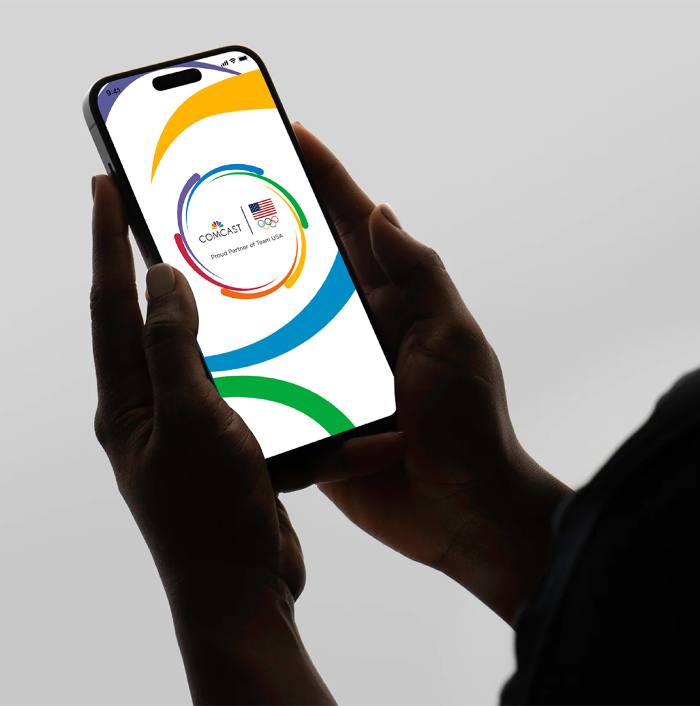
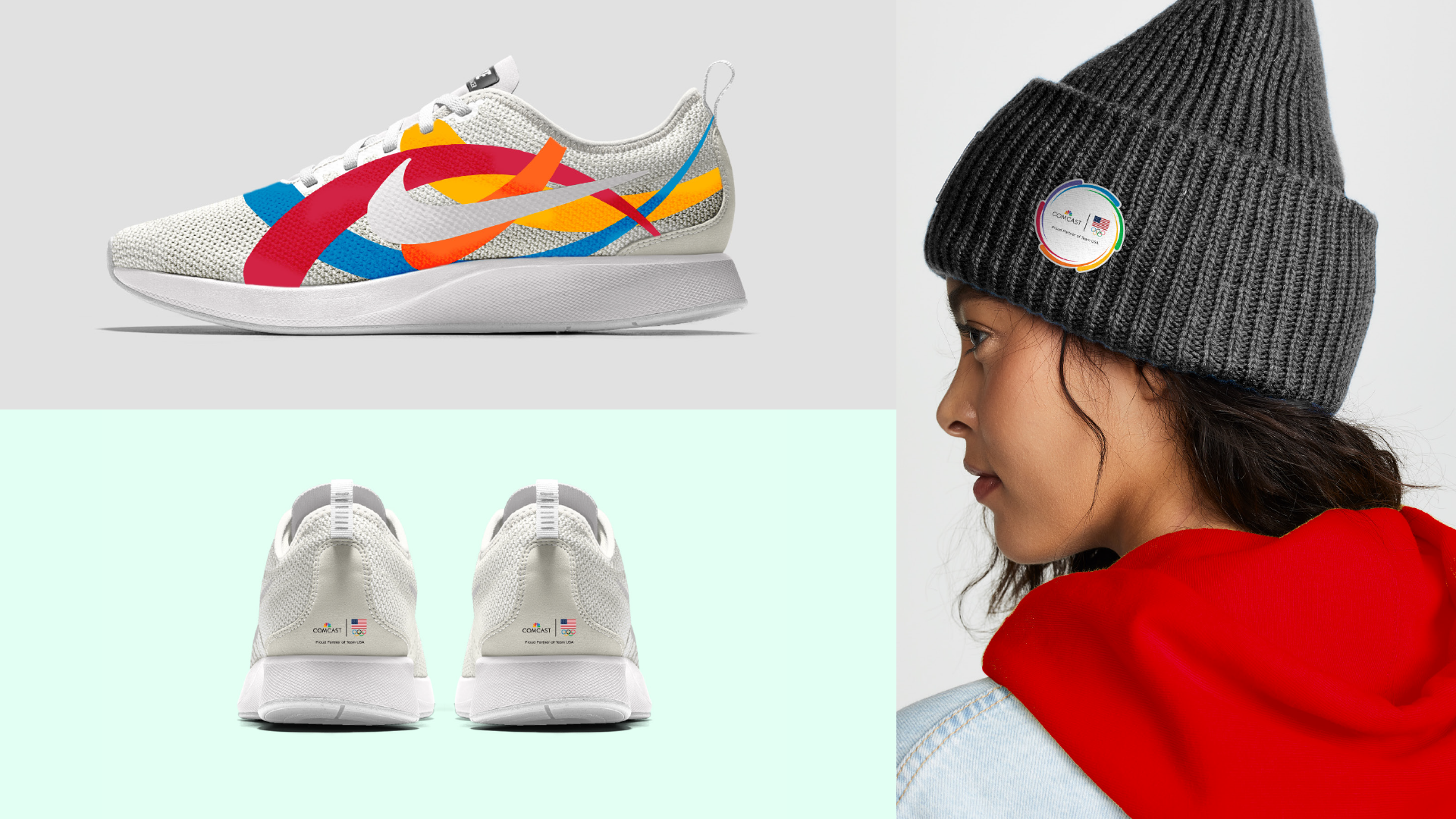
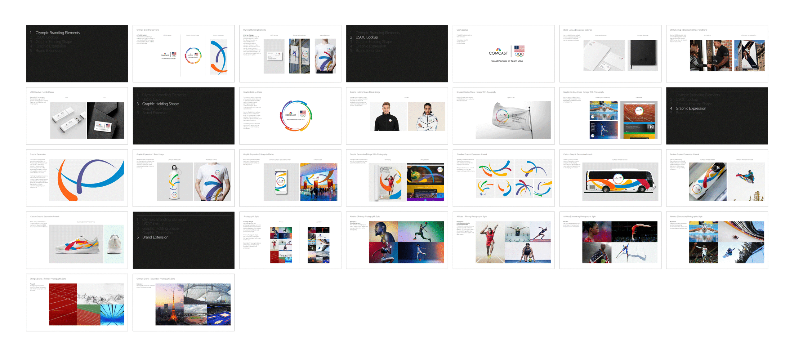
Comcast Olympic Partnership
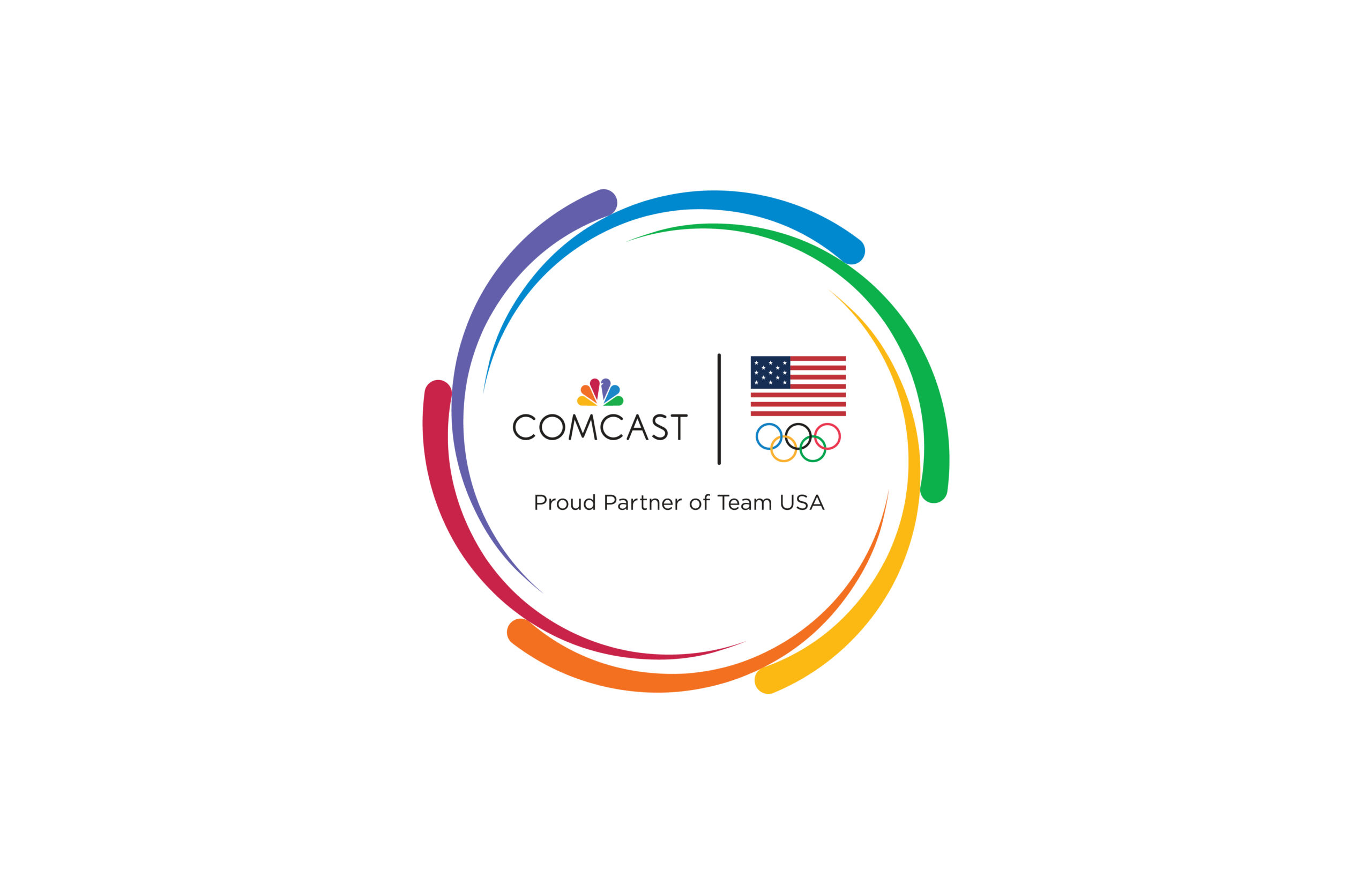
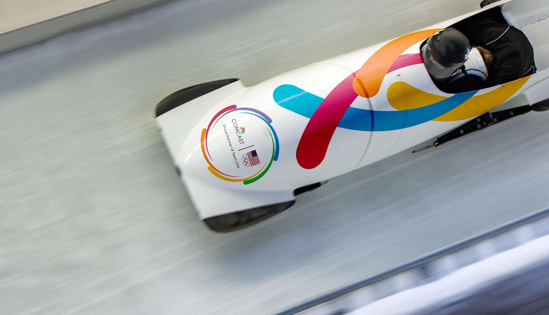
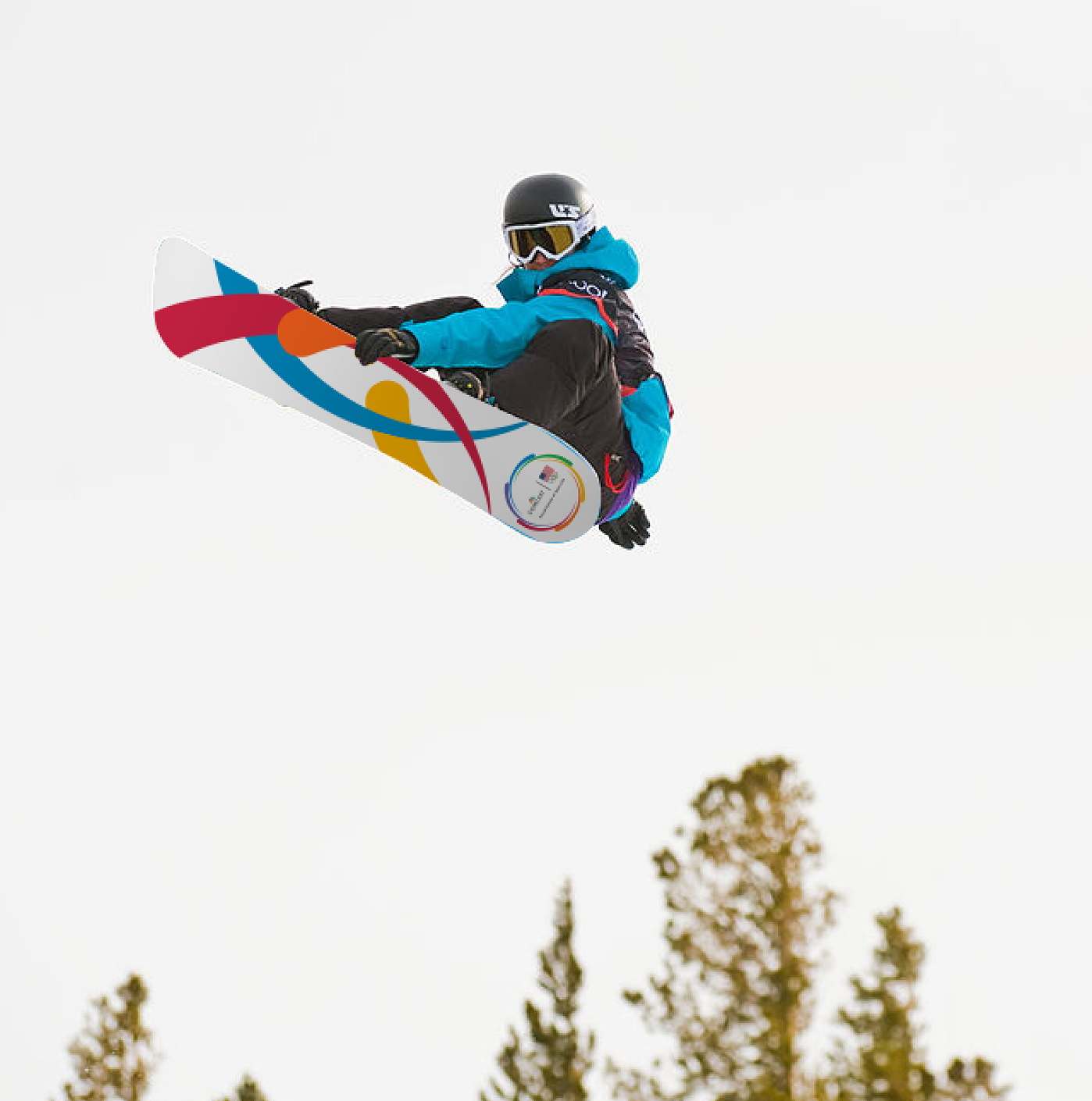
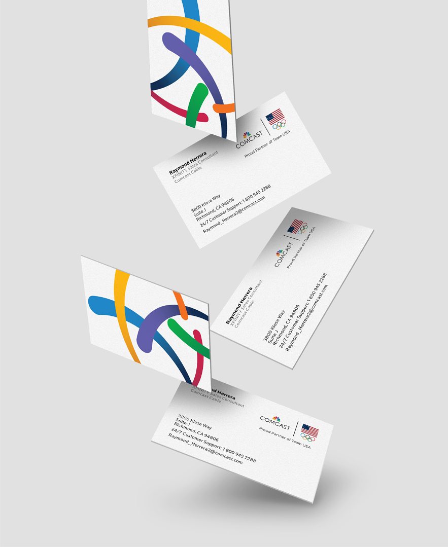
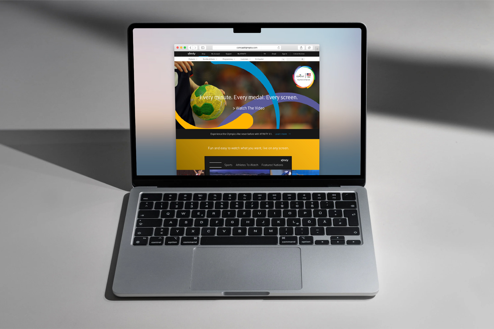
As an Olympic sponsor, Comcast needed a flexible identity that could bring its partnership to life across print, digital, and motion. Inspired by elements of the Comcast NBC identity and Olympic rings, a dynamic visual system captured energy, athleticism, and movement while celebrating meaningful moments of connection and bringing people together.
Brand strategy
Visual identity system
Brand experience
Motion
Environmental design
⟵
(or press esc)
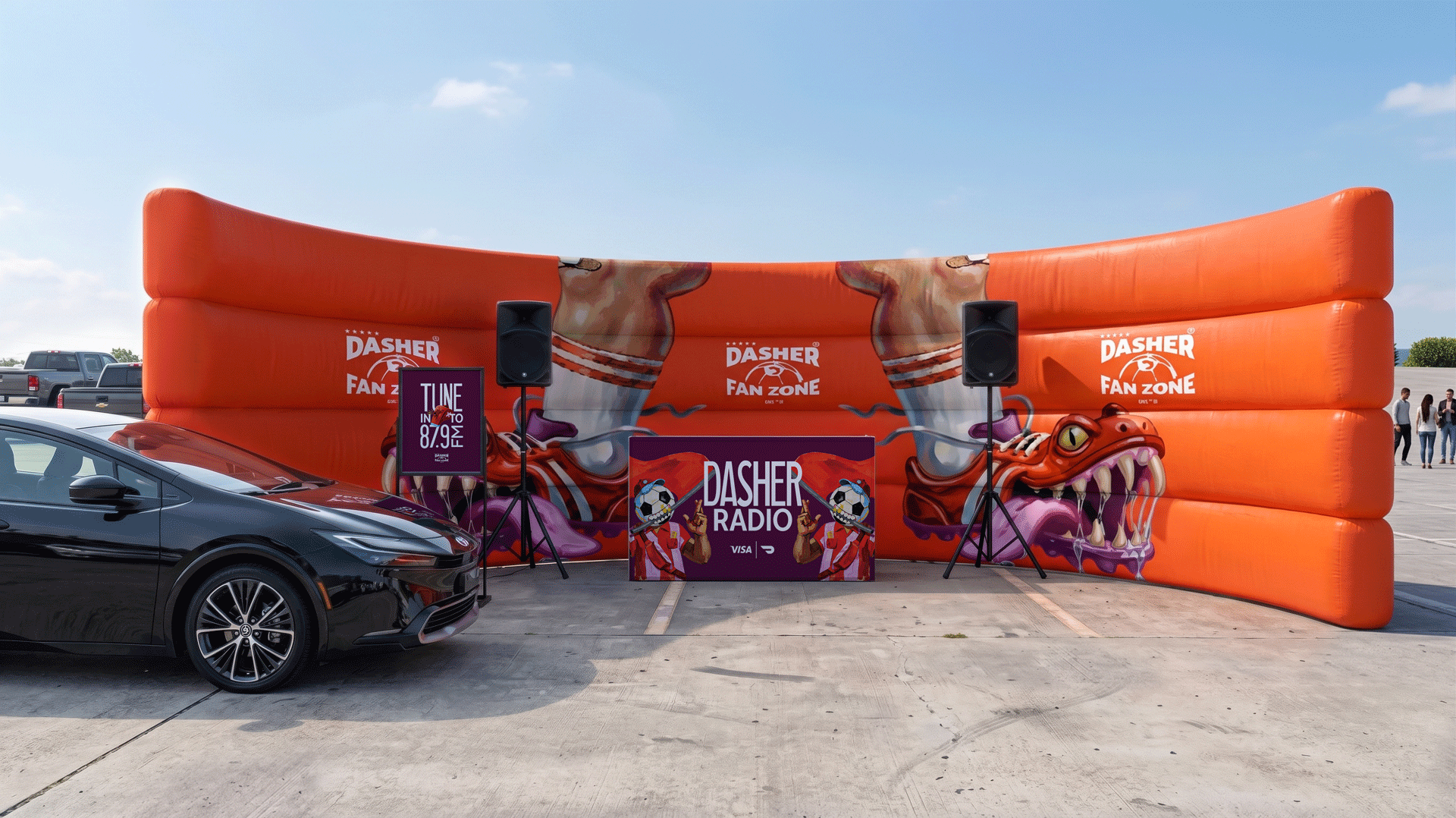
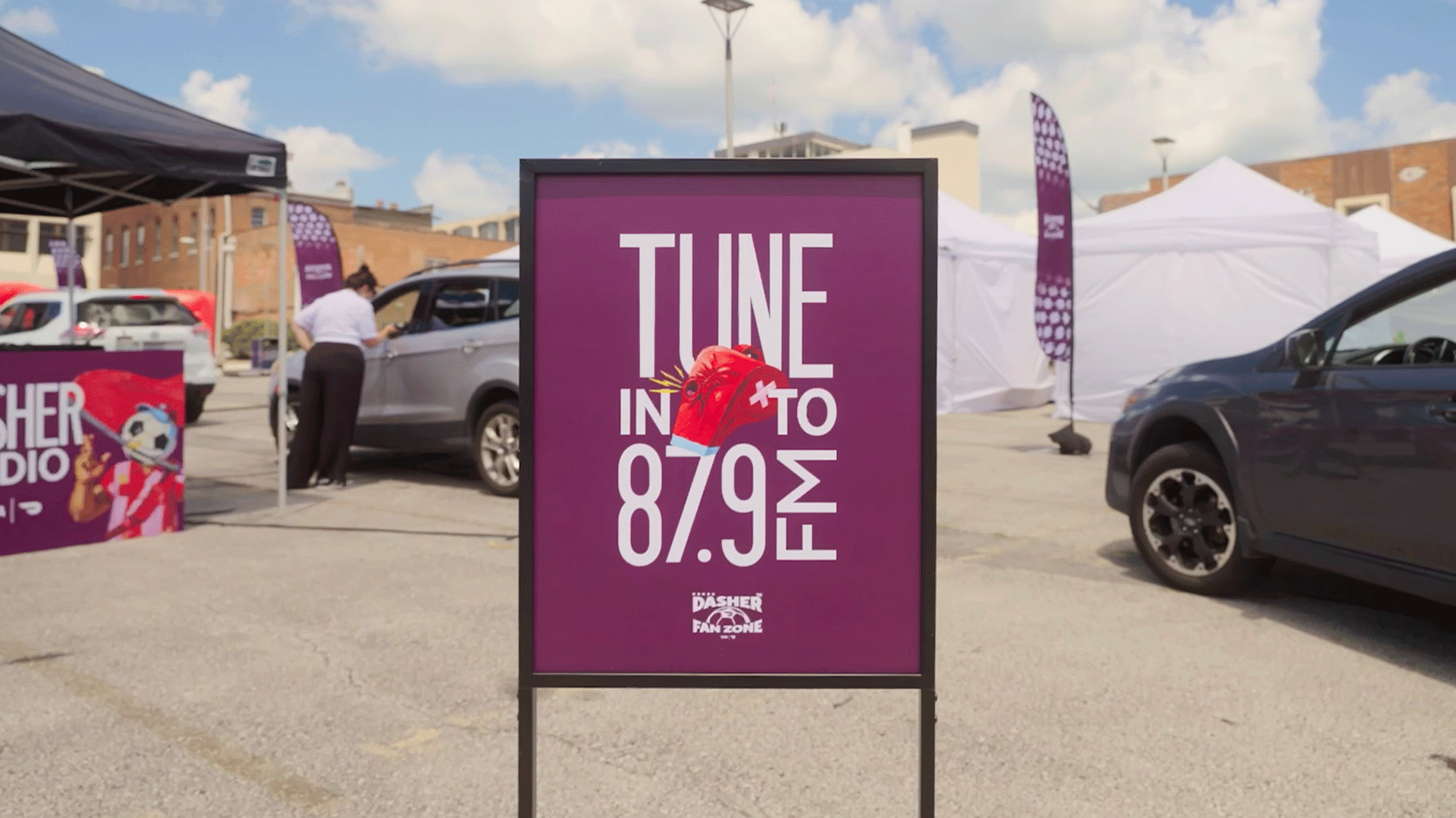
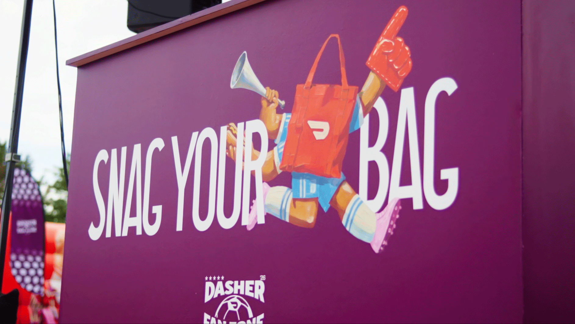
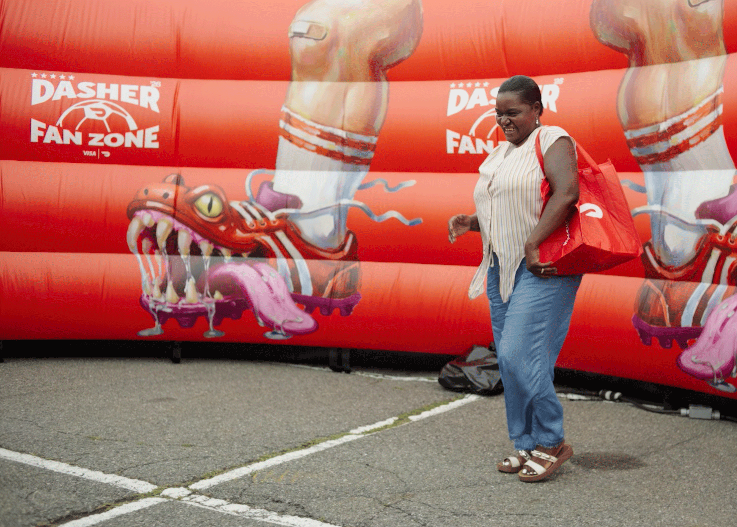
DoorDash × Visa: Dasher Fan Zone
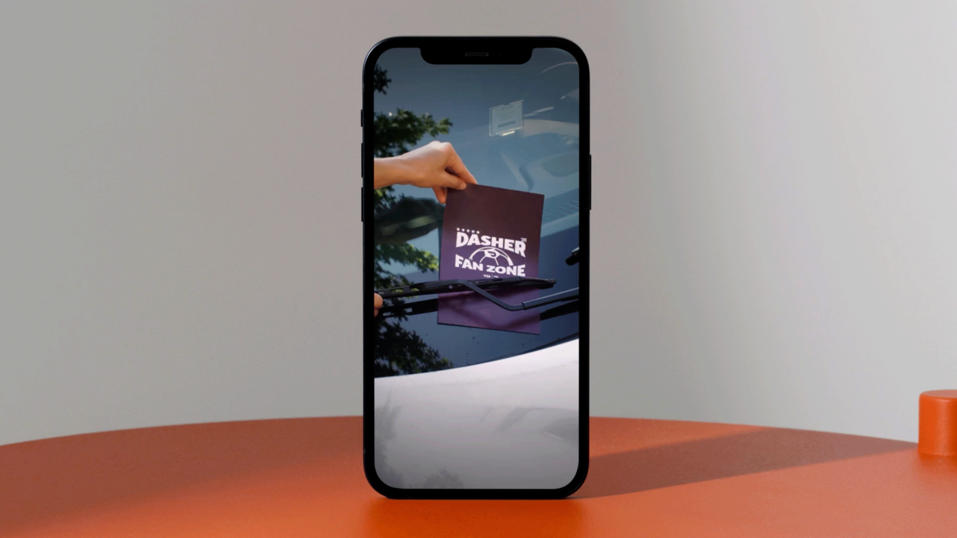
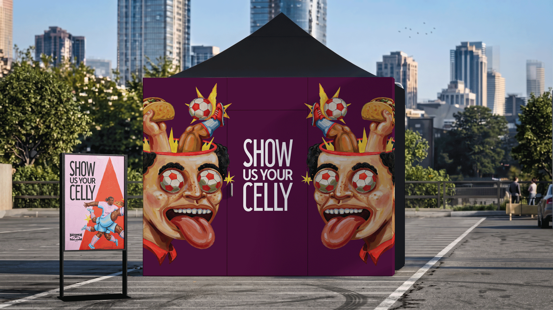
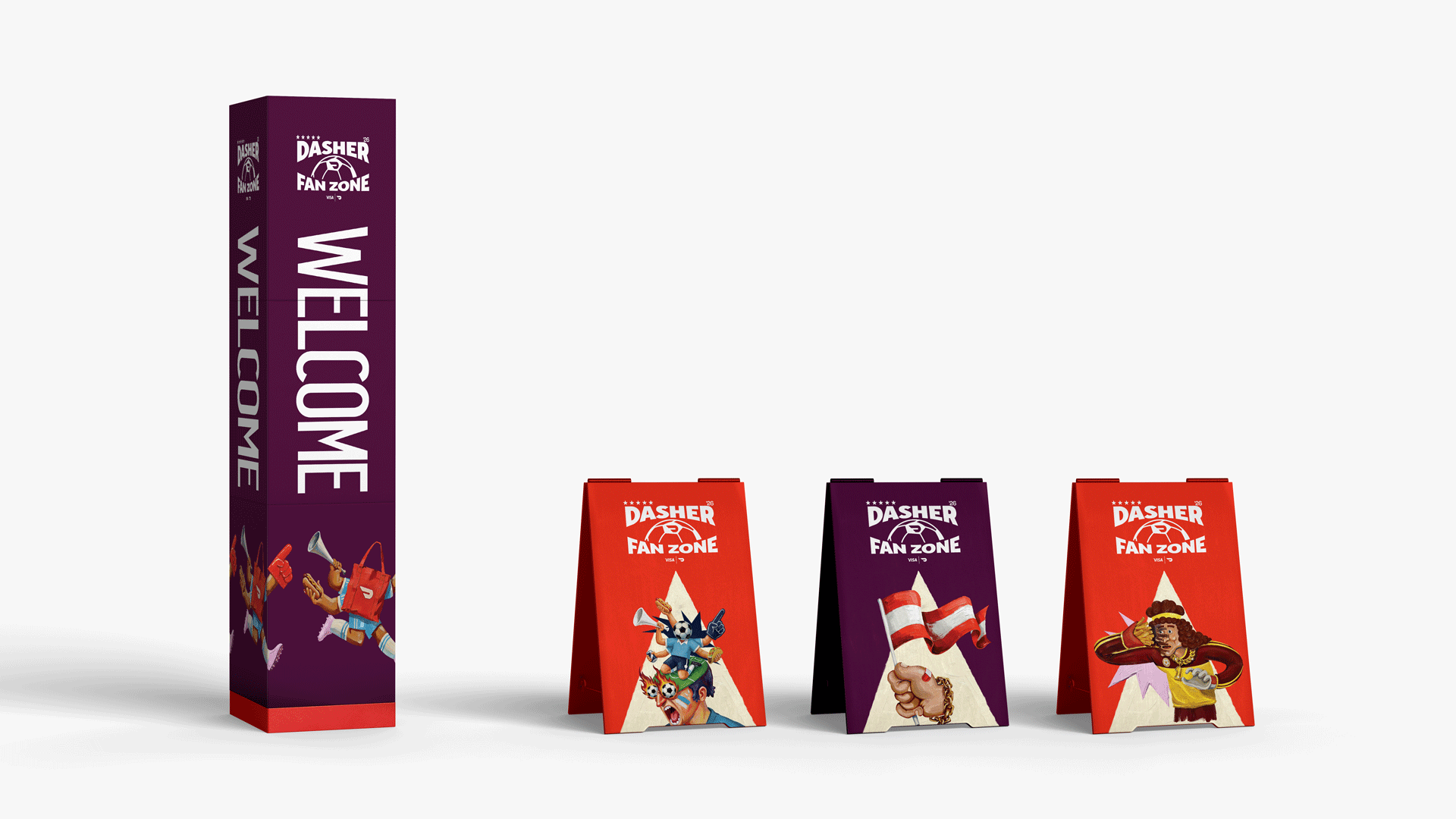
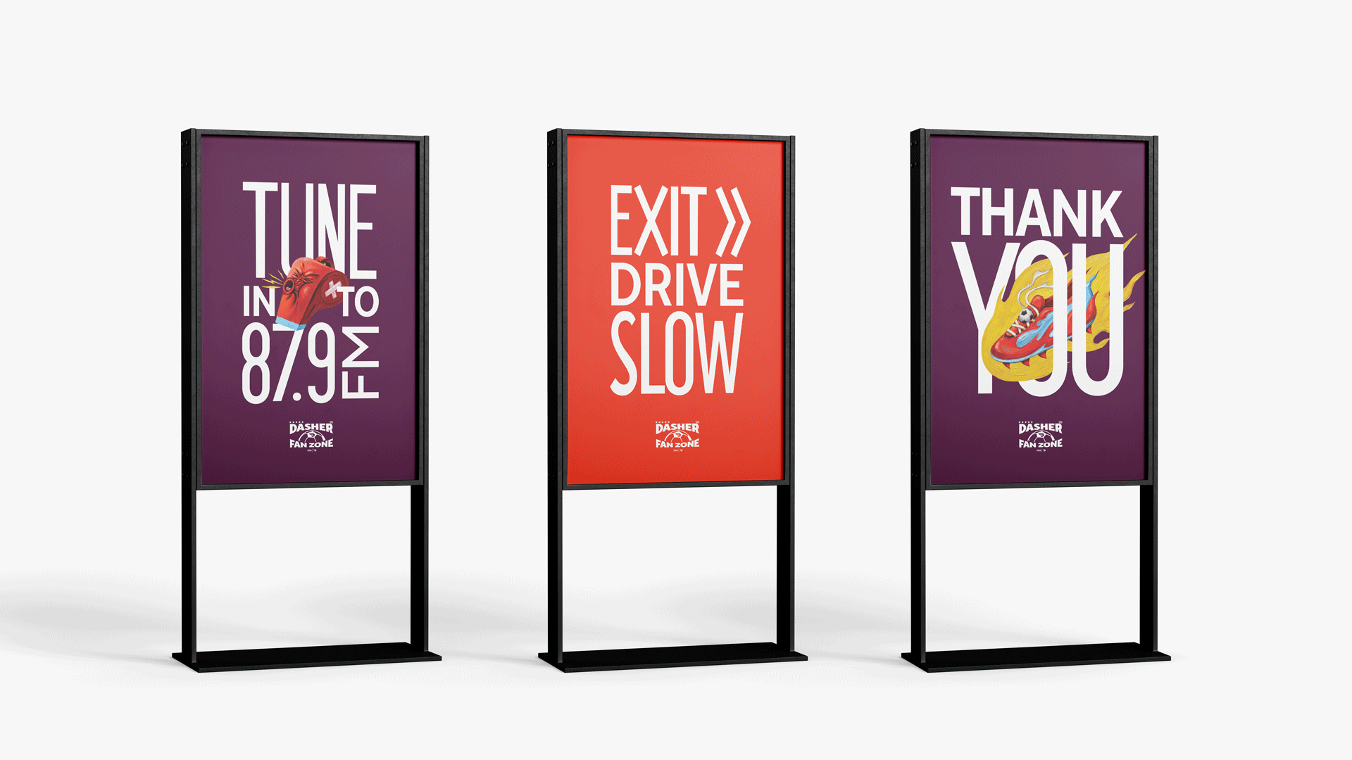
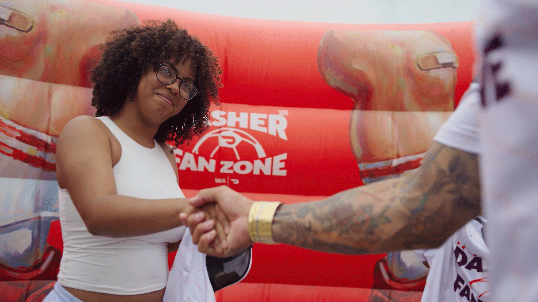
DoorDash teamed up with Visa to create Fan Zone Pit Stops celebrating and supporting the Dashers who power the FIFA World Cup. Extending DoorDash’s World Cup visual identity into a vibrant experiential system, the activation brought the partnership to life through drive-thru hubs, surprise appearances by soccer stars, and exclusive merchandise, keeping Dashers refreshed, rewarded, and connected to the tournament.
Brand activation
Brand experience
Environmental graphics
Implementation

⟵
(or press esc)
More projects
A broader selection of identity, campaign, digital, and experiential work spanning brands, industries, and disciplines.

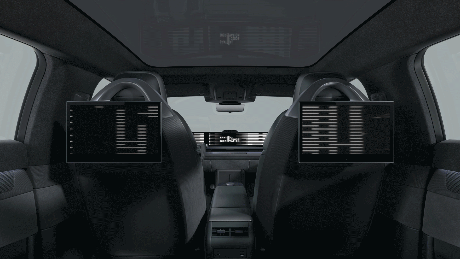
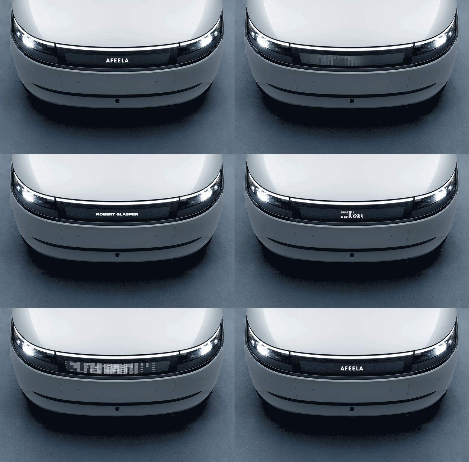
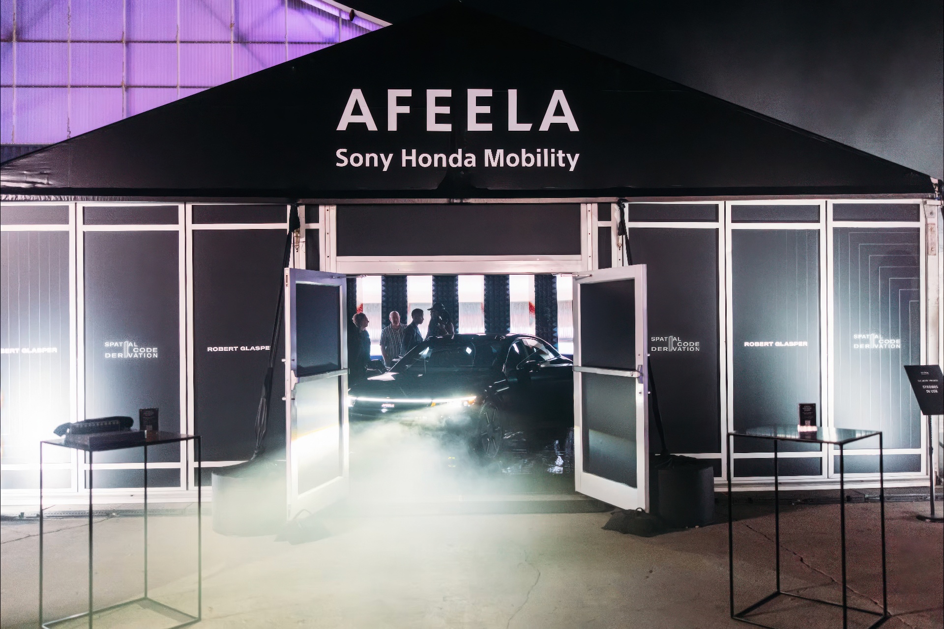
AFEELA @ GRAMMY HOUSE
—
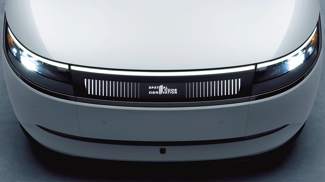
AFEELA at Grammy House showcased the brand’s technology,
design, and audio innovation through an immersive experience at
the intersection of music and mobility. Hosted by the Recording
Academy, the multi-day activation brought together fans, music
creators, industry professionals, and emerging leaders to
experience AFEELA’s vision for the future.
ECD: Aramique Krauthamer
Motion: bk.studio
Event branding / Environment graphics / Motion / Implementation
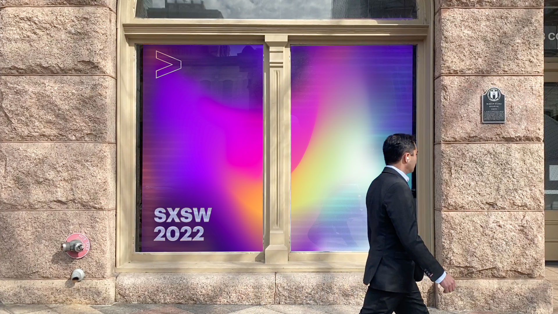
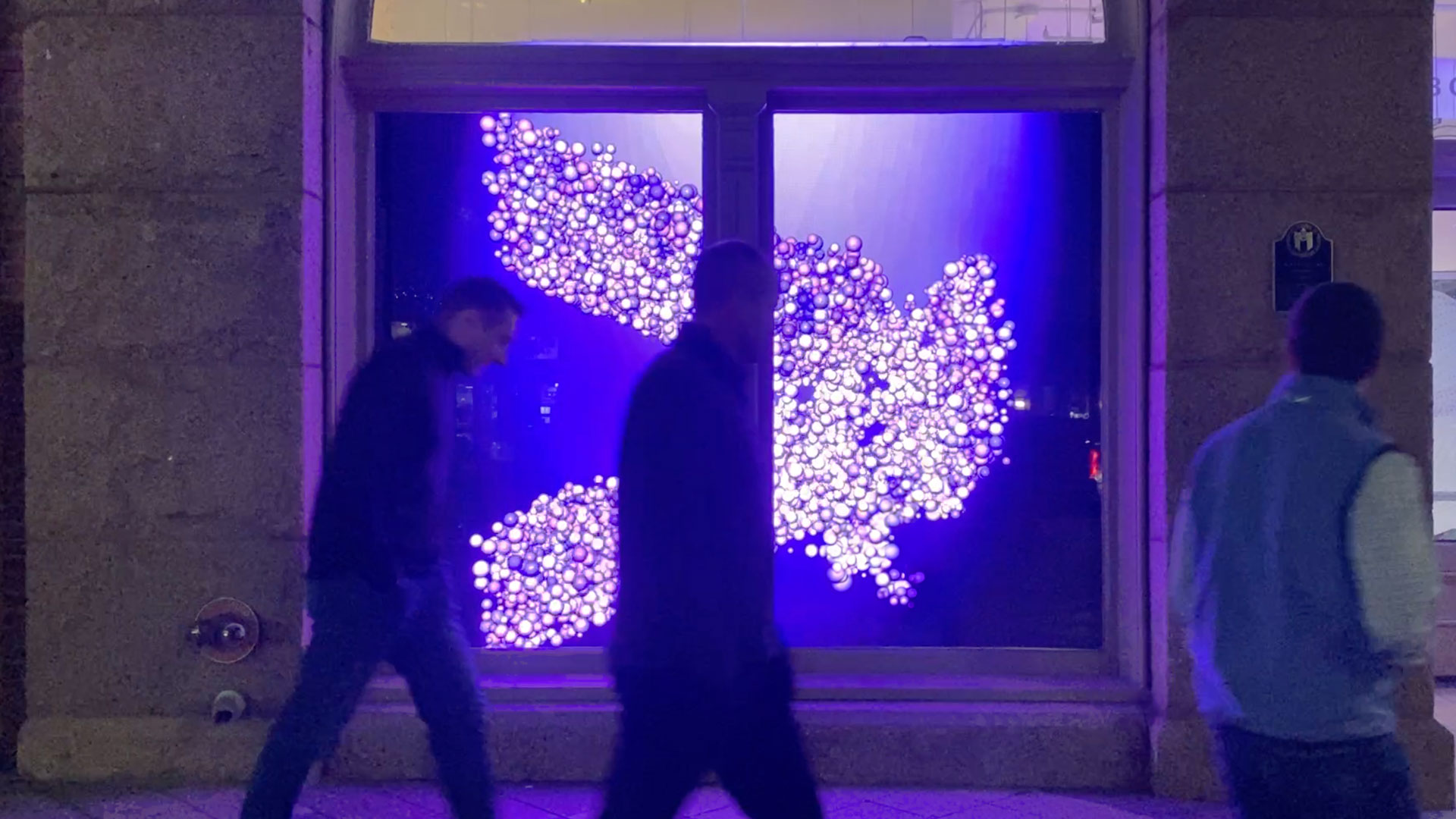
ACCENTURE: AUSTIN INTERACTIVE WINDOW
—
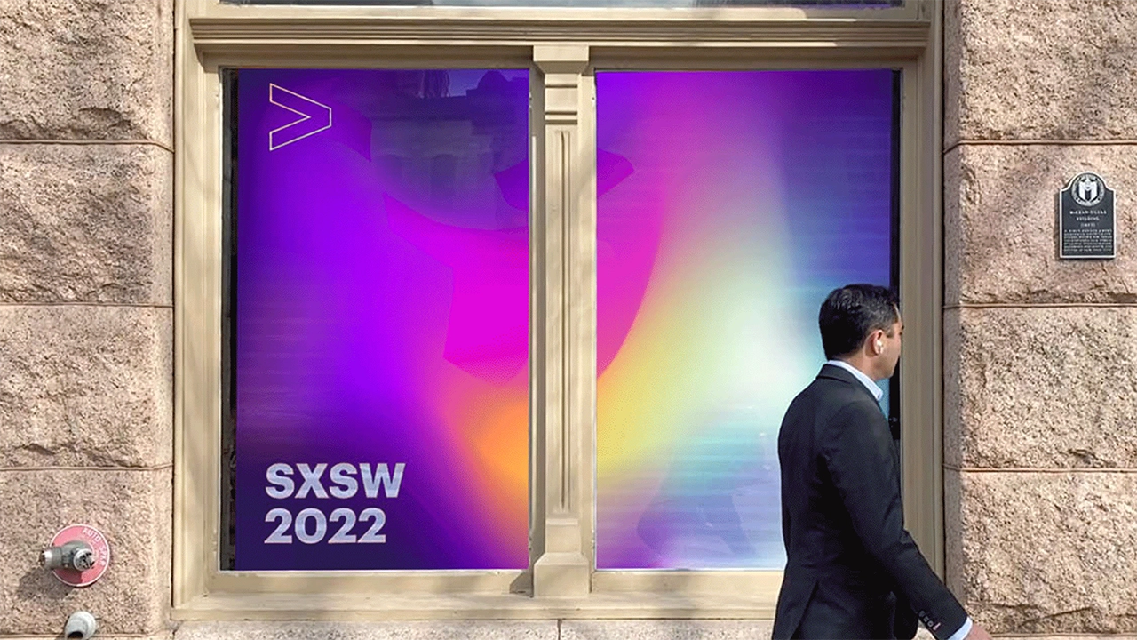
Accenture’s Austin office experience invited the community
to discover how technology, collaboration, and innovation
come together to create new possibilities. Four interactive
window installations brought the brand to life through moments
of discovery, while a flexible visual system allowed the
experiences to adapt and celebrate local events and culture.
Brand experience / Brand activation / Motion


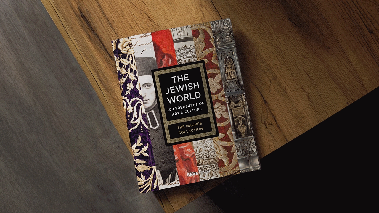
THE JEWISH WORLD: 100 TREASURES OF ART AND CULTURE
—
The first comprehensive catalog of the Magnes Collection of
Jewish Art and Life. The book features art and material culture from
India, Spain, Yemen, Germany, Tunisia, Turkey, China, Russia, the
United States, and other regions where Jews once lived or
continue to live.
Book design / Print design / Implementation


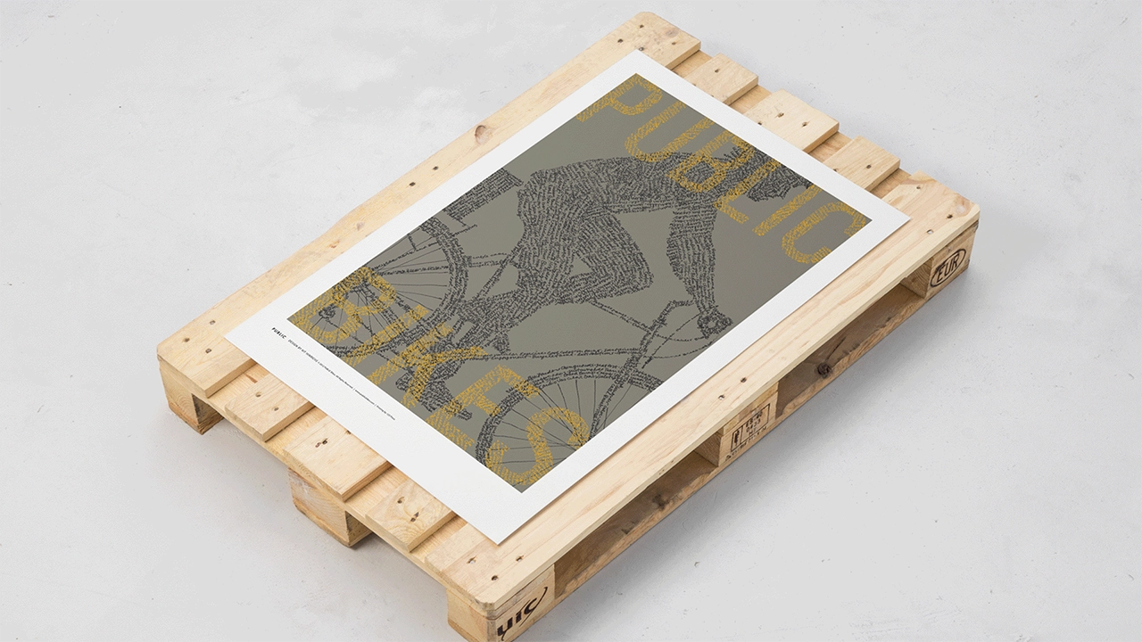
PUBLIC WORKS
—
To highlight critical issues in public space, access, and the
livability of our cities, Rob Forbes, founder of Public Bikes,
started the Public Works project. He asked 27 designers to
create posters that interpret the combined ideas of
"public" and "bicycles."
Visual identity / Book design / Illustration /
Poster design / Implementation
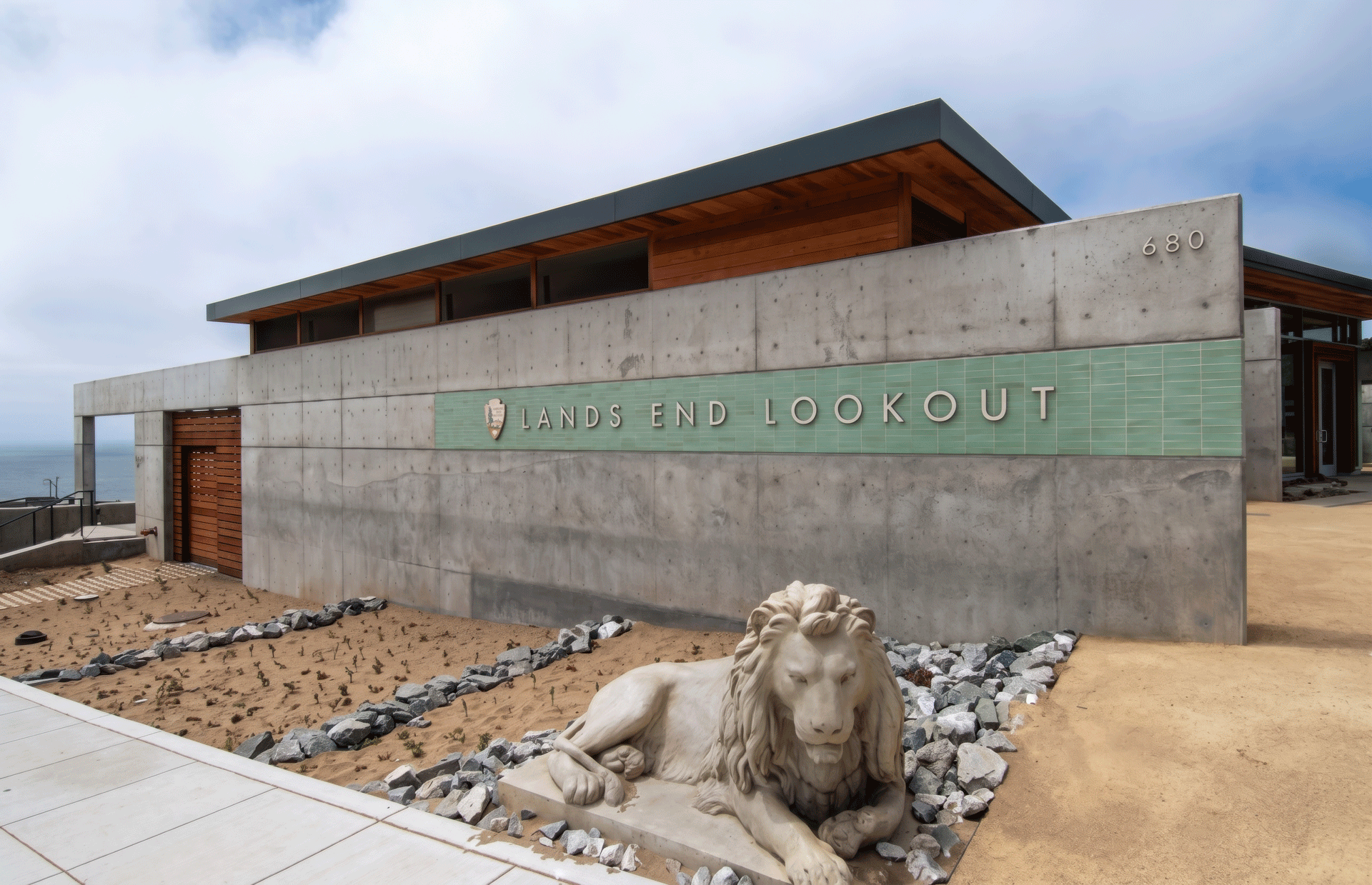
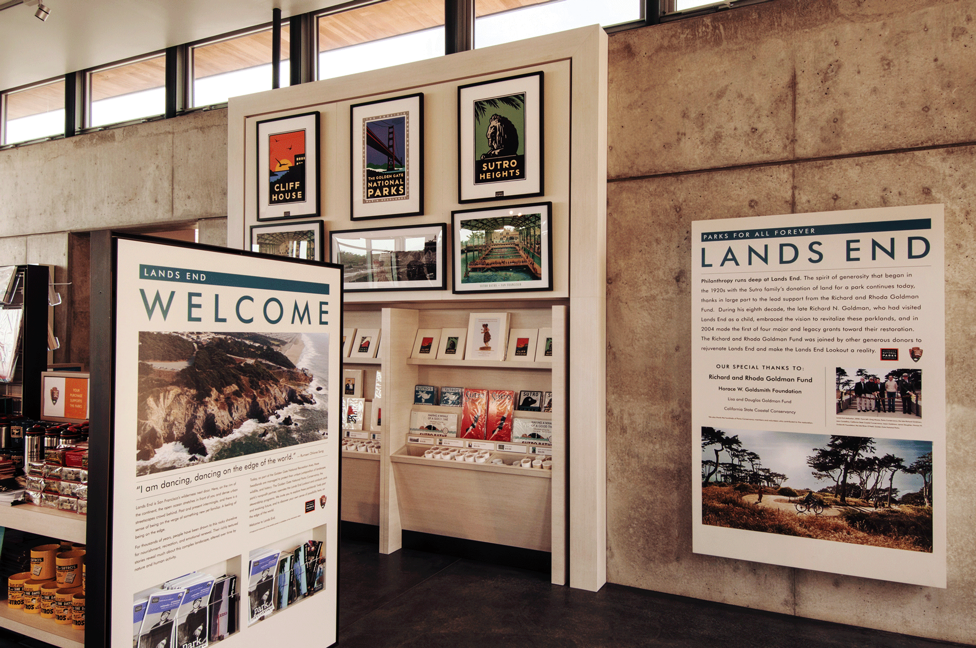
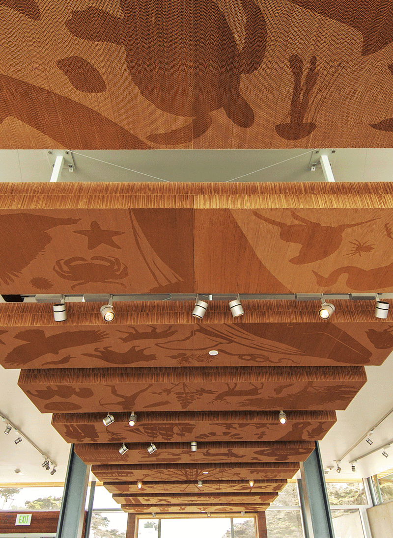
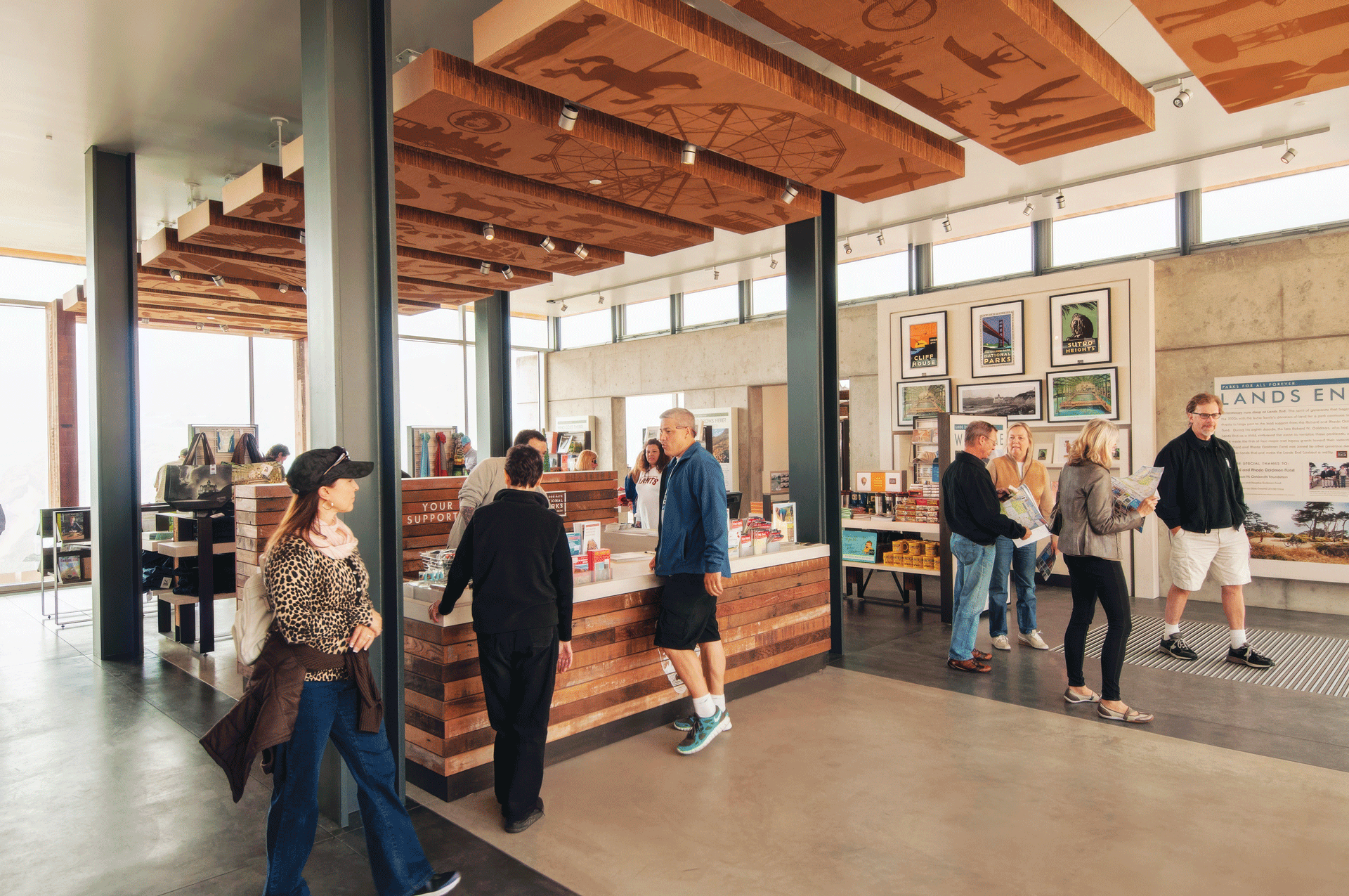
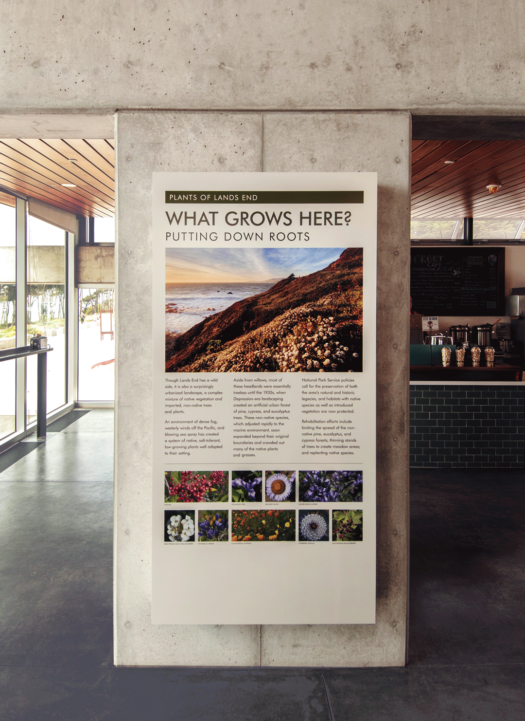
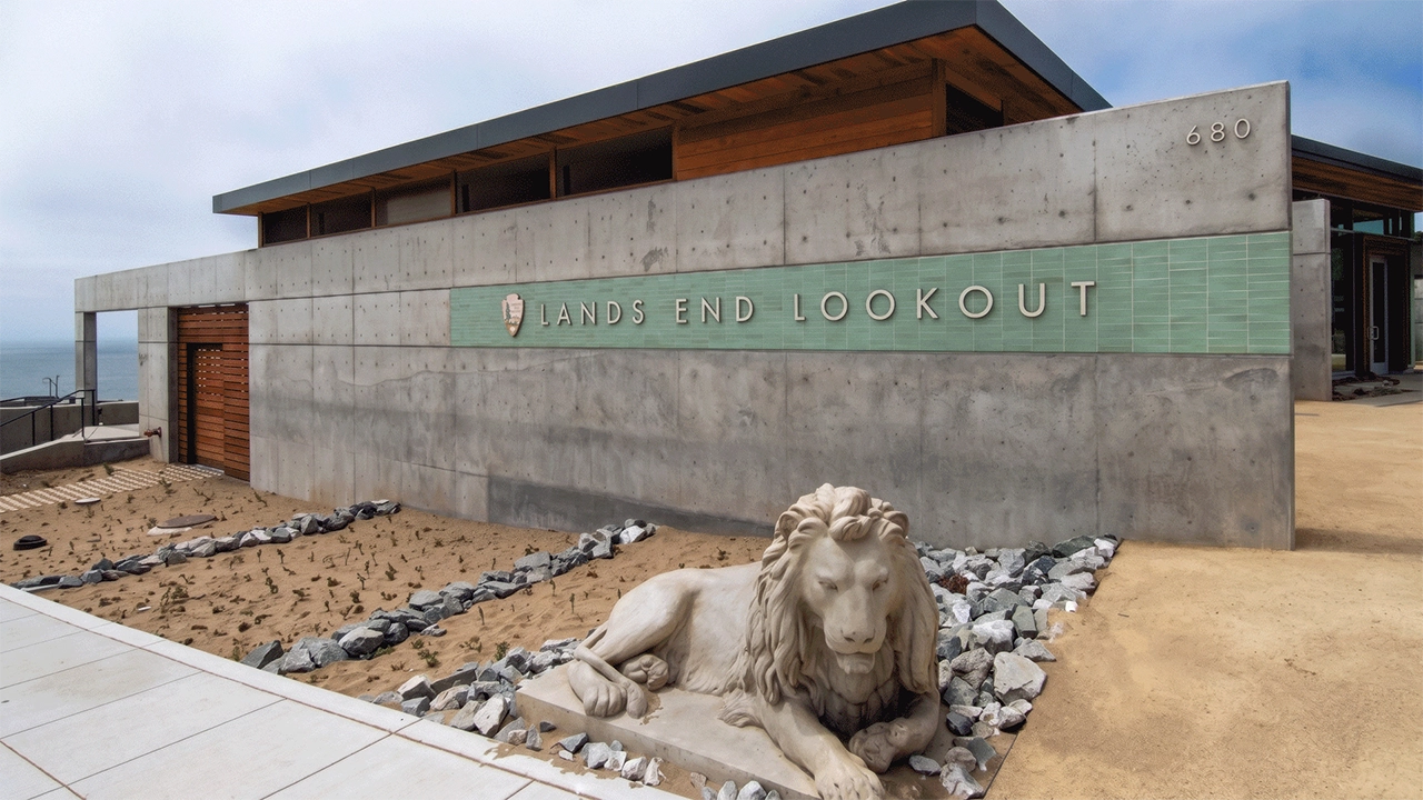
LANDS END LOOKOUT
—
Lands End Lookout, the visitor center in San Francisco's Lands
End, includes informational exhibits describing the area's rich
cultural and natural history, park-related retail, and café. The
project was a collaborative effort between Studio Hinrichs, ehdd.,
Surface Design Inc., Macchiatto, and Plant Construction Co.
Environmental design / Implementation


PUBLIC ARCHITECTURE
—
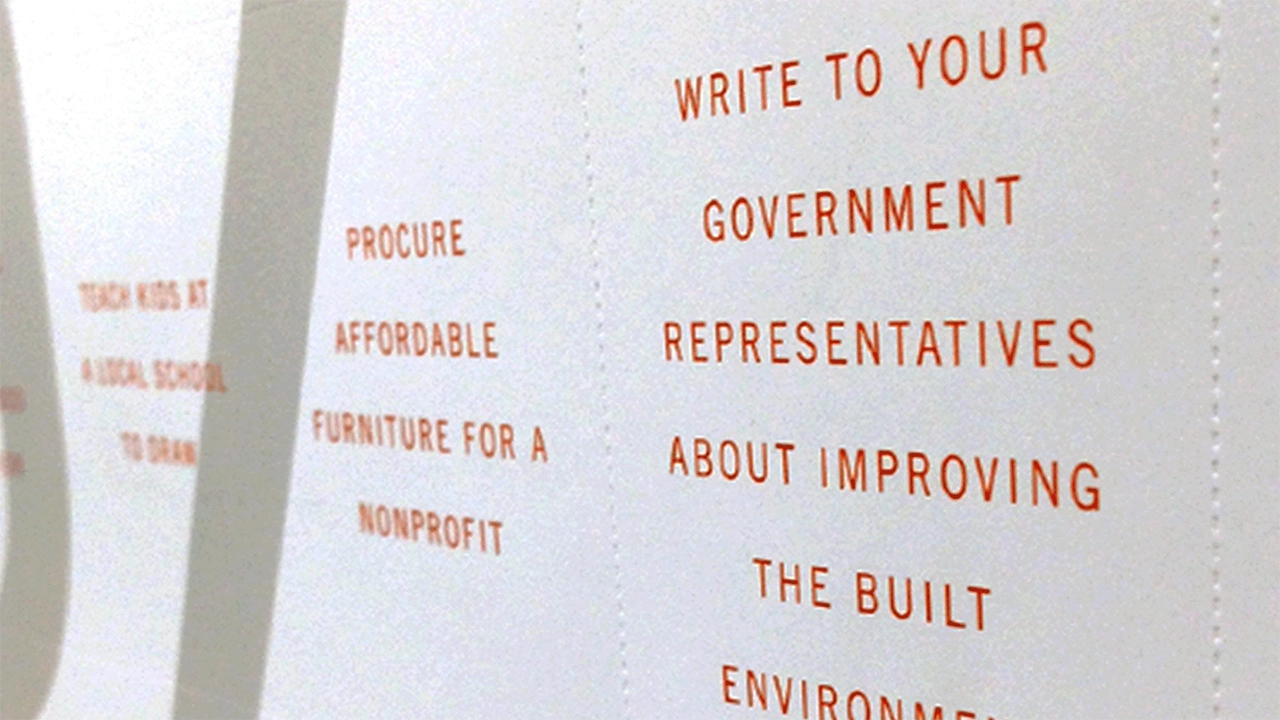
Created in partnership with Public Architecture, this public
service poster and book list 100 specific ways architects can
make a difference—from designing an outdoor classroom to
restoring a wetland to installing a green roof on a school.
The poster uses perforations, rather than a printed rule, to
divide the 100 ideas, which gives the piece a sense of
interactivity and immediacy of action.
Book design / Poster design / Implementation
SAPPI STANDARD 05
—
The Standard, created for Sappi Fine Papers, is the fifth in a series
of educational brochures that highlight the specific uses of paper
in the design profession. This issue features an augmented reality
experience using animated illustrations by Regan Dunnick.
Motion graphics / Animation


BLACK & WHITE BALL 2012
—
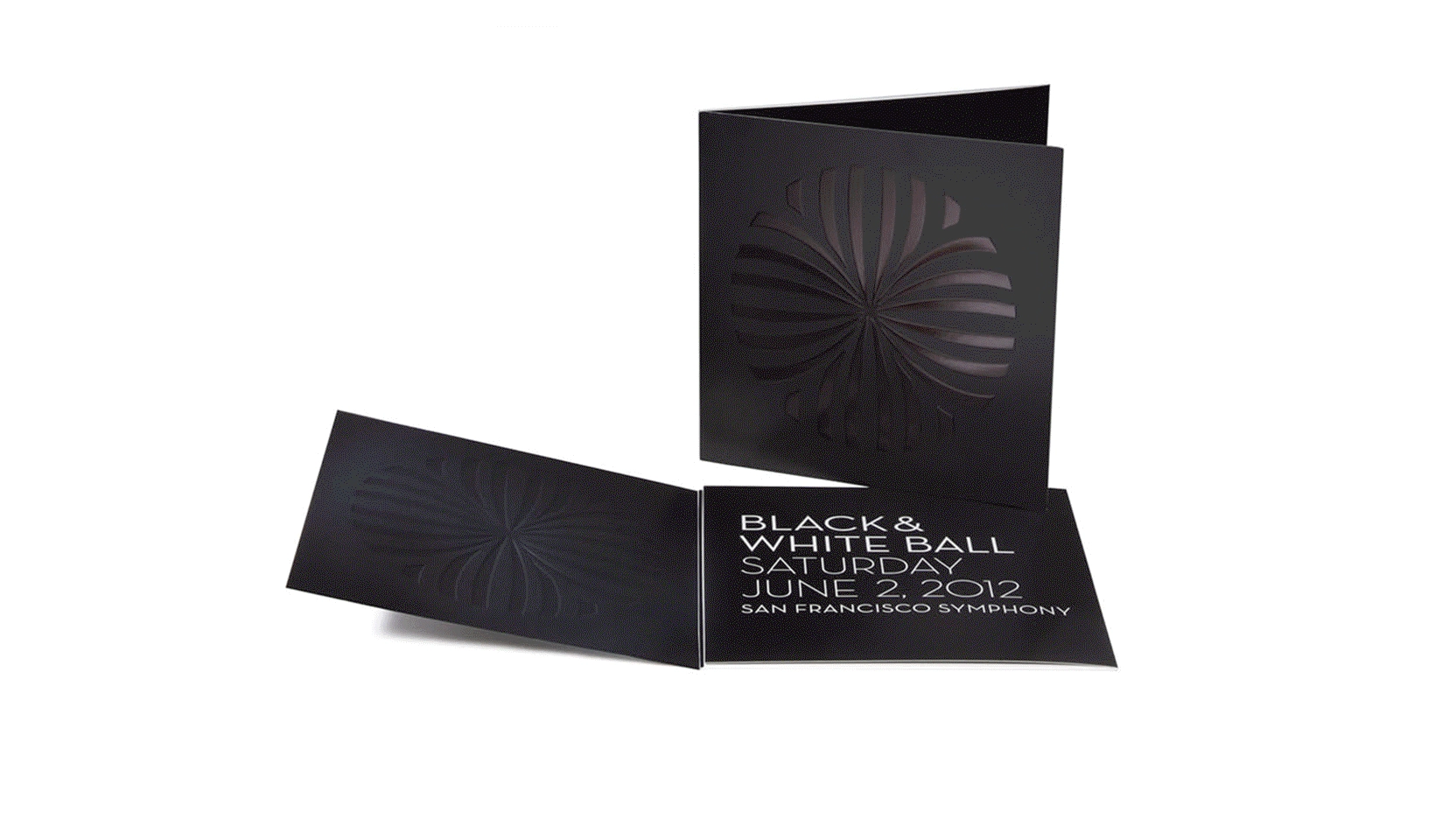
The San Francisco Symphony's biennial Black and White Ball
supports the Symphony's music education programs, benefiting
75,000 students in Bay Area elementary, middle, and high schools.
Creative Director: Takayo Muroga Fredericks
Visual identity system / Collateral / Print design /
Environmental graphics / Implementation


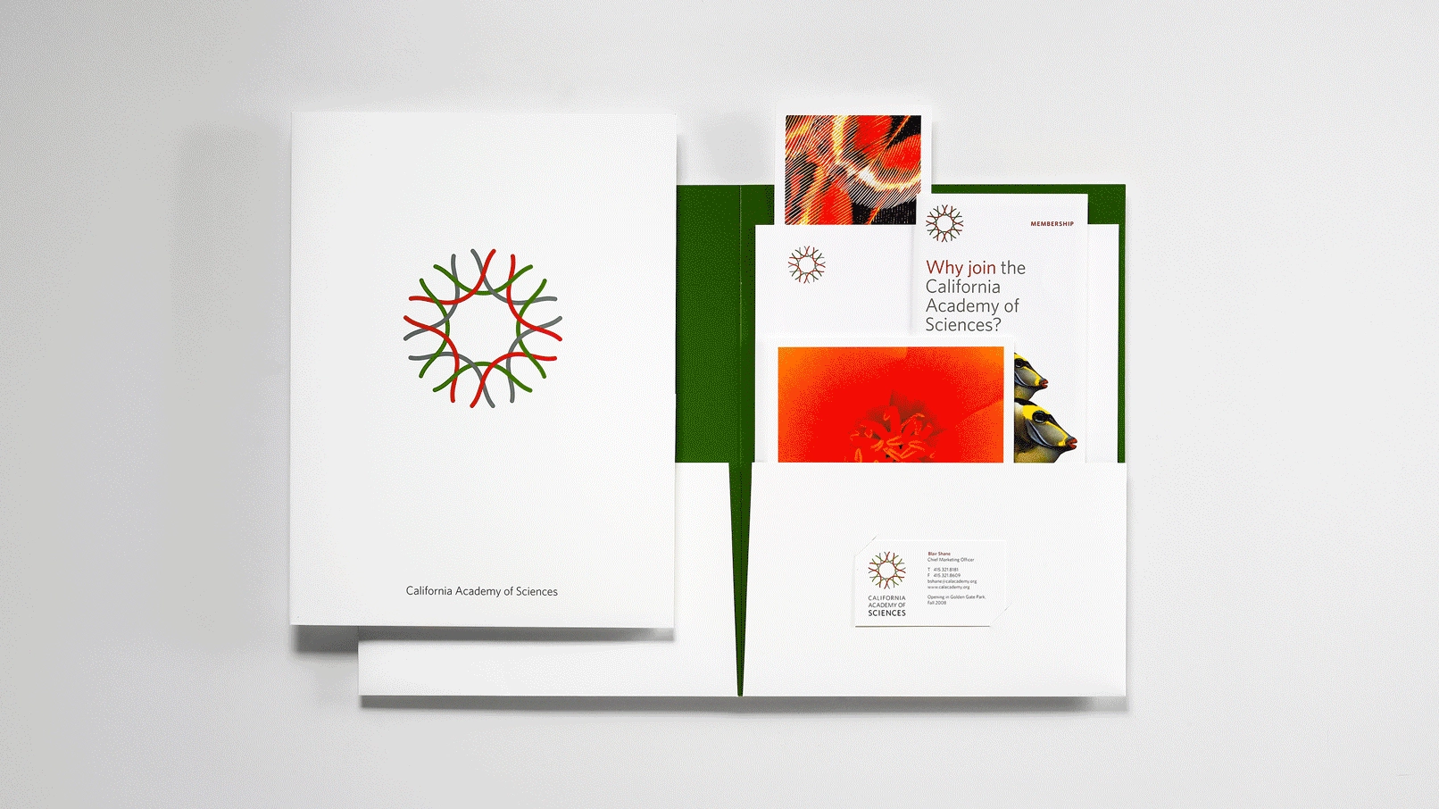
CALIFORNIA ACADEMY OF SCIENCES
—
The California Academy of Sciences, located in San Francisco's
Golden Gate Park, is a renowned research institute and natural
history museum. It ranks among the world's largest natural
history museums, with a collection of nearly 46 million
scientific specimens.
Creative Director: Laura Scott
Collateral / Print design / Environmental graphics / Implementation